
victory
A collection of composable React components for building interactive data visualizations
OTHER License
Bot releases are hidden (Show)
#1531 - Adds a VictoryHistogram component. Huge thanks to @NgoKnows for this new feature!
<VictoryHistogram
  binSpacing={1}
  bins={[0, 20, 50, 500]}
  data={[
    { value: 1 }, { value: 1 }, { value: 2 }, { value: 3 } ...
  ]}
  x="value"
/>
Histogram bins may be defined with the bin prop, which takes either an array of bin edges, or a single number which corresponds to an approximate number of bins. VictoryHistogram is meant to work with continuous data, and expects a data prop as an array of objects with x values. By default, histogram bins will be laid out with no spaces between bins, but the optional binSpacing prop may be provided to change this behavior. Additional documentation and examples here: https://formidable.com/open-source/victory/docs/victory-histogram
#1558 - Adds a backgroundComponent for VictoryChart that will be rendered if VictoryChart's style component includes background styles. The Background component renders a rect for cartesian charts and a circle for polar charts that is correctly sized and positioned to fill the entire range of the chart. Thanks @maddles and @wparsons!
Update typescript types for all Victory components. A huge thanks to @maddles @wparsons and @kale-stew for this work. This release includes the following PRs
#1557, #1556, #1554, #1552, #1551, #1550, #1547, #1546, #1543, #1538, #1536, #1535, #1534, #1533, #1532, #1530,#1529, #1528, #1527, #1526, #1525, #1524, #1522, #1521, #1520, #1519, #1515, #1514, #1512, #1510, #1508
#1481 - Add typescript types from the definitely-typed project so that we can maintain them more easily going forward
Breaking Changes
This version uses the context API introduced in [email protected]
- #1462 - Updates to the new context API. Thanks @fabianishere!
-
#1404 Adds a11y improvements
- corrects behavior of VictoryContainer so that it only adds aria-labelledby and aria-describedby attributes when there are actually title and / or desc elements that are rendered (controlled by the title and desc props on VictoryContainer
- adds a tabIndex prop to all primitive components that Victory renders (i.e. VictoryLabel, Bar etc). This prop may be given as a number or a function of other props
- adds a desc prop to all primitive components. This prop may be given as a number or a function of other props
Breaking Changes
Changes for functional props and styles:
Related PR: #1360
Functional props like labels and functional styles will now be called with a single argument instead of datum and active. The argument passed to functional props and styles will be an object containing all the props that control the rendering of the the target the prop applies to. Including things like datum, active, index, data, scale, etc. We hope this will give users a lot more flexibility and control. In most cases, this change should be very straightforward to apply
old:
labels={(d) => `x: ${d.x}`}
new
labels={({ datum }) => `x: ${d.x}`}
Gotchas:
- Some of the props passed into functional props and styles may themselves be functions. These will not be evaluated, because we have no way to determine evaluation order. So, if you create a
cornerRadiusfunction that depends onbarWidth, do not also makebarWidtha function of some other prop. - A few props that take functions do not follow this pattern. These include data accessor functions like
yandx, andtickFormat. The arguments for these props have not changed.
Changes for VictoryCandlestick labels
Related PR: #1295
VictoryCandlestick now has granular support for labels corresponding to each portion of the candle. The current labels and labelComponent props will be joined by new props corresponding to each part of the candle.
New props
lowLabels
lowLabelComponent
highLabels
highLabelComponent
openLabels
openLabelComponent
closeLabels
closeLabelComponent
This will be a breaking change affecting the positioning of the default label. In earlier versions, the default label was positioned above the candle, it will now be positioned next to the center of the candle.
To use older label positioning, use highLabels / highLabelComponent rather than label / labelComponent. If you are using tooltips with VictoryCandlestick, you will need to register a custom event to trigger your highLabels tooltip:
example:
<VictoryCandlestick
  highLabels={({ datum }) => datum.high}
  highLabelComponent={<VictoryTooltip />}
  events={[{
    target: "data",
    eventHandlers: {
      onMouseOver: () => ({ target: "highLabels", mutation: () => ({ active: true }) }),
      onMouseOut: () => ({ target: "highLabels", mutation: () => ({ active: false }) })
    }
  }]}
/>
The style prop for VictoryCandlestick now also has namespaces for the new labels in addition to the current labels namespace. When both labels and specific label styles (e.g. highLabels) are provided, the styles will be merged
Changes for VictoryVoronoiContainer
Related PR: #1371
Before this version VictoryVoronoiContainer had limited functionality for mouse-following tooltips, and for constraining a tooltip to the chart area, but it was only usable for multi-point tooltips (with voronoiDimension), and was not user configurable. This version aims to correct these limitations:
-
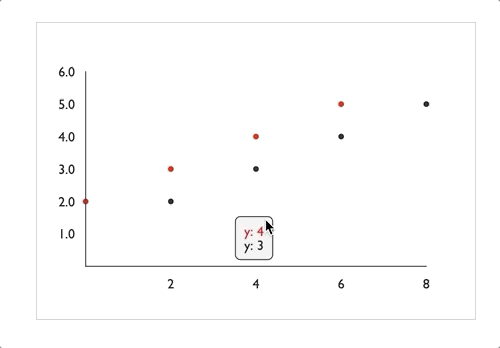
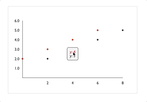
mouseFollowTooltips: This new boolean prop onVictoryVoronoiContainerdetermines whether the labels should follow the mouse position or snap into place. (Note that in charts usingvoronoiDimension, the tooltip still follows the mouse in the non-voronoiDimension, as demonstrated in the charts below (both withvoronoiDimension="x")
mouseFollowLabels={true}
mouseFollowTooltips={false}
- constrained tooltips: multi-point tooltips rendered by
VictoryVoronoiContainerwill no longer be constrained to the chart area by default. Instead, add theconstrainToVisibleAreaprop toVictoryTooltipto enable this behavior for both multi-point and single point tooltips:
example:
containerComponent={
  <VictoryVoronoiContainer
    labelComponent={<VictoryTooltip constrainToVisibleArea />}
  />
}
Changes for VictoryTooltip and VictoryLabel
Related PR:#1371
The changes we wanted to make to support new behaviors in VictoryVoronoiContainer required some changes to VictoryTooltip and VictoryLabel
New props for VictoryTooltip:
-
constrainToVisibleAreais a boolean prop that, when true, will alter the position of the tooltip so that it exactly fits within the svg Victory renders. The tooltip's center will be moved, but the pointer will remain pointing at the associatedx,yvalue of the tooltip. When this prop is set to true,pointerLengthmay not be respected -
centeris a prop that may be given as an object with values or functions for "x" and "y". When this prop is set, it will position the center of the tooltip (centered around the main body of the tooltip, minus the pointer). When this prop is not set, it will be calculated from other props such asx,y,pointerLength, etc. This prop was added to enable mouse-following tooltips inVictoryVoronoiContainer. -
centerOffsetis a prop that may be given as an object with values or functions for "x" and "y". When this prop is set, the center of the tooltip will be offset by some amount from the x, y value it points to, resulting in a slanted pointer. When this prop is set,pointerLengthwill not be respected (because the pointer will be slanted) -
flyoutHeight(formerlyheight): This optional prop determines the height of the tooltip flyout (minus pointer). The name of this prop was changed so that it would not conflict with theheightprop now passed toVictoryTooltipby its parents -
flyoutWidth(formerlywidth): This optional prop determines the width of the tooltip flyout (minus pointer). The name of this prop was changed so that it would not conflict with thewidthprop now passed toVictoryTooltipby its parents -
width: the overall width of the parent svg. This prop will be passed down from any victory component that usesVictoryTooltipas a label -
height: the overall height of the parent svg. This prop will be passed down from any victory component that usesVictoryTooltipas a label
Changes Affecting VictoryLabel and VictoryTooltip
- The
xandyvalues passed to labels by their parent components have all been adjusted so that their values match the position of the data point they correspond to. All padding is now accounted for in thedxanddyprops instead of being added directly toxandy.
This will be a breaking change for anyone who is wrapping label components and relying on thexandyprops they receive, or providing their owndx/dyprops. These breaking changes may take a bit of manual adjustment to correct, but we hope this change will make label positioning easier to reason about in the long run.
Other Changes
We have been concurrently working on improving performance and the stability of events in victory-native. The following changes have been added to support these efforts:
Related PR: #1373
- A
prependDefaultAxesboolean prop has been added toVictoryChart. This prop will be set true by default invictory-nativeto reduce the possibility of axis elements to interfere with events. - Invisible ticks and grids will no longer be rendered unless they have events attached to them. This is again to reduce interference with events.
Related PR: #1365
- Swapped out React component primitives (
Bar,Pathetc) with for function primitives to match performance-improving changes invictory-native. (This is a breaking change for anyone extending fromvictorycomponents)
Published by boygirl over 5 years ago
2019-02-27
Horizontal Chart Improvements!
The goal of this change is to make it possible to turn any existing chart into a horizontal chart by adding the horizontal prop to the chart without needing to alter any other props.
- supports horizontal versions of all chart types without needing to alter data
- supports all event containers for horizontal charts
- enforces consistency across props that take x and y values so that the
xvalue always refers to the independent dimension, and theyvalue always refers to the dependent dimension. - the orientation of
VictoryAxiscomponents is no longer tied to whether or not they are thedependentAxis
Breaking Changes
Most Horizontal Charts
The change in how props with x and y values are treated (i.e. scale, domain, etc) will be a breaking change for most horizontal charts. In most cases, reversing the x and y values of props you are providing to your horizontal chart will be sufficient to correct the change. For example:
<VictoryChart horizontal scale={{ x: "log" }} domain={{ y: [4, 9] }}>
  <VictoryBar
    data={[
      { x: 5, y: 0.1 },
      { x: 6, y: 1 },
      { x: 7, y: 10 },
      { x: 8, y: 100 }
    ]}
  />
</VictoryChart>
Should be changed to:
<VictoryChart horizontal scale={{ y: "log" }} domain={{ x: [4, 9] }}>
  <VictoryBar
    data={[
      { x: 5, y: 0.1 },
      { x: 6, y: 1 },
      { x: 7, y: 10 },
      { x: 8, y: 100 }
    ]}
  />
</VictoryChart>
Props affected by this change are: scale, domain, maxDomain, minDomain, domainPadding, and categories
Horizontal Charts with Event Containers
Dimension props such as brushDimension have changed so that they always refer to the dimension of the target variable (x for the independent variable, and y for the dependent variable). For example, a VictoryBrushContainer component with brushDimension="x" will move and expand only in the independent dimension regardless of whether the chart is horizontal.
Props affected by this change are: brushDimension, cursorDimension, selectionDimension, voronoiDimension, and zoomDimension
Horizontal Charts with Custom dataComponents
The position values (i.e. x, y, x0, y0) supplied to custom dataComponents from components like VictoryChart will be scaled for the layout of the horizontal chart. Users who rely on these values may need to flip them or adjust them depending on their use case
Horizontal VictoryBoxPlot
Previously VictoryBoxPlot required data to be flipped (x values flipped with y values) in order to plot horizontal charts. This is no longer required, and providing data in this format will no longer work correctly. To correct for this change, it should be sufficient to flip the data used in horizontal charts
Published by boygirl over 5 years ago
(2019-01-27)
Axis improvements
-
1244 Supports the
axisValueprop for both cartesian and polar charts. This prop allows users to position an axis relative to a value on the opposite axis. Values may be given as numbers, dates, or strings. This prop only works for axis components when they are nested withinVictoryChart. Standalone axes can still be positioned usingoffsetXand offsetY` props. - 1240 Allows multiple independent axes in a single chart
Removes all deprecated lifecycle methods
-
1239 Removes all
componentWillReceivePropslifecycle methods and addsshouldComponentUpdatelogic for higher level components. Previously only the lowest level components performedsCUchecks. -
1228 Replaces
componentWillMountwithcomponentDidMount
bug fixes
Published by boygirl over 5 years ago
(2019-01-08)
-
1222 Bugfix: Avoid rendering null values on discrete data
-
1218 Bugfix: Ensure that calculated domains respect custom baselines for VictoryBar and VictoryArea
-
1202 Bugfix: Correct missing bar values
-
1208 Performance: Improve performance in
addEventKeys -
1211 Performance: Optimize stringMap calculations
-
1212 Performance: Optimize for preformatted data:
When data objects already contain_x,_y(and_y0where appropriate) and have data accessor props likex="_x", data will no longer be formatted by Victory, but will be used as is.
Example:<VictoryArea data={[ { _x: 0, _y0: 1, _y: 2 } ...]} x="_x" y="_y" y0="_y0" /> -
1209 Feature: Adds an
animationWhitelistproperty to theanimateprop. This property should be given as an array of strings. When this prop is given, only the prop names matching the array will be animated, and all other props will be instantaneously updates.Example:
<VictoryBar
  animate={{
    animationWhitelist: ["data"]
  }}
  data={this.state.data}
  style={{
    data: this.state.style
  }}
/>
When this property is not set, the
static animationWhitelistof any given component will be used.
Published by boygirl over 5 years ago
(2018-11-10)
-
#1177 Adds support for controlling
radius,innerRadius,cornerRadius,padAngle,sliceStartAngleandsliceEndAnglefor each individual slice of a pie:
Details:
The Slice primitive used by VictoryPie now takes radius, cornerRadius, innerRadius, padAngle, sliceStartAngle and sliceEndAngle props. Each of these props may be given as number or a function of datum and active. padAngle, radius, cornerRadius and innerRadius will be passed down from props on VictoryBar, but sliceStartAngle and sliceEndAngle must be defined directly on the Slice instance, These values should be given in degrees. To make these values easier to use as functional props, startAngle, endAngle, and padAngle (in degrees) are added to each datum passed into Slice. (If your data already has these properties they will not be overridden)
Breaking Changes
The Slice primitive will still take a pathFunction prop, but this prop will no longer be provided by VictoryPie. This will not be a breaking change for most users. This will only affect users who were wrapping the Slice component and making use of the pathFunction prop provided by VictoryPie Users who were providing their own pathFunction prop to Slice should not be affected.
Published by boygirl over 5 years ago
(2018-10-26)
-
#1152 Bugfix:
barWidthfunctions were not being correctly evaluated -
#1158
cornerRadiusimprovements forVictoryBar- Artifacts caused by
cornerRadiusvalues larger than the height of the bar have been corrected -
cornerRadiusnow supportstopLeft,topRight,bottomLeftandbottomRightvalues in addition to existing values. This is not a breaking change. These values may be used alongside existing values fortopandbottom, but more specific values will override less specific values.
- Artifacts caused by