
MahApps.Metro
A framework that allows developers to cobble together a better UI for their own WPF applications with minimal effort.
MIT License
Bot releases are hidden (Show)
Published by punker76 over 4 years ago
As part of this release we had 894 commits which resulted in 298 issues being closed.
Breaking Changes
- #3808 Fix RangeSlider Upper/Lower value coercion and value changed events
- #3796 (GH-3587) Last changes to Styles, Themes and Templates
- #3771 Switching to ThemeManager from ControlzEx
- #3756 UWP like ToggleSwitch
- #3753 Remove old ToggleSwitch and replace with UWP like ToggleSwitch
- #3747 Subsequent changes to Brushes and Colors (#3552)
- #3743 Improve ToolbarButtonStyle
- #3724 Adding all target frameworks for showcase and tests
- #3723 Changing blue color scheme to blue
- #3697 Moved attached properties related to Header under HeaderedControlHelper
- #3689 Publish explicit WindowCommand controls styles
- #3682 Share watermark text message storyboards
- #3679 Fix padding for input controls
- #3678 Handle NumericUpDown percentage StringFormat correctly
- #3675 Fix SplitButton contents disappearing on subsequent clicks
- #3672 Improve DataGrid column styling
- #3666 Fix theme based styling for WindowCommands and WindowButtonCommands
- #3649 Updates MA.M font namespaces to be more uniform
- #3636 Rename GroupBoxHelper to HeaderedControlHelper and introduced a new AttachedProperty HeaderBackground
- #3585 Brush Naming Conventions
- #3584 Font Naming Convention
- #3583 Renamed SemiTransparentGrey to SemiTransparentGray
- #3575 Themes.xaml --> Sould it be Gray or Grey?
- #3560 (GH-2384) Subsequent change after #3552 Update colors names
- #3557 (GH-2384) Subsequent changes after #3552 Update resource names
- #3552 [GH-2384] Update resource names
- #3514 Use TabControlEx from ControlzEx as base class for BaseMetroTabControl
- #3511 Change window commands overlay behavior after title bar changes (GH-3503)
- #3503 Improvement for title bar and window commands
- #3483 (GH-3040) Fix grouping virtualization for DataGrid (ItemsControls)
- #3480 Fix for typo behaviours (which should be behaviors)
- #3440 Add DataTemplates for range slider auto tool tip values
- #3416 Change Dialog Button Styles
- #3402 Use Microsoft.Xaml.Behaviors.Wpf instead the System.Windows.Interactivity
- #3400 Use Microsoft.Xaml.Behaviors.Wpf instead the System.Windows.Interactivity
- #3396 Remove obsolete Styles and Templates
- #3395 Remove obsolete Styles and Templates
- #3350 Read available themes from assembly
- #3339 StrongName signed assembly? Hey, it's 2018...
- #3334 Use ControlzEx v4.0 WindowChromeBehavior and GlowWindowBehavior
- #3324 HamburgerMenu changes
- #3317 Drop .NET40
- #3310 Styling of buttons within a BaseMetroDialog should be facilitated
- #3307 ListView default border only on top
- #3296 Using XamlColorSchemeGenerator to generate themes and merging AppTheme and Accent to Theme
- #3292 MahApps.Metro.Demo Build issue
- #3254 (GH-2763) DateTime instead TimeSpan for DateTimePicker/TimePicker
- #3251 (GH-2289) Rename TitlebarHeight to TitleBarHeight
- #3247 Remove obsolete marked code like properties and classes
- #3136 Checkbox colors on dark theme arent good
- #3041 Should we drop the .Net 4 support?
- #3040 DataGrid virtualization broken when grouping activated
- #2989 DemoNET40 Crashed in windows 7 with .net framework 4.0
- #2784 Use DataTemplate in RangeSlider instead of a Converter (AutoToolTipContentTemplate)
- #2763 [Breaking change] DateTimePicker/TimePicker now using DateTime?
- #2384 MahApps.Metro consistent style and template names/keys
- #2289 Rename TitlebarHeight to TitleBarHeight
Bugs
- #3807 Dynamic flyouts are not shown when animated
- #3803 Expander with a nested expander
- #3799 Calendar doesn't show inactive days
- #3798 Range Slider Upper/Lower value coercion
- #3779 Error on ThemeManager.Current.DetectTheme
- #3770 MahApps 2.0 ToggleSwitch and Coded UI Missing InOn/IsChecked State Property
- #3765 TabControl is always the last one to receive focus when using Tab key navigation
- #3757 WindowCommands does not pass focus to the next control on tab-key
- #3746 DateTimePicker changes date to 1/1/0001 when selecting time first
- #3741 Unable to change Style of ToolbarButton
- #3738 metrowindow topmost property binding issue
- #3720 When using TiltBehavior, color and Theme change does not work
- #3713 Element Overlapping With Window TitleBar Unclickable In TitleBar Area
- #3708 DataContext is not passed to UIElement in CustomDialog.DialogTop
- #3702 Error: Could not find an installer for the 'dotnet' scheme.
- #3690 Coded UI Testing Not Working with Multiple Toggle Switches
- #3671 Range slider thumbs are gone in .NET core 3
- #3667 Datagrid TextColumn does not get styled
- #3665 NumericUpDown decimal places replace with 0 in persian culture
- #3662 Can not enter negative number with negative exponent number with StringFormat set to "G" or "E"
- #3660 Animated Single Row Tab Control arrow icon is incorrect when setting flow direction right to left
- #3655 Invalid window control icons.
- #3647 Missing Combobox Scrollbars after adding Controls.AnimatedSingleRowTabControl.xaml to App.xaml
- #3646 RichTextBox is broken in latest source
- #3623 Dark Themes use LightMinButtonStyle, LightMaxButtonStyle and LightCloseButtonStyle for WindowButtonCommands
- #3605 HamburgerMenu: Previous view controls can still be clicked.
- #3603 Custom Dialog ignoring Accent color
- #3599 WindowButtonCommands Foreground Brush should be always OverrideDefaultWindowCommandsBrush
- #3598 The type of OverrideDefaultWindowCommandsBrush should be Brush rather then SolidColorBrush
- #3596 Creating a MetroWindow in a different thread is not possible again
- #3592 HamburgerMenu - HamburgerVisibility "Collapsed" statement doesn't seem to work properly
- #3590 XamlColorSchemeGenerator.exe exited with code 3
- #3589 Various errors building latest commit on develop
- #3547 DataGridNumericUpDownColumn doesn't has a TextAlignment
- #3544 Application.Current: Missing Null check
- #3538 In full-screen mode, the dialog window pops out on 2 monitor
- #3533 SplitView Pane not shown
- #3528 Why is ignore file line 264 end with .exe?
- #3525 Recent Alpha breaks embedded HamburgerMenu
- #3513 SplitButton contents disappearing on subsequent clicks
- #3506 ShowTitleBar can not fill all screen
- #3494 HandleUserPreferenceChanged should handle ArgumentNullException
- #3478 Splitview Animation
- #3473 Minimize button in system menu still appear
- #3471 Windows does not show GlowBrush on Resize="NoResize"
- #3470 DataGridNumericUpDownColumn - Vertical alignment
- #3469 SaveWindowPosition
- #3458 ToggleSwitch and ToggleSwitchButton works differently depending whether user clicked on it or dragged it
- #3455 DateTimePicker System.IndexOutOfRangeException
- #3436 HamburgerMenu ItemInvoked doesn't fire automatically
- #3430 Hamburger menu selected index binding problem
- #3420 NumericUpDown Undo/Redo Value-Binding not updated
- #3412 BaseMetroDialog DialogBottom: CommandBinding doesn't work
- #3408 In InputDialog,The button is partially invisible.
- #3406 Custom ContextMenu on NumericUpDown will not show on text input
- #3391 ItemContainerStyleSelector on ComboBox does not work with MahApps
- #3379 ShowProgressAsync extends autosized window content
- #3377 NumericUpDown SnapToMultipleOfInterval property does not work with decimal increments
- #3376 NumericUpDown StringFormat doesn't handle percentages correctly.
- #3374 [DateTimePicker] - Focus and BorderBrush
- #3367 HamburgerMenu doesn't handle DataContext inheritance for Menu items
- #3365 Wrong foreground/text color with dark theme under frame
- #3360 Slider Value exceeds Minimum and Maximum bounds on MouseWheel
- #3356 Validation popup is shown in the wrong place when control is inside ScrollViewer
- #3349 ToggleButton IsEnable=false is not working.
- #3345 NumericUpDown for values less than 1
- #3342 TextBoxHelper.SelectAllOnFocus does not work for every mouse click
- #3340 Build fail when running the demo application "MahApps.Metro.Demo" - Could not load file or assembly ControlzEx
- #3335 NumericInputMode for DataGridNumericUpDownColumn
- #3333 TimePicker
- #3332 TransitioningContentControl defines a CornerRadius of 2 inside style
- #3329 Windows 10 Maximize icon is slightly broken on high res displays
- #3323 CloseTabItemAction works only with MetroTabControl
- #3313 VS 15.8.1 update causes "Package is not compatible"
- #3308 TabItem HeaderFontSize change leads to freeze
- #3301 Arithmetic operation resulted in an overflow.
- #3293 IsEnabled does not work properly on HamburgerMenuItem
- #3291 metro window keeps glow on top of owned window on restored
- #3288 Hide() method on window with GlowBrush applied leaves behind outline of artifact on screen
- #3286 DateTimePicker: Calendar.SelectedDate not always updated and consistent
- #3284 Gap between menu items and hamburger icon
- #3280 NumericUpDown doesn't handle percentages correctly
- #3275 TransitioningContentControl vs. ContentControl
- #3266 Add InterceptMouseWheel to DataGridNumericUpDownColumn
- #3265 MetroDialogSettings is not settable within a style
- #3262 DropDownButton/SplitButton mouse over still works despite CanExecute of a Command returns false
- #3257 ScrollBar-Buttons of AnimatedSingleRowTabControl possibly too small
- #3241 Setting a HamburgerMenu.Content is giving a nullexception error
- #3239 Customising HamburgerMenu
- #3236 DataGrid with groupstyle shows errors
- #3224 NumericUpDown ignores value change with stringformat if only the number is selected
- #3217 NumericUpDown Parses Decimal Value Incorrectly
- #3216 1px to the left of the LeftWindowCommands
- #3211 Different Header height in DataGrid without columns
- #3194 WindowTitleBrush set in WindowBackgroundBrush in BaseLight theme problem
- #3189 NumericUpDown Input Issues
- #3108 Taskbar shown when child window closed when IgnoreTaskbarOnMaximize=true
- #2820 MahApps.Metro's borderlesswindowbehavior does not work with stickywindows.
- #2762 ToggleSwitch - commands triggered wrongly when grid is virtualized
- #2706 MetroWindow GlowBrush more blur in 1.3.0
- #2398 System.TypeLoadException with SpellCheck.IsEnabledProperty
- #2334 DateTimePicker does not pick the Validation ErrorTemplate
- #2183 Textbox validator tooltip and scrollviewer
- #2093 Change the Validation Error Position
- #1823 Cannot fully programatically maximize window.
Bug Fixs
- #3805 Add DataGrid GroupStyle and fix grouping errors
- #3804 Fixed Validation Tooltip that never shows up.
- #3794 (GH-3356, GH-2093) Fix validation popup position after scrolling inside a ScrollViewer
- #3788 Fix for renamed options property in RuntimeThemeGenerator
- #3775 (GH-3746) Fix Date and Time selection and other improvements for DateTimePicker
- #3739 Fix not updating child when using TiltBehavior, after changing accent or theme
- #3704 Allow using the DropDownButton without a dropdown menu
- #3703 Fix Cake build error
- #3695 Improved external dialog to no longer extend onto other monitors
- #3688 Add CheckMark for VS MenuItem
- #3650 Subsequent changes after GH-3552
- #3648 (GH-3646) Fix broken RichTextBox
- #3645 Fix issue with P, % and ‰ used in StringFormat outside of the format item
- #3610 (GH-3349) Fix disable content of ToggleButton & Button when using circle style
- #3597 Fix creating a MetroWindow in a different thread
- #3593 (GH-3592) Fix HamburgerVisibility "Collapsed" state
- #3591 (GH-3590) Ensure that there is a backslash between nuget path and tool folder
- #3555 Add TextAlignment to DataGridNumericUpDownColumn
- #3546 [GH-3544] Add null check for Application.Current
- #3536 Preventing potential re-entrancy issues by delaying confirmation
- #3509 Support to align the radio checkbox in RadioButton
- #3461 Always update thumb position after drag
- #3456 Fix for DateTimePicker System.IndexOutOfRangeException #3455
- #3444 Fix for HamburgerMenu item selection
- #3413 Fix for: 1px to the left of the LeftWindowCommands
- #3372 Fixing light theme setting detection
- #3348 Fix dependencies for alpha v2.0
- #3322 (GH-3275) Fix TransitioningContentControl vs. ContentControl
- #3319 (GH-3308) Fix TabItem HeaderFontSize change leads to freeze
- #3309 Fix HamburgerMenu IsEnabled false by default
- #2822 Resolved #2820
Features
- #3793 Resizeable SplitViewPane
- #3790 Added a way to use DataTemplate in BadgedControl
- #3785 (GH-3783) Add OnCommand and OffCommand to ToggleSwitch
- #3782 Add IsVisible property to HambugerMenuItemBase
- #3736 Add RadioButton Windows 10 Style
- #3717 Introduce new attached property ControlsHelper.RecognizesAccessKey
- #3712 Add new attached property TreeViewItemHelper.ToggleButtonStyle
- #3709 Add TargetFramework .NET Core 3.1
- #3706 Use ContentControlEx at Labels Template to enable ContentCharacterCasing
- #3696 DatePicker enhancements
- #3692 Add new HamburgerMenuHeaderItem
- #3691 Add helper for multi selected binding for Listbox/Multiselector controls
- #3683 Add explicit WindowCommand styles for Button/ToggleButton
- #3664 Add an OverlayBrush to the SplitView
- #3613 Add a Style for the GridSplitter-Control
- #3550 Add delegate to customize external dialog window
- #3540 Added a Trigger to MouseOver Property of ValidationMessage
- #3534 CheckBox Windows 10 Style
- #3526 NumericUpDown: Add a property to control changing value with key Enter
- #3524 Tab Control Underline Position
- #3519 (GH-3504) Add initial remember checkbox checked
- #3518 (GH-3484) Allow set Dialogs inner content Column GridLength
- #3517 (GH-3252) Close dialogs with Alt+F4
- #3491 (GH-3434) Add new HamburgerMenuSeparatorItem for HamburgerMenu
- #3490 (GH-3457) Allow cancelling the item click for HamburgerMenu items
- #3487 (GH-3477) Add new attached property FocusBorderThickness
- #3486 Expose more dependency properties for NumericUpDown control at DataGridNumericUpDownColumn
- #3485 (GH-3470) Fix for: DataGridNumericUpDownColumn - Vertical alignment
- #3482 (GH-3453) Add new property ShowSystemMenu
- #3475 Provide event for hamburger button click
- #3441 ScrollViewer end of scroll command
- #3429 Added NaviButtonsPosition Inside/Outside choices
- #3428 Added more choices for positioning buttons on NumericUpDown control
- #3425 RichTextBox with ClearTextButton and Watermark
- #3405 VS style demo addition
- #3370 Add dotnet core 3.0 support
- #3330 TabControl, TabItem enhancement
- #3256 [3215] NumericUpDown - Hexdecimal input mode
- #3048 Tab Control Underline Position
- #2277 Create an accent resource dictionary dynamically
Feature Requests
- #3789 BadgedControl should implement a ContentTemplate
- #3783 CheckedCommand and UnCheckedCommand Missing in 2.0.0-Alpha0748
- #3768 Toggling visibility on hamburger menu
- #3763 Can SplitView have a GridSplitter or similar so that user can resize the left and right parts?
- #3758 Hamburgermenu Styles not included with MahApps?
- #3725 Add RadioButton Windows 10 Style
- #3715 Header Text with underscore not working
- #3699 ControlsHelper.ContentCharacterCasing not working for Label
- #3681 Add explicit WindowCommand styles for Button/ToggleButton
- #3661 SplitView overriding LightDismissLayer to set opacity and color
- #3656 Clear Button in DatePicker
- #3616 .NET Core 3.0
- #3612 Add a Style for GridSplitter
- #3587 Styles vs Themes Namespaces
- #3539 Validation Error only visible if control has the focus
- #3531 netcoreapp3.0-preview6 support
- #3504 Add InitialShouldRemember Property to LoginDialogSettings
- #3484 Ability to set the gutter on CustomDialog
- #3477 Removing black border from button
- #3457 HamburgerMenu ItemClick how cancel click?
- #3453 How to disable System Menu On Left Click at the Icon of a MetroWindow
- #3447 How can I use a Menu in the window's titlebar ?
- #3434 HamburgerMenu Separator
- #3426 DateTimePicker - two-digit number in input textbox
- #3394 Introduce a property to change the overlay brush for modal Flyouts
- #3261 BadgeControl does not respect size properties
- #3252 Close Dialog with Alt + F4
- #3215 [Feature request] NumericUpDown - Hexdecimal input mode
- #2845 RichTextBox with ClearTextButton and Watermark
- #2615 Attached property, call command when reaching end of scroll
- #2560 SplitButton and DropDownButton WindowCommand styles
- #2193 The TextBoxHelper.ClearTextButton does not work on DatePicker
- #2163 DWM Colored Theme/Accent
- #1936 Title bar button should overlap WindowCommands
- #1815 Drop shadow is not blinking after focus lost for modal dialogs
Improvements
- #3685 Improve NumericUpDown example
- #3572 Improve check for RD "equality"
- #3523 Wraped the demo pages in a scrollviewer for a better user expierience
- #3521 Demo App should have a scrollviewer around the sample pages
Hacktoberfest
- #3637 Added AttachedProperty CornerRadius to all Buttons (optional)
- #3634 Setting the Background on a HeaderedControl applies only to the Header
- #3633 Rename GroupBoxHelper as it supports also Expander
- #3631 More CornerRadius usage
- #3629 Use attached property CornerRadius for GroupBox control
- #3628 Use attached property CornerRadius for Expander control
- #3627 Use CornerRadius for some controls
- #3626 Add a hidden state for TransitioningContentControl
- #3625 Add the ability to control button font size in dialogs via MetroDialogSettings
- #3624 Fix that makes ContextMenu work with VS theme
- #3620 TransitioningContentControl: old content is not released
- #3619 HamburgerMenu: Allow using own items together with the new HamburgerMenuItemStyleSelector
- #3582 PasswordBox Corner Radius
- #3299 Cornerradius for AccentedSquareButtonStyle?
- #2864 Visual Studio Theme Context Menu
Where to get it
You can download this release from MahApps.Metro
Published by punker76 over 6 years ago
As part of this release we had 1 commit which resulted in 1 issue being closed.
Bug
- #3272 Wrong FileVersion and AssemblyVersion for v1.6.4
Where to get it
You can download this release from MahApps.Metro
Published by punker76 over 6 years ago
As part of this release we had 2 commits which resulted in 1 issue being closed.
Bug
- #3249 (GH-3248) fix thumb in FlatSlider
Where to get it
You can download this release from MahApps.Metro
Published by punker76 over 6 years ago
As part of this release we had 7 commits which resulted in 3 issues being closed.
Bugs
- #3244 RightWindowCommands no more visible when ShowTitleBar is False
- #3240 Fix for Track's height in FlatSlider style
- #3238 FlatSlider height not working
Where to get it
You can download this release from MahApps.Metro
Published by punker76 over 6 years ago
As part of this release we had 29 commits which resulted in 7 issues being closed.
Bugs
- #3231 (GH-3227) Fix for ThemeManager: dynamic accents only work once
- #3230 (GH-3212) Fix Background hit testing for inactive ProgressRing
- #3227 ThemeManager: dynamic accents only work once
- #3225 (GH-3192) Fix setting ShowTitleBar
- #3212 ProgressRing does not collapse if IsActive="False"
- #3192 Wrong behavior with ShowTitleBar="False" in XAML control metrowindow settings
Where to get it
You can download this release from MahApps.Metro
Published by punker76 over 6 years ago
As part of this release we had 4 commits which resulted in 2 issues being closed.
Bugs
Where to get it
You can download this release from MahApps.Metro
Published by punker76 over 6 years ago
As part of this release we had 362 commits which resulted in 153 issues being closed.
Features / Changes / Improvements (most interesting)
- New:
MahApps.Metro.Styles.MetroWatermarkTextBlockstyle to make it easier to set custom properties likeFontFamilyorFontSizefor all Watermarks. - New: Replacing
WindowChromeand related things with reference toControlzEx#3021 -
NumericUpDown- New:
SnapToMultipleOfIntervalproperty forNumericUpDownwhich indicates if theNumericUpDownshould round the value to the nearest possible interval when the focus moves to another element. #2952 @xxMUROxx - New:
NumericInputModeproperty with the new flag enumerationNumericInput(default isNumericInput.All) - Mark
HasDecimalsas obsolete - Block scientific input if only numbers allowed
- Fix:
NumericUpDown,HotKeyBoxandTimerPickerBasedoesn't focus for the first time when the FocusManager will be used.
- New:
- New: Changing popup border thickness and padding for
ComboBoxvia resource keys-
ComboBoxBorderThemeThickness(default 1) -
ComboBoxPopupBorderThemeThickness(default 1) -
ComboBoxPopupBorderThemePadding(default 1)
-
- New: Changing the header padding for
GroupBoxandExpandervia resource keys-
GroupBoxHeaderThemePadding(default 4) -
ExpanderHeaderThemePadding(default 2) -
ExpanderToggleButtonEllipseThemeSize(default 18)
-
- New:
Badgedcontrol has now a different look when disabled. thx @xxMUROxx- New brush for light and dark themes:
MahApps.Metro.Brushes.Badged.DisabledBackgroundBrush
- New brush for light and dark themes:
-
Watermark- Use
TextBoxHelper.WatermarkforHotKeyBoxinstead own DependencyProperty (marked as obsolete). - Allow
TextBoxHelper.AutoWatermarkforHotKeyDependencyProperty ofHotKeyBox. - New:
TextBoxHelper.WatermarkTrimmingattached property to set the text trimming behavior to employ when (floating) watermark overflows the content area. thx to @amkuchta - New:
TextBoxHelper.WatermarkWrappingattached property (only forTextBox) to set how the watermark should wrap text. Default is binded toTextWrappingproperty. thx to @amkuchta
- Use
-
VS Theme- New:
StandardGroupBoxstyle - New:
StandardExpanderstyle
- New:
-
TabControlHelper- New:
TabControlHelper.CloseButtonEnabledattached property to show / hide the close button (default is true). - New:
TabControlHelper.CloseTabCommandattached property which executes if theTabItemwill be closed. - New:
TabControlHelper.CloseTabCommandParameterattached property which will be passed to theCloseTabCommand.
- New:
- New: Add
TextBoxHelper.ButtonsAlignmentsupport forPasswordBoxstyles #3074 @waleswood - New:
MetroHeadercontrol which can contains any other content and can display a header on top of this content.
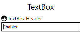
<Controls:MetroHeader Margin="2" Header="TextBox Header"> <Controls:MetroHeader.HeaderTemplate> <DataTemplate> <StackPanel VerticalAlignment="Center" Orientation="Horizontal"> <iconPacks:PackIconMaterial VerticalAlignment="Center" Kind="FaceProfile" /> <TextBlock Margin="2 0 0 0" VerticalAlignment="Center" Text="{Binding}" /> </StackPanel> </DataTemplate> </Controls:MetroHeader.HeaderTemplate> <TextBox Text="Enabled" /> </Controls:MetroHeader> - New:
ScrollViewerHelperclass- New:
IsHorizontalScrollWheelEnabledattached property. If it's set to true and a horizontalScrollBaris visible then the mouse wheel scrolls to left and right. - Change:
VerticalScrollBarOnLeftSideattached property fromScrollBarHelpertoScrollViewerHelper. ScrollBarHelper is now marked as obsolete.
- New:
- New: Use
FlatButtonForegroundBrushin the newMahApps.Metro.Styles.FlatButtonFocusVisualStylewhich is used now forMetroFlatButtonandMetroFlatToggleButton -
PasswordBoxHelper- New:
RevealButtonContentandRevealButtonContentTemplateattached properties - Set the
DefaultRevealButtonIconContentControl toRevealButtonContentattached property
- New:
- Change: Use the original Win 10 close button style
- New:
MahApps.Metro.Styles.WindowButton.Close.Light.Win10andMahApps.Metro.Styles.WindowButton.Close.Dark.Win10styles


- New:
- New:
ItemHelperclass with someBrushattached properties for mouse interaction. These properties can be used withHamburgerMenuItem,ListBoxItem,ListViewItem,TreeViewItemandComboBoxItem.-
ItemHelper.ActiveSelectionBackgroundBrushdefaultAccentColorBrush -
ItemHelper.ActiveSelectionForegroundBrushdefaultAccentSelectedColorBrush -
ItemHelper.DisabledBackgroundBrushdefaultx:Null -
ItemHelper.DisabledForegroundBrushdefaultGrayNormalBrush -
ItemHelper.DisabledSelectedBackgroundBrushdefaultGrayBrush7 -
ItemHelper.DisabledSelectedForegroundBrushdefaultAccentSelectedColorBrush -
ItemHelper.HoverBackgroundBrushdefaultAccentColorBrush3 -
ItemHelper.HoverSelectedBackgroundBrushdefaultAccentColorBrush -
ItemHelper.SelectedBackgroundBrushdefaultAccentColorBrush2 -
ItemHelper.SelectedForegroundBrushdefaultAccentSelectedColorBrush
-
-
ToggleSwitch- New:
ContentPaddingdependency property to change the padding of the inner content in an easy way.
- New:
-
HamburgerMenu- Renaming (internal used styles):
-
HamburgerListBoxItemStyle->HamburgerMenuItemStyle -
HamburgerListBoxStyle->HamburgerMenuListStyle
-
- Revert back to
UWPCommunityToolkitstyle (update template to keep options visible)- Move template to
HamburgerMenuTemplateresource dictionary - Add margins
- Vertically stretch the menu items of the hamburger menu
- Move template to
- Change inner ListBox scrolling (to CanContentScroll)
- New: Add
ItemContainerStyleandOptionsItemContainerStyleproperties. This makes it easier to change the inner styles for the items (and option items) - MinHeight of the menu items should be
0 - Change:
HamburgerMenuImageItem: Downgrade thumbnail property fromBitmapImageto subclassImageSource - New: Introduce
ItemInvokedevent (as an alternative toItemClickandOptionsItemClick) - New:
SelectionIndicator(rectangle) which can be enabled with the newShowSelectionIndicatordependency property- New: resource key
HamburgerMenuSelectionIndicatorThemeWidthdefault6 - New: resource key
HamburgerMenuSelectionIndicatorThemeHeightdefault24
- New: resource key
- Improved item
FocusVisualStyle- Add new (readonly)
ItemFocusVisualStyledependency property which will be re-created if one of these properties are changed:OpenPaneLength,CompactPaneLengthandIsPaneOpen. Default template isHamburgerMenuItemFocusVisualTemplate. - This FocusVisualStyle can be override at the
HamburgerMenuItemstyle by setting theFocusVisualStyleproperty.
- Add new (readonly)
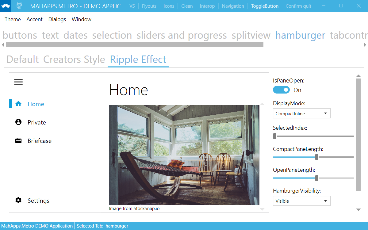
- Change: Reorganize Hamburger sample: shows now Default style, Creators Update style and a sample with the MaterialDesignInXaml Ripple control
- Fix: Set a selected Item only if there is no content set
- Add
HamburgerMenuresources to Control styles to allow style manipulation and fix binding expression infos - Fix:
PanePlacementhandling for right aligned - New: Add
ToolTipDependencyPropertyforHamburgerMenuItem


- Renaming (internal used styles):
-
Dialogs- New: Create new style for Dialogs
MahApps.Metro.Styles.MetroDialogand set this as default - Add
BaseMetroDialogresources to Control styles to allow easier dialog style manipulation - Fix: Do not load all MahApps styles in code behind again (this is not necessary anymore, since it's now at Style level too)
- Fix: Inverted Dialogs theme (the background wasn't correct)
- New: Add
ProgressDialogController.SetProgressBarForegroundBrush(Brush)so that you can customize a progress dialog's progress bar foreground Brush.
- New: Create new style for Dialogs
-
MetroWindow(Dialogs)- Add a new (readonly)
IsAnyDialogOpendependency property. This property will be updated if a dialog is shown or not. - New:
OwnerCanCloseWithDialogproperty atMetroDialogSettingswhich can be used to handle how the owner of the dialog can be closed. - New:
IsCloseButtonEnabledWithDialogproperty atMetroWindowwhich indicates if the close button should be enabled or not if a dialog is shown. - The
HandleOverlayOnHideandHandleOverlayOnShowmethods sets theIsCloseButtonEnabledWithDialogPropertyKeyand restores focus if needed - New:
OverlayFadeInandOverlayFadeOutproperties to set/override the overlay fade in/out Storyboards which are used for theDialogs - Fix: Fade in and out animation was wrong if no duration exists
- Fix:
HideMetroDialogAsyncfails sometimes to close dialog (async call order)
- Add a new (readonly)
- New: Win10
Sliderstyle:MahApps.Metro.Styles.Slider.Win10- Control template:
MahApps.Metro.Styles.Slider.HorizontalTemplate.Win10,MahApps.Metro.Styles.Slider.VerticalTemplate.Win10 - RepeatButton:
MahApps.Metro.Styles.Slider.HorizontalTrack.Win10,MahApps.Metro.Styles.Slider.VerticalTrack.Win10 - Thumb:
MahApps.Metro.Styles.Slider.Thumb.Win10


- Control template:
- New: Normal
Sliderstyle:MahApps.Metro.Styles.Slider(mark old as obsolete)- Control template:
MahApps.Metro.Styles.Slider.HorizontalTemplate,MahApps.Metro.Styles.Slider.VerticalTemplate - RepeatButton:
MahApps.Metro.Styles.Slider.HorizontalTrack,MahApps.Metro.Styles.Slider.VerticalTrack - Thumb:
MahApps.Metro.Styles.Slider.Thumb
- Control template:
- New: Win10
RangeSliderstyle:MahApps.Metro.Styles.RangeSlider.Win10- Control template:
MahApps.Metro.Styles.RangeSlider.HorizontalTemplate.Win10,MahApps.Metro.Styles.RangeSlider.VerticalTemplate.Win10 - RepeatButton:
MahApps.Metro.Styles.Slider.HorizontalTrack.Win10,MahApps.Metro.Styles.Slider.VerticalTrack.Win10 - Thumb:
MahApps.Metro.Styles.Slider.Thumb.Win10,MahApps.Metro.Styles.RangeSlider.HorizontalMiddleThumb.Win10,MahApps.Metro.Styles.RangeSlider.VerticalMiddleThumb.Win10

- Control template:
- New: Normal
RangeSliderstyle:MahApps.Metro.Styles.RangeSlider- Use
SliderHelperbrush properties also forRangeSlider - Thump styles for the middle part:
MahApps.Metro.Styles.RangeSlider.HorizontalMiddleThumb,MahApps.Metro.Styles.RangeSlider.VerticalMiddleThumb - Use
MetroThumbinsteadThumb - Set
ReservedSpacefor allTickBarcontrols insteadMargin
- Use
-
SliderHelper: Add new attached properties for all possibleBrushes- Allow
SliderHelper.EnableMouseWheelandSliderHelper.ChangeValueByforRangeSlidertoo. - Default Win10
Sliderbrushes-
SliderHelper.ThumbFillBrushdefaultAccentBaseColorBrush -
SliderHelper.ThumbFillHoverBrushdefaultGrayBrush3 -
SliderHelper.ThumbFillPressedBrushdefaultAccentBaseColorBrush -
SliderHelper.ThumbFillDisabledBrushdefaultGrayBrush1 -
SliderHelper.TrackFillBrushdefaultGrayBrush2 -
SliderHelper.TrackFillHoverBrushdefaultAccentBaseColorBrush -
SliderHelper.TrackFillPressedBrushdefaultGrayBrush6 -
SliderHelper.TrackFillDisabledBrushdefaultGrayBrush3 -
SliderHelper.TrackValueFillBrushdefaultAccentBaseColorBrush -
SliderHelper.TrackValueFillHoverBrushdefaultGrayBrush6 -
SliderHelper.TrackValueFillPressedBrushdefaultGrayBrush6 -
SliderHelper.TrackValueFillDisabledBrushdefaultGrayBrush6
-
- Default
Sliderbrushes-
SliderHelper.ThumbFillBrushdefaultGrayBrush2 -
SliderHelper.ThumbFillHoverBrushdefaultGrayBrush3 -
SliderHelper.ThumbFillPressedBrushdefaultAccentColorBrush -
SliderHelper.ThumbFillDisabledBrushdefaultGrayBrush5 -
SliderHelper.TrackFillBrushdefaultGrayBrush3 -
SliderHelper.TrackFillHoverBrushdefaultAccentColorBrush -
SliderHelper.TrackFillPressedBrushdefaultGrayBrush2 -
SliderHelper.TrackFillDisabledBrushdefaultGrayBrush3 -
SliderHelper.TrackValueFillBrushdefaultAccentColorBrush -
SliderHelper.TrackValueFillHoverBrushdefaultGrayBrush6 -
SliderHelper.TrackValueFillPressedBrushdefaultGrayBrush6 -
SliderHelper.TrackValueFillDisabledBrushdefaultGrayBrush6
-
- Allow
-
DatePicker- New: Add new dependency property
ControlsHelper.IsReadOnly. This property sets theIsReadOnlyproperty on the innerTextBoxand theIsEnabledon the inner popup button.
- New: Add new dependency property
Strong naming
MahApps will no longer be strong-named beginning with this version. #3029
Why?
Strong-named assemblies are only useful in some rare scenarios. If you need strong-named assembly then you can compile the source by yourself ore use the Strong Namer from Daniel Plaisted @dsplaisted or Strong-Name Signer from Werner van Deventer @brutaldev.
More informations about the reason of this decision can be found here:
- Still Strong-Naming your Assemblies? You do know it’s 2016, right?
- XAML Behaviors UWP Managed 1.1.0
- Strong-Named Assemblies
Commits without PRs/Issues
-
69afa65e Adopt
SpellCheck.IsEnabledchanges fromMaterialDesignInXamlToolkit@ButchersBoy #650 Removes the extra hidden classes and enables flexible style changes, it's more WPF now. -
15bbe66d Inherit FontFamily and FontSize for
CalendarDayButtonandCalendarButtonfromCalendar. -
2c97fd4e Fix: Brushes for
MetroProgressBar - 5c4471c3 Use DynamicResource for all brushes and freeze it too.
-
8c0f893f Fix:
MetroProgressBardoes not work inside ControlTemplate -
c900c5bd Check for RootVisual in
GlowWindowBehavior -
ad16dc30
ResizeBorderThicknessmust also be set to 0 on maximize -
6943cc92 Use
PropertyChangeNotifierfromControlzEx -
7ea7a7c7 Removing trigger for
ResizeBorderThicknessas it's handled byControlzEx -
44c23637 Fix possible System.Windows.Data warning for
ComboBoxItem, if aComboBoxis inside aContentControl. -
edc34679
FlipView: BindItemStringFormattoContentStringFormat -
2c1c692b Fix not updating the text of
TimePickerandDateTimePickerafter changing the culture -
e54aaaf1 Use
DialogTitleFontSizeandDialogMessageFontSizevia DynamicResource at the base MetroDialog style - 9071379b Closing main demo was wrong (TaskCanceledException)
-
4253d89f Set
HorizontalScrollBarVisibilityandVerticalScrollBarVisibilityforHotKeyBoxandNumericUpdDownto Hidden, cause the inner TextBox has this as default too -
713cb69b
Slider: remove linear gradient brush from horizontal and vertical track value style.RangeSlider: fix margin of the middle thumb.
Bugs
- #3185 Fix for (GH-3039) NumericUpDown
- #3181 Reorganize the Sliders and Progress examples with some fixes...
- #3176 (GH-3175) MetroWindow: use BorderThickness as Margin for inner window content
- #3175 Window contents cut off by 1px
- #3171 NumericUpdOwn LostFocus text validation
- #3168 NumericUpDown.StringFormat not working via Code behind
- #3166 Bug On NumericUpDown
- #3162 WIP MetroWindow: OverlayFadeIn / OverlayFadeOut
- #3161 HamburgerMenu: correct PanePlacement handling
- #3160 Fix not focusing custom controls via FocusManager
- #3159 MetroThumbContentControl: Catch possible exception and trace it
- #3156 Fixed issue #3155 "GridViewColumnHeader uses twice the padding"!
- #3155 GridViewColumnHeader uses twice the padding
- #3152 Fix overriding (Metro)TabItem controltemplate/style
- #3150 Templated MetroDialog alignment
- #3148 Fix loaded content at HamburgerMenu
- #3146 Fix for WindowsSettingBehaviour and possible AssociatedObject Nullreference
- #3145 Fix for #3143 Flyout's header not binding to XmlProvider
- #3143 Flyout's header not binding to XmlProvider
- #3142 Fix Dialogs Resource handling
- #3140 System.InvalidOperationException: Ten element Visual nie jest połączony z PresentationSource.
- #3131 WindowSettings.SaveWindowState ConfigurationErrorsException
- #3129 Override MetroTabItem controltemplate with close button
- #3126 Fix MultiFrameImage: frame selection in NoScaleSmallerFrame mode
- #3121 (#3101) Fix disabled Foreground for MahApps.Metro.Styles.MetroCircleButtonStyle
- #3120 (#3109) Fix NullReferenceException when using Flyout with theme
- #3119 (#3118) Fix for dark theme FlatButton FocusVisualStyle Foreground
- #3118 Fix for dark theme flat button FocusVisualStyle
- #3110 Fixes 3107.
- #3109 NullReferenceException When using Flyout With Theme
- #3107 Object reference not set to an instance of an object.
- #3106 HamburgerMenu control: still just a demo?
- #3104 SplitView doesn't work with Caliburn.Micro ActivateItem(xxx)
- #3101 MetroCircleButtonStyle not fading inner icon when button is disabled
- #3091 Fix #3010 IsTabStop for HamburgerMenu
- #3090 Fix NumericUpDown Issue #3086
- #3089 Setting HamburgerMenu.SelectedIndex or Item cause the lost of its content
- #3086 NumericUpDown CornerRadius Border issue.
- #3082 Fix wrong caret index for revealed PasswordBox
- #3079 Incorporate Grey Color Into BaseLight & BaseDark
- #3078 Not All "Grey" Values Are Set in BaseLight/BaseDark
- #3076 Fix for Floating watermak field doesn't fit according to floating watermark FontSize
- #3068 AutoWatermark attached property has no effect on HotKeyBox
- #3067 Right aligned floating Watermark goes behind clear button
- #3066 Don't catch TextChangedEvent in NumericUpDown
- #3060 Fix for TextBox GPU memory leak
- #3054 WindowsSettingBehaviour broken after using ControlzEx
- #3050 Allow TimePicker to parse times with an AM/PM.
- #3049 TimePicker fails to parse times with an AM/PM.
- #3046 Update TextBoxHelper.cs
- #3045 Clicking on the "X" button added by TextBoxHelper.ClearTextButton does not clear the databinding target
- #3043 Width parse error
- #3042 NumericUpDown Focus doesn't work if set through FocusManager
- #3039 NumericUpDown
- #3038 Update from Version 0.13.1 to a higher one
- #3034 GlowBrush="{DynamicResource AccentColorBrush}" is causing a ComponentModel Exception in UpdateCore
- #3031 NumericUpDown do not fire at certain conditions
- #3028 SaveWindowPosition causes application to crash
- #3026 NumericUpDown didn't update when lost focus, StringFormat has no effect to the content string
- #3025 ComboBox popup border thickness problem
- #3023 Custom Dialog Theme Issue
- #3022 HideMetroDialogAsync sometimes fails to close dialog
- #3017 SplitButton with custom ItemTemplate - Source change does not always update layout
- #3013 ListView (ListBox) - Undeletable Top Padding
- #3010 HamburgerMenu ignores Focusable and IsHitTestVisible properties
- #3009 Floating Watermak field doesn't fit according FontSize
- #3001 DatePicker padding do not work
- #3000 Empty Watermark leaves blank border on date time controls
- #2999 Using OrdinalIgnoreCase instead of InvariantCultureIgnoreCase in ThemeManager
- #2997 [Fix] WPF-BindingLeak: Bind to property of non INotifyPropertyChanged without using BindingMode.OneTime
- #2996 Mahapps window steals focus
- #2992 Fixing a few issues in ThemeManager
- #2991 Enable LayoutTransform and RenderTransform on MetroWindow
- #2990 TextBox memory leak
- #2985 TimePicker 24hour format selection
- #2983 NumericUpDown Internal Text Doesn't Update When Expected
- #2972 ThemeManager.ChangeAppStyle from separate thread doesn't take effect every 4th time
- #2966 [Only visual] PasswordBox bug
- #2963 WindowCommands with ItemTemplateSelector not working
- #2962 MetroStatusBar Style and Prism RegionManager
- #2958 NumericUpDown: If HasDecimals is set to false and StringFormat was bound, HasDecimals will be set to true after unloading and loading the control
- #2956 property ToolTip of ProgressRing does not work
- #2954 add contentstringformat to contentpresenter in controls.radiobutton.xaml
- #2953 Can't run MahApps 1.5.0 Caliburn Demos on VS2015
- #2951 Window with showactivated=false and sizetocontent=WidthAndHeight is activated in Mahapps.Metro v1.5
- #2938 DataGridNumericUpDownColumn StringFormat binding
- #2937 Fuzzy button outline
- #2933 Hamburguer menu issue
- #2926 IsPaneOpen property in Hamburger Menu is not properly set after opening/closing pane
- #2813 ControlTemplate and Style are not applied to the CustomDialog
- #2806 Async Content Dialog is not always blocked
- #2753 Race condition in ShowMetroDialogAsync/HideMetroDialogAsync
- #2745 Why change App Style in Flyout if the theme Adapt is chosen?
- #2731 Keep BorderThickness on maximize if necessary
- #2622 DateTimePicker - Format
- #2468 DialogCoordinator.ShowMessageAsync Button Accent
- #2463 [accessibility] Dialogs and screen reader
- #1678 Pivot control does not work with BaseDark style
Features
- #3178 Add ability to set progress dialog progress bar brush color
- #3177 HamburgerMenuItem ToolTip Implementation
- #3170 DatePicker IsReadOnly
- #3165 Add new Win10 Slider style
- #3158 NumericUpDown: Add a new property to handle the allowed numeric input
- #3153 WIP Handle CloseButton together with ShowDialogsOverTitleBar
- #3151 New IsAnyDialogVisible dependency property for MetroWindow
- #3149 Add FlyoutAutomationPeer for better CodedUI support
- #3147 Add basic MetroDialog AutomationPeers
- #3134 HamburgerMenu and Item selection/hover brush improvements
- #3133 Use the original Win 10 close button style
- #3122 (#3105) Allow to change the RevealButton Icon in the PasswordBox
- #3087 New ScrollViewerHelper class with IsHorizontalScrollWheelEnabled
- #3077 Add new MetroHeader control
- #3074 add "PasswordBox" support "ButtonsAlignment"
- #3073 VS Theme TabItem enhancements
- #3072 Add missing VS StandardExpander style
- #3071 Add missing VS GroupBox style
- #3069 Watermark fixes and improvements
- #3021 Replacing WindowChrome and related things with reference to ControlzEx
- #3014 Resolved #2619
- #2975 Creators Hamburger Menu
- #2935 It is now possibile to set FontFamily to DateTimePicker.
- #2930 DisplayFormat in DateTimePicker and TimePicker
- #2467 Added Canceled Result To MessageDialogResut
- #2423 Added the habilitiy to block the use of the scientific notation 'e'.
Feature Requests
- #3169 HamburgerMenuIconItem ToolTip
- #3105 [Enhancement] Allow to change the Reveal Icon in the PasswordBox
- #3100 HorizontalAlignment of BaseMetroDialog content
- #3084 MetroAnimatedSingleRowTabControl Scrollbar issue
- #3070 VS GroupBox style
- #2979 [Request]Win 10 Fluent Design Hamburger Menu
- #2977 Badge must have a different look when disabled
- #2952 NumericUpDown snap to interval
- #2931 [Request]Win 10 Creators Update Hamburger Menu
- #2889 [Feature Request] Watermark Wrapping
- #2884 [Feature Request] Watermark Trimming
- #2882 Titlebar Close command does not work with ShowDialogsOverTitleBar=False
- #2879 [Feature request] Ticks property for the RangeSlider
- #2825 Shorten Dialog Show/Hide animation duration
- #2527 Coded UI Testing in not working Properly on this UI
- #2491 Question: Changing font style for watermark
- #2422 Added the habilitiy to block the use of the scientific notation 'e' on NumericUpDown.
- #1731 VS Theme TabItem Question
- #957 Expander icon in VS theme
Where to get it
You can download this release from MahApps.Metro
Published by punker76 almost 7 years ago
pre-release notes
Published by punker76 about 7 years ago
pre-release notes
Published by punker76 about 7 years ago
pre-release notes
Published by punker76 over 7 years ago
Features / Changes / Fixes
- If a dialog is shown in a window other than the MainWindow,
OwningWindowwill be used if available to detect the theme. #2840 - Fixed an issue for
DateTimePickerwhen the time is cleared if a date is selected #2837 -
HamburgerMenuchanges and improvements- New
HamburgerMenuIconItemhelper class which can be used to put any object icon to the menu item. - Fixed tab order and keyboard selection.
-
ItemCommandandOptionsItemCommand -
CommandforHamburgerMenuItem - New property
PaneForegroundfor HamburgerMenu and Splitview and new Foreground/Background brushesMahApps.Metro.HamburgerMenu.PaneBackgroundBrush,MahApps.Metro.HamburgerMenu.PaneForegroundBrush - Update scroll behavior to match with the UWPCommunityToolkit (see UWP Toolkit Issue #954).
- Add a new dependency property
VerticalScrollBarOnLeftSideto show the vertical scrollbar on the left side - Use a disappearing ScrollViewer
- Add a new dependency property
- Add
HamburgerVisibilityproperty UWPCommunityToolkit #1020 - Set
ContentforHamburgerMenuonly if one of the inner ListBox controls has a selected item. - New
HamburgerMenuHeaderTemplateproperty to set a header right of the HamburgerMenu button. @SilverDragon135 #2917 - Implement the interface
ICommandSourceand handle Command binding change to hook or unhook command executable.

- Add
MahApps.Metro.Styles.HamburgerMenustyle key to the HamburgerMenu.
- New
- If
ShowInTaskbar = false, when double click on the title bar of a minimized window, the window will be restored instead of maximized. #2854 @hausenism - Fix WindowCommands tab stop bug #2858 @neilt6
- Don't overwrite cancellation for window close event #2868 @batzen
- Expose close button margin for
MetroTabItem#2803 - New
Badgedcontrol. Thx to @ButchersBoy

- The
ControlsHelper.CornerRadiuscan now used forSplitButtonandDropDownButton. - New underline types for
TabControlandMetroTabControl#2902- Adds a new
Underlinedattached property toTabControlHelperwhich controls the type of the underline type. The oldIsUnderlinedproperty is now obsolete.
/// <summary> /// Specifies the underline position of a TabControl. /// </summary> public enum UnderlinedType { None, // nothing TabItems, // the old behavior with `IsUnderlined="True"` SelectedTabItem, // selected TabItem underlined + underline hover effect for unselected items TabPanel // underlined TabPanel and selected/hovered TabItem }- Add also new
Brushattached properties to enable easy changing the underline brushes.
TabControlHelper.UnderlineBrush
TabControlHelper.UnderlineSelectedBrush
TabControlHelper.UnderlineMouseOverBrush
TabControlHelper.UnderlineMouseOverSelectedBrush
- Adds a new
- New underline types also for
AnimatedTabControlandAnimatedSingleRowTabControlstyles and forMetroAnimatedTabControlandMetroAnimatedSingleRowTabControl#2905 - Fix / improve
AnimatedSingleRowTabControlstyles- Fix template changing (doesn't works if TabStripPlacement was changed)
- Disappear arrow repeat buttons
- Use brush, hover and pressed brush like normal ScrollViewer
- Fixed
ClearTypeHintand wrongMarginforComboBoxandComboBoxItem#2903 - Fix
ListViewstyle issues- Use accent brush for highlighted border
- Fix SnapsToDevicePixels usage
- Fix disabled foreground brush
- Fix SnapsToDevicePixels usage for
CheckBox -
Flyoutchanges and improvements- Fix
Flyoutmodal usage. All title bar commands are now hidden if aFlyoutis modal. - Fix background and foreground usage of controls in a
Flyoutif user changes theme on the fly. #2337 TheFlyouthas a different background, so we should override some background and foreground brushes and colors. - Change
FlyoutfromContentControltoHeaderedContentControlwhich has the correct properties for headers. - Enable
BorderforFlyout
- Fix
- Use
GrayBrush7andWhiteBrushfor menuSeparatorinstead fixed colors. - Fix BindingExpression at
DropDownButton. Don't setItemTemplatetoContentTemplate,ItemTemplateSelectortoContentTemplateSelectorandItemStringFormattoContentStringFormat. This breaks the whole usage of the content stuff and shows a BindingExpression path error. #2883 - New
UsernameCharacterCasingproperty forLoginDialogSettings#2683 - Fix
SelectionChangedevent ofSplitButtonwhich fires now only once. - Add
TransitionCompletedevent toMetroContentControlandWindowTransitionCompletedevent toMetroWindowwhich will be fired after the loaded Storyboard is completed. - Add new
WatermarkAlignmentattached property toTextBoxHelperwhich indicates the horizontal alignment of the watermark (incl. floating watermark).

- Add new
DataGridHelperwithEnableCellEditAssistattached property which enabled direct editing for CheckBox and ComboBox cells. (default to false) Thx to @ButchersBoy (taken from MaterialDesignInXamlToolkit)
Closed Issues
- #2835 ShowMessageAnsync() causes exception
- #2848 HamburgerMenu Command MVVM
- #2866 Validation-Popup won't be opened after closing by mouse left button down
- #2870 MahApps Not Thread Safe But Should Be [Test Case]
- #2877 Can't bind to ShowTitleBar
- #2871 SplitButton CornerRadius
- #2862 Flyout close button icon is incorrect when setting flow direction right to left
- #1938 Problem with window size
- #2066 On Windows 8 a window with height 23px resizes to 39px after dragging
- #2792 Win32Exception on closing window
- #2886 NumericUpDown: HasDecimals=False & using a bound StringFormat allows to enter a decimal point @davericardo
- #2885 [Bug] Badged Control Causes Window Loading to Hang
- #2895 [RFC] [Enhancement] Proposed TabControlHelper.IsUnderlined Change
- #2903 1 pixel space between ComboBoxItems closes ComboBox
- #2841 Modal flyout issue
- #2337 Flyout style from Accent to Light is not working
- #2883 Can Reproduce BindingExpression path error: ... property not found ... On DropDownButton
- #2683 [Question] Force TextBox uppercase in ShowLoginAsync
- #2857 HamburgerMenuItem Scrolling
- #1835 Window animation interferes with WindowsFormsHost positioning
- #2917 Hamburger Header Templating
- #2332 Calendar ignores IsTodayHighlighted property
- #2434 DataGridNumericUpDownColumn foreground color
- #2627 Inconsistent FloatingWatermark Alignment
- #2865 [Feature request]Enable/Disable of Hamburger Menu Item
- #2880 RangeSlider: Inadequate snapping to ticks
- #2812 Font family in Flyout.xaml and MetroNavigationWindow.xaml
- #2764 Flyout - Border not shown
- #2515 NumericUpDown Value not displayed
- #1929 MetroDataGridCheckBox style prevents the CellEditEnding
Published by punker76 over 7 years ago
Published by punker76 over 7 years ago
Changes / Fixes
-
#2814 Correct display of media buttons in
HotKeyBox(thx @thoemmi) -
7fcc6b7 Fix breaking changes for obsolete properties
ButtonHelper.PreserveTextCase,ButtonHelper.CornerRadiusandControlsHelper.ButtonWidth - a1d199d Fix binding to Content of HamburgerMenu
-
#2799 DateTimePicker SelectedDate issue (thx @xxMUROxx)
- Fix issue where
SelectedDateis set to theDisplayDateif theSelectedDateisDateTime.MinValue. This issue appears when binding to a property of DateTime and the date isDateTime.MinValue.
- Fix issue where
- Z-Order was wrong if
MetroWindowis ignoring the Taskbar and maximized. This fix and the main Taskbar z-Order issue only happens with Windows 10 anniversary update 1607. Hopefully fixed in the future. #2780 - Use internal GetPhysicalCursorPos instead GetCursorPos (tested with remote desktop and different DPI) #2748
Closed Issues
- #2585 HotKeyBox gives wrong names to multimedia buttons
- #2817 TransitioningContentControl's TransitionCompleted event fires twice
- #2804 TransitionsEnabled=false NullpointerException
- #2823 Issue with ClearTextButton on TextBox
- #2815 Layout issue with TabControl, TabStripPlacement Left, TabControlHelper.IsUnderlined="True"
- #2770 Increase Win10 ToggleSwitch Default Margins
- #2780 External Dialogs not visible with MainWindow set to IgnoreTaskbarOnMaximize
- #2748 Access Denied
- #2591 Weird MetroProgressBar animation with IsIndeterminate=true
Published by punker76 almost 8 years ago
Changes / Fixes
- #2793 StringToVisibilityConverter should handle null like an empty string
- #2796 HamburgerMenu SelectedIndex Fix
- #2797 Fix NumericUpDown using UseFloatingWatermark
- #2789 Prevent the MetroDataGridCheckBox from being toggled by a TAB + SPACE when the cell is supposed to be read only.
Closed Issues
Published by punker76 almost 8 years ago
Features / Changes / Fixes
-
Don't focus flyout on close #2671 (@ButchersBoy) This hack was introduced with #1805 which was noticed by manual testing.
-
Don't focus the
FlyoutsControl -
Fix another
TopMostissue: If the window is top most and you switch to another window the top most will be gone. -
Change icon for TimePicker #2700 (@p76984275)
-
Icon scaling #2667 (@thoemmi)
- New property
IconScalingModeto MetroWindow. It's forwarded toMultiFrameImage.MultiFrameImageModeto set the icon scaling.-
MultiFrameImageMode.ScaleDownLargerFrame
It takes the smallest frame which from the icon which has equal or larger size as the window's icon template. The frame is scaled down it's larger.

-
MultiFrameImageMode.NoScaleSmallerFrame
It takes the largest frame from the window which has equal or smaller size than the window's icon template. The frame is rendered centered if it's smaller.

-
- New property
-
Changes for
DateTimePickerandTimePicker#2710- Change
DateTimePicker.SelectedDatetoBindsTwoWayByDefault. The reason is that we do not have to use Mode=TwoWay explicit, and DatePicker.SelectedDate has BindsTwoWayByDefault too. - [Fix] Issue where Binding issues on DateTimePicker/TimePicker are shown on the output window
- [Fix] Issue where Hour 0 is not shown when using 24h clock
- Fix issue where clearing text does not immediately set value to
nullbut00:00:00and0001.01.01 00.00.00respectively - Change icon for
TimePicker#2700 (@p76984275) - Hide
DateTimePickerandTimePickeron lost focus. Fix also Shift+Tab focus moving.
- Change
-
New
SplitViewandHamburgerMenucontrol #2704- The
SplitViewsource comes from theUniversalWPFGitHub repo (from @dotMorten) with some changes from @Evangelink and @punker76. - The
HamburgerMenusource comes from theUWPCommunityToolkitGitHub repo.

- The
-
New dependency properties for
MetroWindowto set the brush and opacity for the overlay if a dialog is shown.-
OverlayBrushsets the brush used for the dialog overlay. -
OverlayOpacitysets the opacity used for the dialog overlay (0 = disabled, 1 = full overlay).
-
-
The
TextBox's with the stylesMetroButtonTextBoxandSearchMetroTextBoxcan now use the button also ifIsReadOnly="True"(only if the button command is set) -
New
AutoWatermarkattached property atTextBoxHelper#2722 (@xxMUROxx) which is able to get theDisplayAttributefrom the bound property in following cases:- Binding that is supported
"{Binding Path=Property}""{Binding Path=Property.SubProperty}""{Binding Path=CollectionProperty}""{Binding Path=CollectionProperty[0].SubProperty}"
- Binding that is not supported
"{Binding Path=CollectionProperty[0]}"
- This property is available for
TextBox,ComboBox,NumericUpDown,DatePicker,TimePickerandDateTimePicker
- Binding that is supported
-
Flyoutchanges for betterMarginusage- This changes affects only users who used the sample from the source which shows how to use the
FlyoutsControlactual width and aMarginfor theFlyout - It's now possible to work without the actual width and use only the
MarginorHorizontalContentAlignemntfor Left/Right andVerticalContentAnlignmentfor Top/BottomFlyout.-
Margin="200 30 0 0"andPosition="Right"Flyout with left an top Margin -
HorizontalContentAlignment="Stretch"andPosition="Right"Flyout which covers the whole window
-
- This changes affects only users who used the sample from the source which shows how to use the
-
Changed style names (and changes, see #2767) for
- Default
Button(ButtonBase) ->MahApps.Metro.Styles.MetroButton - Default
ToggleButton->MahApps.Metro.Styles.MetroToggleButton
- Default
-
Fixed
Expanderclosing animation and make it possible to change both animations (expand and collapse). #2769 (@ Alkalinee) -
Updated
TabControlandTabItemstyle for VS #2768- Handle TabStripPlacement
- Default close button action (no closing event yet)
-
TextBoxContextMenu changes #2772, #2758 by @Deadpikle- If you want to use the default context menu items cut, copy and paste you must do nothing
- If you want to use your own context menu items without the default items you must do this
<TextBox Text="Yeahh"> <TextBox.ContextMenu> <ContextMenu> <MenuItem Header="This is only a Test-Item" /> </ContextMenu> </TextBox.ContextMenu> </TextBox>- If you want to use your own context menu items with the spell checker items then you must do this
<TextBox Margin="{StaticResource ControlMargin}" Controls:TextBoxHelper.IsSpellCheckContextMenuEnabled="True" Text="Enabled"> <TextBox.ContextMenu> <ContextMenu> <MenuItem Header="This is only a Test-Item" /> </ContextMenu> </TextBox.ContextMenu> </TextBox>- If you want to use your own context menu items with the deafult items then you must do this
<TextBox Controls:TextBoxHelper.ClearTextButton="True" Controls:TextBoxHelper.UseFloatingWatermark="True" Controls:TextBoxHelper.Watermark="Watermark"> <TextBox.ContextMenu> <ContextMenu> <MenuItem Header="Custom Item" /> <Separator /> <MenuItem Style="{DynamicResource MetroMenuItem}" Command="ApplicationCommands.Cut" /> <MenuItem Style="{DynamicResource MetroMenuItem}" Command="ApplicationCommands.Copy" /> <MenuItem Style="{DynamicResource MetroMenuItem}" Command="ApplicationCommands.Paste" /> </ContextMenu> </TextBox.ContextMenu> </TextBox> -
CustomDialogimprovements #2775- New overloaded generic method
ShowMetroDialogAsyncto create and show custom dialogs (self created dialogs which are inherited fromCustomDialog)
// create and show a new custom dialog of the given type with the default dialog settings var customBaseMetroDialog = await this.ShowMetroDialogAsync<CustomBaseMetroDialog>(); // create and show a new custom dialog of the given type with own settings var customBaseMetroDialog = await this.ShowMetroDialogAsync<CustomBaseMetroDialog>(this.metroDialogSettings);- Better handling for dialogs settings also with the already available
ShowMetroDialogAsyncmethod
// create and show custom dialog with default settings await this.ShowMetroDialogAsync(new CustomBaseMetroDialog()); // create and show custom dialog with own settings await this.ShowMetroDialogAsync(new CustomBaseMetroDialog(this.metroDialogSettings)); // or await this.ShowMetroDialogAsync(new CustomBaseMetroDialog(this, this.metroDialogSettings));- It's now also possible to configure the dialog settings at the custom dialogs class itself.
protected override MetroDialogSettings ConfigureSettings(MetroDialogSettings settings) { return new MyCustomDialogSettings(); }- Here is the source for the given samples
<dialogs:CustomDialog x:Class="ShowMetroDialogAsyncIssue.CustomBaseMetroDialog"
    xmlns="http://schemas.microsoft.com/winfx/2006/xaml/presentation"
    xmlns:x="http://schemas.microsoft.com/winfx/2006/xaml"
    xmlns:mc="http://schemas.openxmlformats.org/markup-compatibility/2006"
    xmlns:dialogs="clr-namespace:MahApps.Metro.Controls.Dialogs;assembly=MahApps.Metro"
    xmlns:d="http://schemas.microsoft.com/expression/blend/2008"
    mc:Ignorable="d"
    d:DesignHeight="300" d:DesignWidth="300"
    Title="CustomBaseMetroDialog">
    <StackPanel>
        <TextBlock Text="This is a custom dialog based on BaseMetroDialog" />
        <Button Click="Close_OnClick">Close</Button>
    </StackPanel>
</dialogs:CustomDialog>
namespace ShowMetroDialogAsyncIssue { using System.Windows; using MahApps.Metro.Controls; using MahApps.Metro.Controls.Dialogs; public partial class CustomBaseMetroDialog : CustomDialog { public CustomBaseMetroDialog() { InitializeComponent(); } public CustomBaseMetroDialog(MetroDialogSettings settings) : base(settings) { InitializeComponent(); } public CustomBaseMetroDialog(MetroWindow parentWindow, MetroDialogSettings settings) : base(parentWindow, settings) { InitializeComponent(); } private void Close_OnClick(object sender, RoutedEventArgs e) { (this.OwningWindow ?? (MetroWindow)Application.Current.MainWindow).HideMetroDialogAsync(this); } } } - New overloaded generic method
Closed Issues / Pull Requests
- #2674, #2671 Null Reference Exception in BorderlessWindowBehavior.TopMostChangeNotifierOnValueChanged (@mikeasage)
- #2671 Proposal - Dont focus flyout on close
- #2699 [Suggestion] TimePicker & DateTimePicker Icon
- #2480 Windows 10 SplitView
- #2715 Center mouse click crashes applications on some PCs with an Arithmetic Overflow Exception
- #1709 Disable transparency or hide controls in background
- #2497 Custom dialog background and foreground
- #2720 DateTimePicker does not hides for Date Change
- #2713 Weird animation on combobox with only one item
- #2746 WindowCommands - Toggle Button And Button Access Key Not Underlined When Pressing Alt
- #2744 Flyout IsPinned = False/True
- #2737 Design for textbox
- #2678 SearchMetroTextBox style, IsReadOnly
- #2435 BackgroundToForegroundConverter returning color may be changed in some accents?
- #2712 TextBox "Auto" Watermark-text
- #2694 Maximized Window is "Always on Top" when IgnoreTaskbarOnMaximize=True. Window remains "Always on Top" on Restore
- #2734 Mahapps UI is locked in Dialog Window after re-login
- #2338 Impossible to toggle the visibility of TitleBar with UseNoneWindowStyle!
- #2750 Fix for FlipView : Navigation's button visibility and Transition update
- #2216 Flyout with a margin does not slide out properly
- #2752 Unable to change the MessageDialog highlighted button
- #2687 Implement SecureStrng into LoginDialogData and ShowLoginDialog
- #2756 Flyout Position top element focus inhibited by title bar
- #2755 MetroAnimatedTabControl first tab font not changing
- #2760 DatePicker SelectionBackground doesn't match accent color
- #2766 Flyout - Strange issue with a listview
- #2767 Button Border not Transparent when Focused.
- #2346 TabControl with VS style
- #2090 VS TabItem
- #1890 How do i use the CloseCommand in StandardTabControl with VS Style
- #2261 ComboBox context menu.
- #2774 Fix DataGridRowHeader HorizontalAlignment
- #2735 MetroWindow.ShowMetroDialogAsync odd behaviour with provided DialogSettings
Published by punker76 about 8 years ago
- Switched from Ms-PL to MIT license #2646
- New
DateTimePickerandTimePickercontrols #2299 #2510 (@xxMUROxx) - New Hotkey control
HotKeyBox#2322 (@thoemmi) - New 'Remember' CheckBox in
LoginDialog#2308 #2305 (@manekovskiy) - New
IconPacksfor MahApps:PackIconMaterial,PackIconModern,PackIconFontAwesomeandPackIconEntypo#2328 availabe at MahApps.Metro.IconPacks
  <iconPacks:PackIconMaterial Kind="EmoticonCool" Height="32" Width="32" />
  <iconPacks:PackIconModern Kind="Cupcake" Height="24" Width="24" />
  <iconPacks:PackIconFontAwesome Kind="FontAwesome" Height="16" Width="16" />
  <iconPacks:PackIconEntypo Kind="ThumbsUp" />
- New
Auto Closefeature forFlyout#2228 #1710 (@Sikta)- Enable this by set
IsAutoCloseEnabledto true - Time changable by
AutoCloseInterval(default 5000 ms)
- Enable this by set
- Fix
PasswordBoxBindingBehaviorandIsWaitingForData#2355- Fixed: Behaviors in
StylizedBehaviorsshould be detached on unload - Fixed:
PasswordBoxBindingBehavior, it doesn't work e.g. in TabControl TabItems -
IsWaitingForDataforMetroButtonTextBox,MetroPasswordBox,MetroButtonPasswordBox,MetroButtonRevealedPasswordBox - PackIconMaterial
Eyeand ClearTextButton feature forMetroButtonRevealedPasswordBox
- Fixed: Behaviors in
- Added
ContentStringFormatTemplateBinding to ToolTip #2359 (@nrpog) #2363 -
ControlsHelper.ButtonWidthforComboBoxand other stuff #2365- set
ChromelessButtonStylePadding to 0 - new dependency property
ButtonContentTemplateinTextBoxHelper - fix width of ClearText button if height change, e.g. for floating watermark
- fix background state colors (
IsPressed,IsMouseOver) - new own sytle
MetroComboBoxDropDownToggleButtonStyleforComboBoxtoggle button
- set
- Added
EllipseDiameterScaletoProgressRing#2204 #2382 (@petvetbr) -
WindowButtonCommandsenhancements #2378- use ContentPresenter to show the WindowButtonCommands, so it's now possible easier to change the min/max/close button styles
- enable changing min/max/restore/close button tooltip
- new Win10 style/template:
MahApps.Metro.Styles.WindowButtonCommands.Win10andMahApps.Metro.Templates.WindowButtonCommands.Win10


- Minor Automation API support for
FlyoutsandNumericUpDown#2381 #2166 (@petvetbr) - Dialog font sizes setting implementation #2380 #2383 (@petvetbr, @punker76)
- changable via
DialogTitleFontSizeandDialogMessageFontSize
- changable via
- New attached dependency property
TextButtonin TextBoxHelper which handles the visibility of the button inMetroButtonPasswordBoxandMetroButtonTextBoxstyles #2387 - Win10
ToggleSwitchandToggleSwitchButton#2410-
ToggleSwitchis now inherited fromHeaderedContentControl - new dependency property
HeaderFontFamilyforToggleSwitch - new Win10 and Metro styles
-
MahApps.Metro.Styles.ToggleSwitchButton.Win10,MahApps.Metro.Styles.ToggleSwitch.Win10 -
MahApps.Metro.Styles.ToggleSwitchButton,MahApps.Metro.Styles.ToggleSwitch
-
- new Win10 font family and size keys
-
ToggleSwitchFontFamily.Win10,ToggleSwitchHeaderFontFamily.Win10 -
ToggleSwitchFontSize.Win10,ToggleSwitchHeaderFontSize.Win10
-
- fixed broken
IsPressedstate - new brushes for the Win10 styles
MahApps.Metro.Brushes.ToggleSwitchButton.PressedBrush.Win10
MahApps.Metro.Brushes.ToggleSwitchButton.OffBorderBrush.Win10
MahApps.Metro.Brushes.ToggleSwitchButton.OffMouseOverBorderBrush.Win10
MahApps.Metro.Brushes.ToggleSwitchButton.OffDisabledBorderBrush.Win10
MahApps.Metro.Brushes.ToggleSwitchButton.OffSwitchBrush.Win10
MahApps.Metro.Brushes.ToggleSwitchButton.OnSwitchBrush.Win10
MahApps.Metro.Brushes.ToggleSwitchButton.OnSwitchDisabledBrush.Win10
MahApps.Metro.Brushes.ToggleSwitchButton.OnSwitchMouseOverBrush.Win10
MahApps.Metro.Brushes.ToggleSwitchButton.ThumbIndicatorBrush.Win10
MahApps.Metro.Brushes.ToggleSwitchButton.ThumbIndicatorMouseOverBrush.Win10
MahApps.Metro.Brushes.ToggleSwitchButton.ThumbIndicatorCheckedBrush.Win10
MahApps.Metro.Brushes.ToggleSwitchButton.ThumbIndicatorPressedBrush.Win10
MahApps.Metro.Brushes.ToggleSwitchButton.ThumbIndicatorDisabledBrush.Win10 - new brush and color keys for all accent colors:
AccentBaseColorandAccentBaseColorBrush(full color)
-
-
Flyoutchanges- SetFlyoutOpenAction is now obsolete
- new/update template names BackButton, BackHeaderText
- new
CloseCommandParameterdependency property
-
FlipViewchanges-
MouseOverGlowEnabledis now obsolete, useMouseHoverBorderEnabledinstead - new
MouseHoverBorderBrushandMouseHoverBorderThicknessdependency property
-
- New dependency property
CircularNavigationfor theFlipView#2389 -
BindsTwoWayByDefaultremoved fromIsActivePropertyofProgressRing#2438 (@xxMUROxx) - Fix Flyout theme usage in
Caliburn.Microsample - New dependency properties for
Tilecontrol:HorizontalTitleAlignmentandVerticalTitleAlignment#2293 - New attached dependency properties
TextBoxHelper.ButtonFontSize#2345 Also add a new font sizeClearTextButtonFontSize(default to 16) for all 'ClearText' buttons - Added a
MetroFlatToggleButtonstyle like MetroFlatButton #2481 (@Koopakiller) - New
MetroThumbContentControlforMetroWindowtitle #2487- It's now possible again to have title templates with clickable controls
- Replaced
TitleCapswithTitleCharacterCasing(marked as obsolete). Now title can beUpper,LowerorNormal - Add new styles
MahApps.Metro.Styles.ContentControlExandMahApps.Metro.Styles.MetroThumbContentControl
-
Flyoutimprovement caused by #2485 #2523- use
ContentControlExfor header, so it's now possible to useControlsHelperattached propertiesContentCharacterCasing,HeaderFontSize,HeaderFontWeightandHeaderFontStretch - new attached property
ControlsHelper.HeaderMarginto handle the Margin from Flyout side
- use
- New dependency property
ShowDialogsOverTitleBarfor `MetroWindow? which allows showing title bar while showing dialogs (fixes #2109) #2534 (@Deadpikle) - Store/Restore focused element methods which will be used automatically with dialogs (but can be also used explicit) #2532
- Added new methods
ShowModalInputExternal,ShowModalLoginExternalandShowModalMessageExternal. #2518 (@adeniltonbs) - New brush keys
NonActiveWindowTitleColorBrushandNonActiveBorderColorBrush - Add IsNavigationEnabled Property in FlipView #2563 (@yoker)
- Another SplitButton and DropDownButton fixes #2572
- change SplitButton to Selector to get access to SelectedValuePath and SelectedValue
- fixed Popup alignmentand close Popup on button click
- add ItemsPanel template binding
- add 2 new dependency properties
ArrowMouseOverBrush,ArrowPressedBrush - enable Items usage (for SplitButton and DropDownButton)
- add new dependency properties
ContentTemplate,ContentTemplateSelectorandContentStringFormatfor DropDownButton, if this proeprties are empty DropDownButton will be use the ItemXYZ properties - add
protected virtual void SetContextMenuPlacementTarget(ContextMenu contextMenu)to DropDownButton
- Glow activation/resizing/dpi fixes #2581
- mouse activation bug if the MetroWindow uses a Glow
- resizing/cursor bug on higher DPI
- the glow can come on top if the main app has a second window and the user minimize and restore the main app again
- the window doesn't zoom in vertical height if the user double clicks on the top Glow
- Introduce new styles for circle button and circle toggle button which removes the non removable inner margin.
MahApps.Metro.Styles.MetroCircleButtonStyleMahApps.Metro.Styles.MetroCircleToggleButtonStyleMahApps.Metro.Styles.MetroCircleFocusVisual
Closed Issues
- #2003 "VisualButton" That makes working with the XAML icons easier
- #2114 Icon color not changing on theme change (as #1029)
- #2275 Embed Material Design Icons (in addition to Modern UI Icons)?
- #1710 New "Auto Close" feature for Flyouts
- #2354 TextBoxHelper.ButtonClicked should pass ButtonCommandParameter to ButtonCommand.CanExecute
- #2343 Win8MetroPasswordBox Preview does not work with Tabcontrol (item > 1)
- #2352 Can't set ComboBox buttons width with ControlsHelper.ButtonWidth
- #2370 Pasting over selection in NumericUpDown doesn't work #2371 (@michaelprewecki)
- #1901 ThemeChanging causing app crash
- #1439 ComboBox in Toolbar closes if Scrollbar track/button is clicked
- #1972 Changing Close button icon
- #2166 Controls Do not get distinct automation ID's
- #2204 Progress ring dot scaling seems to be wrong (1.1.2)?
- #2380 Missing FontSize Property for ProgressDialog/ShowProgressAsync
- #2385 ButtonCommandMetroTextBox text displaid over icon.
- #2220 Why in the MetroButtonTextBox the visibility of PART_ClearText is not managed as the MetroTextBox?
- #2311 ComboBox won't toggle closed in ribbon
- #2396 ShowMetroDialogAsync does not raise DialogManager.DialogOpened event.
- #2402 Window Command ItemSource Binding
- #2403 NumericUpDown HasDecimals Is Broken. #2404 (@feinstein)
- #2415 ToggleSwitch "Click" event not triggered #2421
- #2413 Focusable (Selectable) Text in MessageDialog
- #2409 MetroWindow can be closed while a modal dialog is shown
- #2348 Thumb height of slider control
- #2340 How to change Datagrid Header Background using our custom style and based on MetroColumnHeader?
- #2390 PasswordBox CapsLockIndicator is not refreshed when host window is inactive
- #2416 WPF inside WF, Cannot close Flyouts and FlyView doesn't select
- #2432 Modal Flyouts Window Not Dragable
- #2333 FlipView SelectedIndex resetting bug
- #2214 Is there a way to control the "PART_GlowBorder" thickness in FlipView?
- #2126 FlipView.HideControlButtons() does not disable arrow keys.
- #2395 MahApps.Metro resource icons cannot be used repeatedly
- #2389 Circular FlipView
- #2056 ToggleButton foreground color when selected
- #1823 Cannot fully programatically maximize window.
- #2414 Focus is lost after a dialog is closed
- #2332 Calendar ignores IsTodayHighlighted property
- #2420 ShowmessageAsync Cancellation Exception #2454 (@MatthewKinsman)
- #2293 Align Tile Title
- #2459 MetroDialogSettings not being propagated to ProgressDialog by DialogManager
- #2462 Should a click on a MetroTabItems close button really clear the buttons Command and CommandParameter properties?
- #2345 Can't edit TextBoxHelper.ClearTextButton properties
- #2474 right to left DatePicker
- #2476 MetroWindow OnClosing exception (.Net 4.0)
- #2339 The Glow border does not follow the window is is used the UseNoneWindowStyle property!
- #2477 Create a custom Thumb for the title DragMove
- #2449 Visual bug while using RightWindowCommands
- #2495 Default for ControlsHelper.HeaderFontSizeProperty should be SystemFonts.MessageFontSize
- #2479 DefaultButtonFocus Not Working As Expected PR #2505
- #2514 NumericUpDown UseFloatingWatermark Issue
- #2485 Hiding close button and title leaves blank space in top-positioned flyouts #2485
- #2531 Setting TitleFontSize & CountFontSize in Tile is no longer working
- #2109 Size of MahApps Dialog background..
- #2538 Focus Message Dialog from flyout
- #2537 Bad contrast in ProgressDialog's progress bar
- #2532 ProgressDialog close causes loss of focus on child control
- #2486 DateTimePicker right click menu appearance
- #2524 DatePicker and DateTimePicker UseFloatingWatermark don't work
- #2269 Make Controls:TextBoxHelper.UseFloatingWatermark="True" work for DatePicker
- #2525 System.Windows.Media.Animation.DoubleAnimation' cannot use default origin value of 'Infinity
- #2552 How to hide flyout title
- #2556 Interact with DialogController from Background Thread (@xxMUROxx)
- #2473 Cannot use DialogCoordinator from background threads.
- #2551 Feature Request: NonActiveWindowTitleColorBrush
- #2542 NumericUpDown SelectAllOnFocus doesn't work
- #2148 MetroProgressBar orientation does not work (@petvetbr) #2379
- #2492 MetroProgressBar / IsIndeterminate / Animation Warning 6
- #2504 DataGrid causes lag when switching content PR #2570
- #2374 SplitButton: Add SelectedValuePath and SelectedValue property
- #2540 Popup in SplitButton is aligned wrong
- #2457 Splitbutton Popup doesn't close
- #2215 SplitButton does not respect GroupStyle
- #2185 SplitButton IsPressed trigger won't change Foreground
- #2360 SplitButton Items
- #2078 Fill DropDownButton items without Binding
- #2051 DropDownButton and SplitButton doesn't works
- #2224 DropDownButton uses ItemTemplate template binding twice
- #2569 DropDownButton popup placement
- #2574 SplitButton Popup Doesn't Close After Alt+Tab (@Deadpikle) #2621
- #2498 Vertical space for Title still being taken up even though Title is blank
- #2577 Window Resizing Erroneously Acts Deferred
- #2279 Corner resize issues with GlowBrush enabled
- #2591 Weird MetroProgressBar animation with IsIndeterminate=true
- #1191 Missing style for RepeatButton
- #2584 ComboBox UseFloatingWatermark Issue
- #2598 DatePickerTextBoxBehavior NullReferenceException
- #2611 SliderHelper.EnableMouseWheel is working only once when using TabControl
- #2618 IgnoreTaskbarOnMaximize stopped working after windows 10 anniversary update. (@igorushi, @punker76)
- #2635 Showing any Window before Main Window causes Left and Right window commands not work properly.
- #2656 Flyout problem with ActualWidth
Published by punker76 over 8 years ago
pre-release notes
Published by punker76 over 8 years ago
Bugfixes
- #2288 First 30 units of flyout aren't clickable
- #2324 DataGrid activated by Titlebar (rows are hovered while dragging a window over a DataGrid)
- #2287 IsWindowDraggable broke starting in 1.2
Published by punker76 over 8 years ago
Bugfixes
- #2320 Fixed window can't be moved around using a touch screen
Published by punker76 almost 9 years ago
Bugfixes
- Fixed strong sign assembly stuff

