EasyMarkdownEditor
Easy Markdown Editor is a simple, beautiful, and embeddable JavaScript Markdown editor. Delightful editing for beginners and experts alike. Features built-in autosaving and spell checking.
MIT License
Easy Markdown Editor
I have created the Markdown Component component for Blazor WebAssembly and Blazor Server based on the EasyMarkdownEditor. The repository is not been maintained for a while. For this reason, I decided to start my repository and fix the issues I found in the JavaScript code.
So, from now, I'm going to maintain 2 different repositories:
For more information, please visit my blog PureSourceCode.
What is the Easy Markdown Editor?
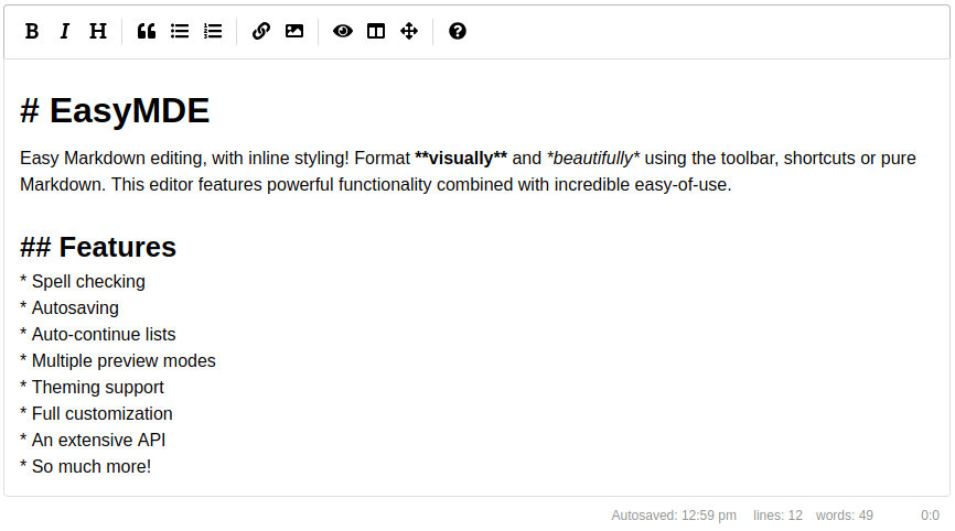
A drop-in JavaScript text area replacement for writing beautiful and understandable Markdown. EasyMDE allows users who may be less experienced with Markdown to use familiar toolbar buttons and shortcuts.
In addition, the syntax is rendered while editing to clearly show the expected result. Headings are larger, emphasized words are italicized, links are underlined, etc.
EasyMDE also features both built-in auto saving and spell checking. The editor is entirely customizable, from theming to toolbar buttons and javascript hooks.
Table of content
- Easy Markdown Editor
Install EasyMarkdownEditor
Via npm:
npm install psc-markdowneditor
Via the UNPKG CDN:
<link rel="stylesheet" href="https://unpkg.com/psc-markdowneditor/dist/easymde.min.css">
<script src="https://unpkg.com/psc-markdowneditor/dist/easymde.min.js"></script>
Or jsDelivr:
<link rel="stylesheet"
      href="https://cdn.jsdelivr.net/gh/erossini/EasyMarkdownEditor@main/dist/easymde.min.css">
<script src="https://cdn.jsdelivr.net/gh/erossini/EasyMarkdownEditor@main/dist/easymde.min.js">
</script>
How to use
Loading the editor
After installing and/or importing the module, you can load EasyMDE onto the first textarea element on the web page:
<textarea></textarea>
<script>
const easyMDE = new EasyMDE();
</script>
Alternatively you can select a specific textarea, via JavaScript:
<textarea id="my-text-area"></textarea>
<script>
const easyMDE = new EasyMDE({element: document.getElementById('my-text-area')});
</script>
Editor functions
Use easyMDE.value() to get the content of the editor:
<script>
easyMDE.value();
</script>
Use easyMDE.value(val) to set the content of the editor:
<script>
easyMDE.value('New input for **EasyMDE**');
</script>
Configuration
Options list
-
autoDownloadFontAwesome: If set to
true, force downloads Font Awesome (used for icons). If set tofalse, prevents downloading. Defaults toundefined, which will intelligently check whether Font Awesome has already been included, then download accordingly. -
autofocus: If set to
true, focuses the editor automatically. Defaults tofalse. -
autosave: Saves the text that's being written and will load it back in the future. It will forget the text when the form it's contained in is submitted.
-
enabled: If set to
true, saves the text automatically. Defaults tofalse. -
delay: Delay between saves, in milliseconds. Defaults to
10000(10 seconds). -
submit_delay: Delay before assuming that submit of the form failed and saving the text, in milliseconds. Defaults to
autosave.delayor10000(10 seconds). - uniqueId: You must set a unique string identifier so that EasyMDE can autosave. Something that separates this from other instances of EasyMDE elsewhere on your website.
-
timeFormat: Set DateTimeFormat. More information see DateTimeFormat instances. Default
locale: en-US, format: hour:minute.
-
enabled: If set to
-
autoRefresh: Useful, when initializing the editor in a hidden DOM node. If set to
{ delay: 300 }, it will check every 300 ms if the editor is visible and if positive, call CodeMirror'srefresh(). -
blockStyles: Customize how certain buttons that style blocks of text behave.
-
bold: Can be set to
**or__. Defaults to**. -
code: Can be set to
```or~~~. Defaults to```. -
italic: Can be set to
*or_. Defaults to*.
-
bold: Can be set to
-
unorderedListStyle: can be
*,-or+. Defaults to*. - scrollbarStyle: Chooses a scrollbar implementation. The default is "native", showing native scrollbars. The core library also provides the "null" style, which completely hides the scrollbars. Addons can implement additional scrollbar models.
-
element: The DOM element for the
textareaelement to use. Defaults to the firsttextareaelement on the page. -
forceSync: If set to
true, force text changes made in EasyMDE to be immediately stored in original text area. Defaults tofalse. - hideIcons: An array of icon names to hide. Can be used to hide specific icons shown by default without completely customizing the toolbar.
-
indentWithTabs: If set to
false, indent using spaces instead of tabs. Defaults totrue. - initialValue: If set, will customize the initial value of the editor.
-
previewImagesInEditor: - EasyMDE will show preview of images,
falseby default, preview for images will appear only for images on separate lines. -
imagesPreviewHandler: - A custom function for handling the preview of images. Takes the parsed string between the parantheses of the image markdown
as argument and returns a string that serves as thesrcattribute of the<img>tag in the preview. Enables dynamic previewing of images in the frontend without having to upload them to a server, allows copy-pasting of images to the editor with preview. -
insertTexts: Customize how certain buttons that insert text behave. Takes an array with two elements. The first element will be the text inserted before the cursor or highlight, and the second element will be inserted after. For example, this is the default link value:
["[", "](http://)"].- horizontalRule
- image
- link
- table
-
lineNumbers: If set to
true, enables line numbers in the editor. -
lineWrapping: If set to
false, disable line wrapping. Defaults totrue. - markdownUrl: Customize url for guide.
-
minHeight: Sets the minimum height for the composition area, before it starts auto-growing. Should be a string containing a valid CSS value like
"500px". Defaults to"300px". -
maxHeight: Sets fixed height for the composition area.
minHeightoption will be ignored. Should be a string containing a valid CSS value like"500px". Defaults toundefined. -
onToggleFullScreen: A function that gets called when the editor's full screen mode is toggled. The function will be passed a boolean as parameter,
truewhen the editor is currently going into full screen mode, orfalse. -
parsingConfig: Adjust settings for parsing the Markdown during editing (not previewing).
-
allowAtxHeaderWithoutSpace: If set to
true, will render headers without a space after the#. Defaults tofalse. -
strikethrough: If set to
false, will not process GFM strikethrough syntax. Defaults totrue. -
underscoresBreakWords: If set to
true, let underscores be a delimiter for separating words. Defaults tofalse.
-
allowAtxHeaderWithoutSpace: If set to
-
overlayMode: Pass a custom codemirror overlay mode to parse and style the Markdown during editing.
- mode: A codemirror mode object.
-
combine: If set to
false, will replace CSS classes returned by the default Markdown mode. Otherwise the classes returned by the custom mode will be combined with the classes returned by the default mode. Defaults totrue.
- placeholder: If set, displays a custom placeholder message.
-
previewClass: A string or array of strings that will be applied to the preview screen when activated. Defaults to
"editor-preview". - previewRender: Custom function for parsing the plaintext Markdown and returning HTML. Used when user previews.
-
promptURLs: If set to
true, a JS alert window appears asking for the link or image URL. Defaults tofalse. -
promptTexts: Customize the text used to prompt for URLs.
-
image: The text to use when prompting for an image's URL. Defaults to
URL of the image:. -
link: The text to use when prompting for a link's URL. Defaults to
URL for the link:.
-
image: The text to use when prompting for an image's URL. Defaults to
- iconClassMap: Used to specify the icon class names for the various toolbar buttons.
-
uploadImage: If set to
true, enables the image upload functionality, which can be triggered by drag and drop, copy-paste and through the browse-file window (opened when the user click on the upload-image icon). Defaults tofalse. -
imageMaxSize: Maximum image size in bytes, checked before upload (note: never trust client, always check the image size at server-side). Defaults to
1024 * 1024 * 2(2 MB). -
imageAccept: A comma-separated list of mime-types used to check image type before upload (note: never trust client, always check file types at server-side). Defaults to
image/png, image/jpeg. -
imageUploadFunction: A custom function for handling the image upload. Using this function will render the options
imageMaxSize,imageAccept,imageUploadEndpointandimageCSRFTokenineffective.- The function gets a file and
onSuccessandonErrorcallback functions as parameters.onSuccess(imageUrl: string)andonError(errorMessage: string)
- The function gets a file and
-
imageUploadEndpoint: The endpoint where the images data will be sent, via an asynchronous POST request. The server is supposed to save this image, and return a JSON response.
- if the request was successfully processed (HTTP 200 OK):
{"data": {"filePath": "<filePath>"}}where filePath is the path of the image (absolute ifimagePathAbsoluteis set to true, relative if otherwise); - otherwise:
{"error": "<errorCode>"}, where errorCode can benoFileGiven(HTTP 400 Bad Request),typeNotAllowed(HTTP 415 Unsupported Media Type),fileTooLarge(HTTP 413 Payload Too Large) orimportError(see errorMessages below). If errorCode is not one of the errorMessages, it is alerted unchanged to the user. This allows for server-side error messages.
No default value.
- if the request was successfully processed (HTTP 200 OK):
-
imagePathAbsolute: If set to
true, will treatimageUrlfromimageUploadFunctionand filePath returned fromimageUploadEndpointas an absolute rather than relative path, i.e. not prependwindow.location.originto it. - imageCSRFToken: CSRF token to include with AJAX call to upload image. For various instances like Django, Spring and Laravel.
-
imageCSRFName: CSRF token filed name to include with AJAX call to upload image, applied when
imageCSRFTokenhas value, defaults tocsrfmiddlewaretoken. -
imageCSRFHeader: If set to
true, passing CSRF token via header. Defaults tofalse, which pass CSRF through request body. -
imageTexts: Texts displayed to the user (mainly on the status bar) for the import image feature, where
#image_name#,#image_size#and#image_max_size#will replaced by their respective values, that can be used for customization or internationalization:-
sbInit: Status message displayed initially if
uploadImageis set totrue. Defaults toAttach files by drag and dropping or pasting from clipboard.. -
sbOnDragEnter: Status message displayed when the user drags a file to the text area. Defaults to
Drop image to upload it.. -
sbOnDrop: Status message displayed when the user drops a file in the text area. Defaults to
Uploading images #images_names#. -
sbProgress: Status message displayed to show uploading progress. Defaults to
Uploading #file_name#: #progress#%. -
sbOnUploaded: Status message displayed when the image has been uploaded. Defaults to
Uploaded #image_name#. -
sizeUnits: A comma-separated list of units used to display messages with human-readable file sizes. Defaults to
B, KB, MB(example:218 KB). You can useB,KB,MBinstead if you prefer without whitespaces (218KB).
-
sbInit: Status message displayed initially if
-
errorMessages: Errors displayed to the user, using the
errorCallbackoption, where#image_name#,#image_size#and#image_max_size#will replaced by their respective values, that can be used for customization or internationalization:-
noFileGiven: The server did not receive any file from the user. Defaults to
You must select a file.. -
typeNotAllowed: The user send a file type which doesn't match the
imageAcceptlist, or the server returned this error code. Defaults toThis image type is not allowed.. -
fileTooLarge: The size of the image being imported is bigger than the
imageMaxSize, or if the server returned this error code. Defaults toImage #image_name# is too big (#image_size#).\nMaximum file size is #image_max_size#.. -
importError: An unexpected error occurred when uploading the image. Defaults to
Something went wrong when uploading the image #image_name#..
-
noFileGiven: The server did not receive any file from the user. Defaults to
-
errorCallback: A callback function used to define how to display an error message. Defaults to
(errorMessage) => alert(errorMessage). -
renderingConfig: Adjust settings for parsing the Markdown during previewing (not editing).
-
codeSyntaxHighlighting: If set to
true, will highlight using highlight.js. Defaults tofalse. To use this feature you must include highlight.js on your page or pass in using thehljsoption. For example, include the script and the CSS files like:<script src="https://cdn.jsdelivr.net/highlight.js/latest/highlight.min.js"></script><link rel="stylesheet" href="https://cdn.jsdelivr.net/highlight.js/latest/styles/github.min.css"> -
hljs: An injectible instance of highlight.js. If you don't want to rely on the global namespace (
window.hljs), you can provide an instance here. Defaults toundefined. -
markedOptions: Set the internal Markdown renderer's options. Other
renderingConfigoptions will take precedence. -
singleLineBreaks: If set to
false, disable parsing GitHub Flavored Markdown (GFM) single line breaks. Defaults totrue. - sanitizerFunction: Custom function for sanitizing the HTML output of Markdown renderer.
-
codeSyntaxHighlighting: If set to
- shortcuts: Keyboard shortcuts associated with this instance. Defaults to the array of shortcuts.
- showIcons: An array of icon names to show. Can be used to show specific icons hidden by default without completely customizing the toolbar.
-
spellChecker: If set to
false, disable the spell checker. Defaults totrue. Optionally pass a CodeMirrorSpellChecker-compliant function. -
inputStyle:
textareaorcontenteditable. Defaults totextareafor desktop andcontenteditablefor mobile.contenteditableoption is necessary to enable nativeSpellcheck. -
nativeSpellcheck: If set to
false, disable native spell checker. Defaults totrue. -
sideBySideFullscreen: If set to
false, allows side-by-side editing without going into fullscreen. Defaults totrue. -
status: If set to
false, hide the status bar. Defaults to the array of built-in status bar items.- Optionally, you can set an array of status bar items to include, and in what order. You can even define your own custom status bar items.
- statusTexts: Customize the text used to status bar.
-
styleSelectedText: If set to
false, remove theCodeMirror-selectedtextclass from selected lines. Defaults totrue. -
syncSideBySidePreviewScroll: If set to
false, disable syncing scroll in side by side mode. Defaults totrue. -
tabSize: If set, customize the tab size. Defaults to
2. -
theme: Override the theme. Defaults to
easymde. -
toolbar: If set to
false, hide the toolbar. Defaults to the array of icons. - toolbarTitles: Customize the title used to toolbar.
-
toolbarTips: If set to
false, disable toolbar button tips. Defaults totrue. -
toolbarButtonClassPrefix: Adds a prefix to the toolbar button classes when set. For example, a value of
"mde"results in"mde-bold"for the Bold button. -
direction:
rtlorltr. Changes text direction to support right-to-left languages. Defaults toltr.
Options example
Most options demonstrate the non-default behavior:
const editor = new EasyMDE({
autofocus: true,
autosave: {
enabled: true,
uniqueId: "MyUniqueID",
delay: 1000,
submit_delay: 5000,
timeFormat: {
locale: 'en-US',
format: {
year: 'numeric',
month: 'long',
day: '2-digit',
hour: '2-digit',
minute: '2-digit',
},
},
},
blockStyles: {
bold: "__",
italic: "_",
},
unorderedListStyle: "-",
element: document.getElementById("MyID"),
forceSync: true,
hideIcons: ["guide", "heading"],
indentWithTabs: false,
initialValue: "Hello world!",
insertTexts: {
horizontalRule: ["", "\n\n-----\n\n"],
image: [""],
link: ["[", "](https://)"],
table: ["", "\n\n| Column 1 | Column 2 | Column 3 |\n| -------- | -------- | -------- |\n" +
"| Text | Text | Text |\n\n"],
},
lineWrapping: false,
minHeight: "500px",
parsingConfig: {
allowAtxHeaderWithoutSpace: true,
strikethrough: false,
underscoresBreakWords: true,
},
placeholder: "Type here...",
previewClass: "my-custom-styling",
previewClass: ["my-custom-styling", "more-custom-styling"],
// Returns HTML from a custom parser
previewRender: (plainText) => customMarkdownParser(plainText),
previewRender: (plainText, preview) => { // Async method
setTimeout(() => {
preview.innerHTML = customMarkdownParser(plainText);
}, 250);
// If you return null, the innerHTML of the preview will not
// be overwritten. Useful if you control the preview node's content via
// vdom diffing.
// return null;
return "Loading...";
},
promptURLs: true,
promptTexts: {
image: "Custom prompt for URL:",
link: "Custom prompt for URL:",
},
renderingConfig: {
singleLineBreaks: false,
codeSyntaxHighlighting: true,
sanitizerFunction: (renderedHTML) => {
// Using DOMPurify and only allowing <b> tags
return DOMPurify.sanitize(renderedHTML, {ALLOWED_TAGS: ['b']})
},
},
shortcuts: {
drawTable: "Cmd-Alt-T"
},
showIcons: ["code", "table"],
spellChecker: false,
status: false,
status: ["autosave", "lines", "words", "cursor"], // Optional usage
status: ["autosave", "lines", "words", "cursor", {
className: "keystrokes",
defaultValue: (el) => {
el.setAttribute('data-keystrokes', 0);
},
onUpdate: (el) => {
const keystrokes = Number(el.getAttribute('data-keystrokes')) + 1;
el.innerHTML = `${keystrokes} Keystrokes`;
el.setAttribute('data-keystrokes', keystrokes);
},
}], // Another optional usage, with a custom status bar item that counts keystrokes
statusTexts: {
characters: "characters: ",
lines: "lines: ",
words: "words: ",
autosave: "Autosaved: ",
},
styleSelectedText: false,
sideBySideFullscreen: false,
syncSideBySidePreviewScroll: false,
tabSize: 4,
toolbar: false,
toolbarTips: false,
toobarTitles: {
"bold": {"title": "Bold"},
},
toolbarButtonClassPrefix: "mde",
});
Toolbar icons
Below are the built-in toolbar icons (only some of which are enabled by default), which can be reorganized however you like. "Name" is the name of the icon, referenced in the JavaScript. "Action" is either a function or a URL to open. "Class" is the class given to the icon. "Tooltip" is the small tooltip that appears via the title="" attribute. Note that shortcut hints are added automatically and reflect the specified action if it has a key bind assigned to it (i.e. with the value of action set to bold and that of tooltip set to Bold, the final text the user will see would be "Bold (Ctrl-B)").
Additionally, you can add a separator between any icons by adding "|" to the toolbar array.
| Name | Action | TooltipClass |
|---|---|---|
| bold | toggleBold | Boldfa fa-bold |
| italic | toggleItalic | Italicfa fa-italic |
| strikethrough | toggleStrikethrough | Strikethroughfa fa-strikethrough |
| heading | toggleHeadingSmaller | Headingfa fa-header |
| heading-smaller | toggleHeadingSmaller | Smaller Headingfa fa-header |
| heading-bigger | toggleHeadingBigger | Bigger Headingfa fa-lg fa-header |
| heading-1 | toggleHeading1 | Big Headingfa fa-header header-1 |
| heading-2 | toggleHeading2 | Medium Headingfa fa-header header-2 |
| heading-3 | toggleHeading3 | Small Headingfa fa-header header-3 |
| code | toggleCodeBlock | Codefa fa-code |
| quote | toggleBlockquote | Quotefa fa-quote-left |
| unordered-list | toggleUnorderedList | Generic Listfa fa-list-ul |
| ordered-list | toggleOrderedList | Numbered Listfa fa-list-ol |
| clean-block | cleanBlock | Clean blockfa fa-eraser |
| link | drawLink | Create Linkfa fa-link |
| image | drawImage | Insert Imagefa fa-picture-o |
| upload-image | drawUploadedImage | Raise browse-file windowfa fa-image |
| table | drawTable | Insert Tablefa fa-table |
| horizontal-rule | drawHorizontalRule | Insert Horizontal Linefa fa-minus |
| preview | togglePreview | Toggle Previewfa fa-eye no-disable |
| side-by-side | toggleSideBySide | Toggle Side by Sidefa fa-columns no-disable no-mobile |
| fullscreen | toggleFullScreen | Toggle Fullscreenfa fa-arrows-alt no-disable no-mobile |
| guide | This link | Markdown Guidefa fa-question-circle |
| undo | undo | Undofa fa-undo |
| redo | redo | Redofa fa-redo |
| indent | indent | Indentfa fa-indent |
| outdent | outdent | Outdentfa fa-outdent |
Toolbar customization
Customize the toolbar using the toolbar option.
Only the order of existing buttons:
const easyMDE = new EasyMDE({
    toolbar: ["bold", "italic", "heading", "|", "quote"]
});
All information and/or add your own icons or text
const easyMDE = new EasyMDE({
    toolbar: [
        {
            name: "bold",
            action: EasyMDE.toggleBold,
            className: "fa fa-bold",
            title: "Bold",
        },
        "italic", // shortcut to pre-made button
        {
            name: "custom",
            action: (editor) => {
                // Add your own code
            },
            className: "fa fa-star",
            text: "Starred",
            title: "Custom Button",
            attributes: { // for custom attributes
                id: "custom-id",
                // HTML5 data-* attributes need to be enclosed in quotation marks ("")
                // because of the dash (-) in its name.
                "data-value": "custom value"
            }
        },
        "|" // Separator
        // [, ...]
    ]
});
Put some buttons on dropdown menu
const easyMDE = new EasyMDE({
    toolbar: [{
                name: "heading",
                action: EasyMDE.toggleHeadingSmaller,
                className: "fa fa-header",
                title: "Headers",
            },
            "|",
            {
                name: "others",
                className: "fa fa-blind",
                title: "others buttons",
                children: [
                    {
                        name: "image",
                        action: EasyMDE.drawImage,
                        className: "fa fa-picture-o",
                        title: "Image",
                    },
                    {
                        name: "quote",
                        action: EasyMDE.toggleBlockquote,
                        className: "fa fa-percent",
                        title: "Quote",
                    },
                    {
                        name: "link",
                        action: EasyMDE.drawLink,
                        className: "fa fa-link",
                        title: "Link",
                    }
                ]
            },
        // [, ...]
    ]
});
Keyboard shortcuts
EasyMDE comes with an array of predefined keyboard shortcuts, but they can be altered with a configuration option. The list of default ones is as follows:
| Shortcut (Windows / Linux) | Shortcut (macOS) | Action |
|---|---|---|
| Ctrl-' | Cmd-' | "toggleBlockquote" |
| Ctrl-B | Cmd-B | "toggleBold" |
| Ctrl-E | Cmd-E | "cleanBlock" |
| Ctrl-H | Cmd-H | "toggleHeadingSmaller" |
| Ctrl-I | Cmd-I | "toggleItalic" |
| Ctrl-K | Cmd-K | "drawLink" |
| Ctrl-L | Cmd-L | "toggleUnorderedList" |
| Ctrl-P | Cmd-P | "togglePreview" |
| Ctrl-Alt-C | Cmd-Alt-C | "toggleCodeBlock" |
| Ctrl-Alt-I | Cmd-Alt-I | "drawImage" |
| Ctrl-Alt-L | Cmd-Alt-L | "toggleOrderedList" |
| Shift-Ctrl-H | Shift-Cmd-H | "toggleHeadingBigger" |
| F9 | F9 | "toggleSideBySide" |
| F11 | F11 | "toggleFullScreen" |
| Ctrl-Alt-1 | Cmd-Alt-1 | "toggleHeading1" |
| Ctrl-Alt-2 | Cmd-Alt-2 | "toggleHeading2" |
| Ctrl-Alt-3 | Cmd-Alt-3 | "toggleHeading3" |
| Ctrl-Alt-4 | Cmd-Alt-4 | "toggleHeading4" |
| Ctrl-Alt-5 | Cmd-Alt-5 | "toggleHeading5" |
| Ctrl-Alt-6 | Cmd-Alt-6 | "toggleHeading6" |
Here is how you can change a few, while leaving others untouched:
const editor = new EasyMDE({
    shortcuts: {
        // alter the shortcut for toggleOrderedList
        "toggleOrderedList": "Ctrl-Alt-K",
        // unbind Ctrl-Alt-C
        "toggleCodeBlock": null,
        // bind Cmd-Alt-T to drawTable action, which doesn't come with a default shortcut
        "drawTable": "Cmd-Alt-T",
    }
});
Shortcuts are automatically converted between platforms. If you define a shortcut as "Cmd-B", on PC that shortcut will be changed to "Ctrl-B". Conversely, a shortcut defined as "Ctrl-B" will become "Cmd-B" for Mac users.
The list of actions that can be bound is the same as the list of built-in actions available for toolbar buttons.
Advanced use
Event handling
You can catch the following list of events: https://codemirror.net/doc/manual.html#events
const easyMDE = new EasyMDE();
easyMDE.codemirror.on("change", () => {
    console.log(easyMDE.value());
});
Removing EasyMDE from text area
You can revert to the initial text area by calling the toTextArea method. Note that this clears up the autosave (if enabled) associated with it. The text area will retain any text from the destroyed EasyMDE instance.
const easyMDE = new EasyMDE();
// ...
easyMDE.toTextArea();
easyMDE = null;
If you need to remove registered event listeners (when the editor is not needed anymore), call easyMDE.cleanup().
Useful methods
The following self-explanatory methods may be of use while developing with EasyMDE.
const easyMDE = new EasyMDE();
easyMDE.isPreviewActive(); // returns boolean
easyMDE.isSideBySideActive(); // returns boolean
easyMDE.isFullscreenActive(); // returns boolean
easyMDE.clearAutosavedValue(); // no returned value
How it works
EasyMDE is a continuation of SimpleMDE.
SimpleMDE began as an improvement of lepture's Editor project, but has now taken on an identity of its own. It is bundled with CodeMirror and depends on Font Awesome.
CodeMirror is the backbone of the project and parses much of the Markdown syntax as it's being written. This allows us to add styles to the Markdown that's being written. Additionally, a toolbar and status bar have been added to the top and bottom, respectively. Previews are rendered by Marked using GitHub Flavored Markdown (GFM).
Hacking EasyMDE
You may want to edit this library to adapt its behavior to your needs. This can be done in some quick steps:
- Follow the prerequisites and installation instructions in the contribution guide;
- Do your changes;
- Run
gulpcommand, which will generate files:dist/easymde.min.cssanddist/easymde.min.js; - Copy-paste those files to your code base, and you are done.
Publish the library on npm
If you want to publish the library on npm, you have to login first with this command from the command prompt:
npm login --scope @your-org
Then, publish the JavaScript library with the following command:
npm publish --access public
Remember this upgrade the version number in the package.json.
Contributing
Want to contribute to EasyMDE? Thank you! We have a contribution guide just for you!
License
This project is released under the MIT License.
- Copyright (c) 2015 Sparksuite, Inc.
- Copyright (c) 2017 Jeroen Akkerman.
- Copyright (c) 2024 Enrico Rossini.