Bot releases are hidden (Show)
Published by cwensley almost 3 years ago
⭐ New Features
- Allow overriding the default WebView2 initialization #2074
- Update WebView2 to latest #2061
- Add Splitter.PositionChangeStarted/Completed events, and fix WPF events and sizing #2051
- Remove WinRT #2041
- Mac: Fix error message when RID is missing. #2040
- Support building with net6.0-macos #2036
- Add check for UI thread when using UI controls. #2032
- Fix performance issue of GTK DropDown when using an IEnumerable as a data store #2029
- Mac: Use async to set contextmenu/print features when WebView loads. #2026
- Mac: Add ability to draw NSImage via Graphics when it is a template #2019
- Add NumericStepper.Wrap #2018
- Add ability to print controls #2017
- Added sizing cursors #2009
- Add GraphicsPath.Fill/StrokeContains methods #2004
- WebView2Handler: some properties from private to protected #2003
- [GTK] Use of MessageBox.Show on different threads is inconsistent #2002
- Add EtoSpecialFolder.Downloads #1986
- BitmapData.Translate methods now properly convert premultiplied data #1985
- Mac: Support calendar drop down in 10.15+ #1970
- Mac: Support using transparent background colors for most controls #1969
- Wpf: Close window when disposed #1967
- Use implicit initialization for WebView2 #1965
- Add Slider.ValueBinding #1962
- Wpf: a few minor optimizations #1961
- Support using PropertyDescriptor with bindings #1960
- Update WebView2 reference to 1.0.818.41 #1953
- Printing, preview? #969
🪲 Bug Fixes
- Only use newer api's for .NET 6 or later #2072
- Wpf: Fix issue autosizing a Drawable content with labels with constraints #2053
- Wpf/Mac control printing fixes #2052
- Bounds check when getting TextChangingEventArgs.NewText #2048
- WinForms: Fix DrawText alignment #2047
- Fix MessageBox themes in WPF apps without a custom manifest in .NET 5+ #2046
- WinForms: Use DataObjectHandler from WPF #2045
- Wpf: Release mouse capture before MouseUp event is called. #2044
- Wpf: Fix endless update cycles due to odd DPIs and wrapped labels #2043
- Revert removal of setting WS_CHILD style when Form.CanFocus is false #2042
- Wpf: Set FloatingForm.Visible properly after calling Show() #2039
- Provide a better error message when RuntimeIdentifiers is missing for Mac64 bundling #2038
- Put back ObserverActionEventArgs.Widget and Control properties #2035
- Wpf: Fix issues with Window.CanFocus and Visible #2034
- Mac: Fix WebView crash when subscribing to DocumentTitleChanged event #2033
- Mac: CellClick/CellDoubleClick should respect Handled property #2028
- Gtk: Fix TextStepper ValidDirection #2027
- Application.RunIteration fixes #2025
- Allow RadioButtonList.SelectedIndex to be set to -1 #2024
- Mac: Ensure Splitter.RelativePosition values fall within range #2016
- Wpf: Fix CustomCell getting the right selected/focused state #2015
- Mac: Support mouse events for controls in a CustomCell #2014
- Mac: Fix CheckBox alignment when the title is blank on Big Sur #2013
- Mac: Fix some Tree/GridView issues #2012
- Mac: Fix Window.PointTo/FromScreen #2010
- Delete text from RichTextArea in WPF #2007
- Set deletable text in RichTextArea correctly; #2006
- Mac: Fix Application.RunIteration() #1997
- Wpf: Don't set style of panels in Splitter #1995
- Mac/Gtk: Only fire DropDown.SelectedIndexChanged when the index is different while setting DataStore #1994
- Mac: Fix regression where PasswordBox would show what is typed instead of bullets #1992
- Mac: Fix MouseUp on many controls that use event loops with MouseDown. #1991
- Wpf: Clip PixelLayout content to its bounds #1989
- Wpf: PixelLayout now respects the desired and contained size #1988
- Show errors properly when type is not found in the current platform #1987
- Wpf: Fix CheckBoxCell not firing CellEdited events #1981
- Mac: Rich/TextArea BackgroundColor should override any other color #1977
- TextBox.AutoSelectMode fixes #1974
- Wpf: Fix DropDown.SelectedIndexChanged before control is loaded #1972
- Mac: Fix crash when Splitter.RelativePosition is set to 0 #1971
- Mac: Fix crash when aborting a change to a TextBoxCell #1966
- Gtk: Prevent exception when trying to close a window when already closed #1963
- Mac: Fix showing expanders for TreeGridView #1958
- Fix some unit tests #1957
- Wpf: Only fire SizeChanged when resulting size changes #1956
- Mac: Show image in toolbar overflow drop down menu #1955
- WinForms: DataObject malfunction #1927
- Text not aligning properly with DrawText #1921
- MessageBox on WPF on .NET 5 does not follow modern system design #1851
- WPF Splitter doesn't autosize correctly in some cases #1676
❤️ Contributors
We'd like to thank all the contributors who worked on this release!
Full Changelog: https://github.com/picoe/Eto/compare/2.5.11...2.6.0
Published by cwensley almost 4 years ago
🪲 Bug Fixes
- Gtk: Fix styling of Stepper so the buttons aren't chopped off. #1857
- Gtk: Fix DateTimePicker dropdown in dialog #1856
- Fix templates for VS 16.8 #1839
- Wpf/WinForms: Fix more screen system DPI issues in different situations #1838
- Fix crashes with Windows 8.1 due to recent DPI changes #1837
- Mac: Fix reporting .NET stack trace in the crash reporter when using .NET Core/5 #1836
- Eto.Bitmap.Lock problem with macOS Big Sur #1824
- Eto.Gtk DateTimePicker drop-down dialog fails to close and loses parent connection. #1816
- Fix creating templates with VS for Mac #1848
❤️ Contributors
We'd like to thank all the contributors who worked on this release!
Published by cwensley almost 4 years ago
This release adds support for the Microsoft Edge WebView2 control on WinForms and WPF, if the Microsoft.Web.WebView2 nuget package has been added to your launcher project.
⭐ New Features
- Add support for Microsoft.Web.WebView2 #1829
🪲 Bug Fixes
- Wpf: More fixes getting proper screen bounds and image when using system dpi #1832
- Gtk/Mac Check/RadioToolItem event fixes #1830
❤️ Contributors
We'd like to thank all the contributors who worked on this release!
Published by cwensley almost 4 years ago
⭐ New Features
- Build for .NET 5.0 #1821
- Wpf/WinForms: Report per-monitor screen information when in system-dpi mode #1820
- Wpf/WinForms: Extract dependencies to normal nuget references #1806
- Mac: Add automatic code signing and notarization #1805
- Add PixelOffsetMode.Aligned for aligned drawing with sharp lines #1799
- [Feature Request] Custom WndProc #1790
🪲 Bug Fixes
- Fix Big Sur issue with Mac64 #1822
- Building running Mac with .NET 5 prompts to install Mono framework #1814
- Extracting dependencies broke XAML loading on non-Windows platforms #1810
- Wpf: Graphics.ResetClip() can reset transform if one exists #1808
- Fix slow leak of Pango context objects in drawable update #1801
- Mac: Fix sizing of labels when initially shown on a PixelLayout #1798
- Mac: Fix closing attached dialog until mouse moves #1797
- GTK Platform/GtkSharp has a slow memory leak with Drawable controls #1796
- Gtk3: Fix autosizing of forms with wrapping labels. #1793
- Mac: DataObject.GetData() should not crash when data is zero #1792
- GTK Form vertically scaled too large using TableLayout #1791
- BundleResource not working correctly MacOS #1789
- Mac: Support proper packaging for .NET 5 #1788
- Mac: Fix drag/drop changes #1787
- Mac: Properly handle Padding with Scrollable #1786
- Eto.Platform.Mac64 bundle doesn't recognize .NET 5 #1762
- [Mac] Labels not sized correctly in PixelLayout #1747
- Gtk3: incorrect extra height of last vertical element in DynamicTable #1708
- Attached dialogs on macOS don't close until you move your mouse #1685
❤️ Contributors
We'd like to thank all the contributors who worked on this release!
Published by cwensley about 4 years ago
Bug fix release.
Fixes these issues.
Published by cwensley about 4 years ago
Bug fix release.
Published by cwensley about 4 years ago
Bug fix release. Issues fixed
Published by cwensley over 4 years ago
This fixes a few issues:
- Bundling Mac64 apps with msbuild can cause an error #1701
- Mac: Fix issues setting width/height of a form when it has already been shown #1701
- Auto load the handler type when subclassing custom platform controls #1701
- Wpf: Fix huge performance issue when creating many small bitmaps using a Graphics object #1698
- Fix GraphicsPath.GetRoundRect when the width/height is smaller or equal to radius*4 #1694
- Fix
Application.Instance.Openon .NET Core #1695 - Gtk: Fix
PixelFormats.Format32bppRgb#1458 - Wpf: Fix
PixelFormats.Format32bppRgbwhen using a Graphics object #1458
Published by cwensley over 4 years ago
This release brings in some fixes since 2.5.0, namely:
- Can now debug .NET Core Eto.Mac64 apps in VS for Mac
- Native macOS .dylib libraries are included with mkbundle --library option
- Added FontTypeface.IsSymbol and HasCharacterRanges
- Bindings now support child properties of struct properties
- Child property bindings can now be used with more than one control
- DropDown allows formatting the Font of each item
- MaskedTextBox/Stepper allow formatting the decimal and sign characters with a specific culture
- Added Screen.GetImage() to get a Bitmap representation of a screen
- Added APIs to set progress for long running tasks in the Taskbar.
- Many fixes
Published by cwensley over 4 years ago
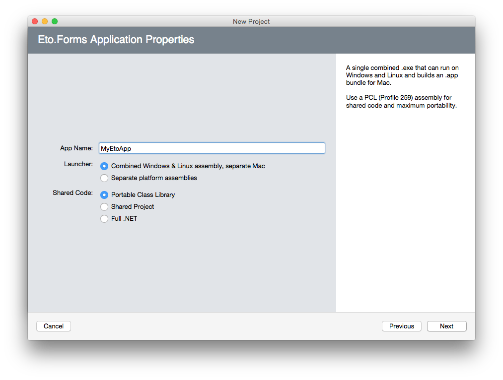
The 2.5.0 release is a culmination of new features, refinements, and fixes.
There have been over 680 commits and 948 files changed since v2.4.1. Thanks to the following for their very generous contributions included in this release: @couven92, @MartinRothschink, @SteveGilham, @harry-cpp, @e673, @halid-durakovic, @wjk, @acormier, @carlreinke, @oigami, @kike-garbo, @brtn, @allsorts46, @ItEndsWithTens
Also, a big thanks to everyone that submitted or contributed to issues and helped others on gitter. It is greatly appreciated!
New Features
Here are some of the most notable features of this release:
- Full support for .NET Core 3.x for WPF, WinForms, Gtk, and Mac64
- Updated extensions for VS for Mac 8.x and VS 2019
- Cascading Styles
- Drag images with cursor offset
- Drop descriptions (windows only)
- New Eto.Drawing.FormattedText to draw wrapped and/or aligned text using any brush with the Graphics object
- New Windows.MovableByWindowBackground property
- New Controls: CheckBoxList, EnumCheckBoxList, PropertyGrid, ToggleButton, and SegmentedButton
- 32-bit macOS platforms are no longer supported (Eto.Platform.Mac and Eto.Platform.XamMac).
Please use Eto.Platform.Mac64 or Eto.Platform.XamMac2 instead.
.NET Core 3.x
This release brings support for .NET Core to all of the desktop platforms including Eto.Platform.Wpf, Eto.Platform.Windows, Eto.Platform.Mac64, and Eto.Platform.Gtk (which already had support for .NET Core 2.x). This means you can use the same libraries and runtime for all platforms, and use newer packages that depend on .NET Standard 2.1.
Note that this does not include Xamarin.Mac as it does not support .NET Core.
For the Mac64 platform it will automatically package up the .NET Core runtime into an .app bundle in Release mode, for other platforms you can use the standard dotnet publish to publish your app to run without anything pre-installed.
Note that you can only debug apps using .NET Core for Mac64 using VSCode on macOS. Support for debugging .NET Core using VS for Mac is forthcoming.
When targeting .NET Core, you must use separate launchers per platform, the combined launcher only works when targetting .NET Framework only.
Visual Studio Extensions
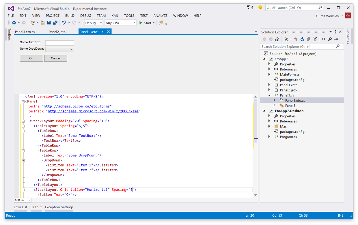
The visual studio extensions have been updated for the latest VS for Mac and VS 2019, including the design preview for xaml (.xeto), json (.jeto), and code preview (.eto.cs).
Cascading Styles
Cascading styles allows you to apply styles to all controls within a specific container instead of globally. You can also provide your own style provider which could eventually support things like using .css files to define styles.
The syntax for adding styles is nearly identical to global styles, allowing you to optionally specify a style identifier. A simple example could be something like the following, which vertically centers all labels in a panel:
class MyPanel : Panel
{
  public MyPanel()
  {
    // make all labels vertically centered in this panel
    Styles.Add<Label>(null, l => l.VerticalAlignment = VerticalAlignment.Center);

    Content = new TableLayout {
      Rows = {
        new TableRow("First Name", new TextBox()),
        new TableRow("Last Name", new TextBox()),
        new TableRow("Birth Date", new DateTimePicker())
      }
    };
  }
}
Drag Images and Drop Descriptions
You can now specify drag images and drop descriptions for a Drag 'n Drop operation by using the new Control.DoDragDrop(DataObject data, DragEffects allowedEffects, Image image, PointF cursorOffset) override and DragEventArgs.SetDropDescription(string format, string inner = null).
These integrate with the standard functionality of each platform so your apps will work beautifully. On windows it uses the newer shell drag/drop to provide a more modern look for the link/move/copy actions.
Mac
Windows (with drop description)

Note that the drop description is only supported on Wpf and WinForms, on other platforms it will be ignored. Drag images are supported on all platforms.
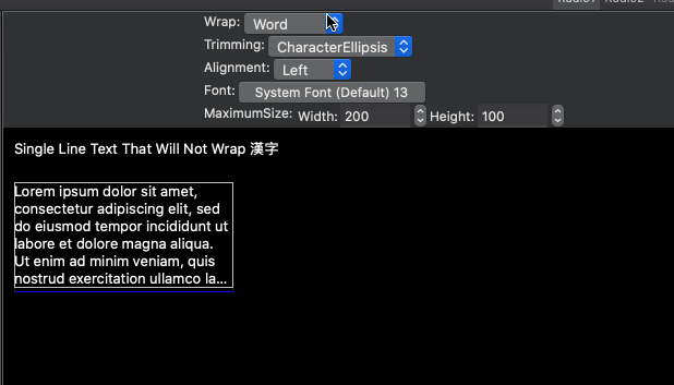
FormattedText
You can now draw formatted text with wrapping and alignment options, with any brush (solid, linear gradient, radial gradient, texture brush).
Mac and Xamarin.Mac Improvements
The macOS platforms have had numerous updates to improve layout performance, and also it now uses the alignment rectangle for sizing and positioning controls. This means that many standard controls, such as Button, Stepper, DropDown, etc that have had intrinsic padding no longer do and will now align to the control itself.
CheckBoxList and EnumCheckBoxList
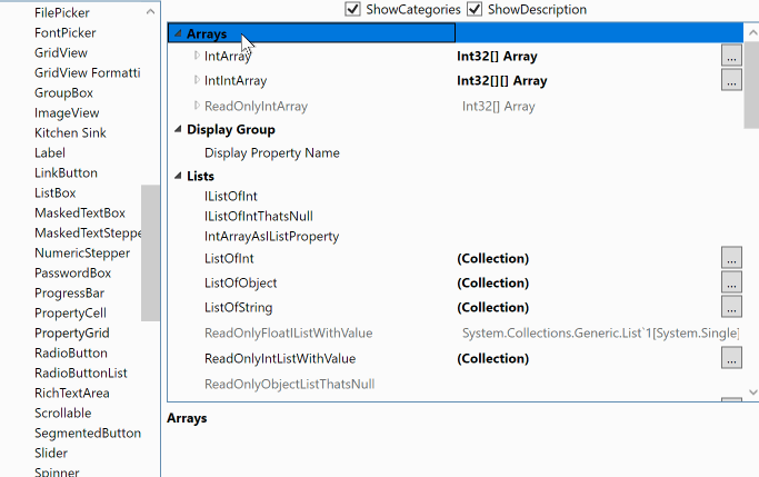
PropertyGrid
The PropertyGrid can be used to edit object(s) and arrays, very much like the one included in Windows Forms. This combines the TreeGridView and PropertyCell to provide an editor UI you can use to allow you users to easily modify objects and its properties.
ToggleButton
The ToggleButton is perfect when you want something other than a check box to toggle a value.
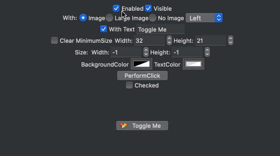
SegmentedButton
The SegmentedButton presents a grouped set of buttons that can optionally be selected and optionally show drop down menus for each item.

Release Cadence
2.5.x will continue to be improved, and point releases will be distributed as often as necessary to bring the latest features and fixes to official nuget packages sooner than has been done in the past. This is thanks in part of the added CI automation provided by Azure DevOps.
Eto.Forms 2.4.0 is now released! This release brings many new cool things, such as a fresh new Gtk platform supporting Gtk+ 3.14 or later, addin updates for VS 2017 and VS for Mac, and many new controls. See below for details.
There have been over 500 commits and 2755 files changed since v2.3, with 7 authors. Thanks to the following for their very generous contributions:
- @cra0zy
- @smoothdeveloper
- @SlowLogicBoy
- @k5jae
- @philstopford
- @Serg-Norseman
- @ItEndsWithTens
.. and thanks to everyone that has submitted issues to help make Eto.Forms better!
Visual Studio Addins
All new addins have been created for VS 2017 and VS for Mac/MonoDevelop, including form preview for xaml, json, and code view definitions.
Download links for the addins are above!
dotnet new
Project templates are now based on the dotnet template engine. This means you can easily create project templates from the command line using the dotnet sdk or in IDEs like Rider and VS Code. First, install the template package:
dotnet new -i "Eto.Forms.Templates::*"
Now you can create a new application:
dotnet new etoapp
Add --help to that to get a list of options, such as creating a .sln, using xaml, etc.
.NET Standard
Eto, Eto.Serialization.Xaml, and Eto.Serialization.Json has been migrated to .NET Standard 1.0. They are still compatible with the same platforms and projects as before, but now are much friendlier with .NET Core. (see Gtk Platform)
Gtk Platform
Eto.Platform.Gtk is now Gtk 3.14+ and uses @cra0zy's exellent GtkSharp library. Works on Windows, Linux, and Mac. This platform is also the first to have full .NET Core support! Note that the project templates do not use .NET Core by default but you can easily change the target framework after.
Note that you can still use Gtk2 by installing the new Eto.Platform.Gtk2 package.
Mac Templates
Projects created on Windows or Linux now can be run directly when loaded in VS for Mac using the Mac/Mac64/XamMac2 platforms, and the Mac platforms all create the .app bundle for you instead of relying on a separate Eto.Platform.Mac.Template (which is now obsolete).
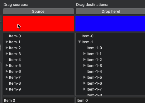
Drag 'n Drop
A long awaited feature is now here! Fully integrated with each native OS, and gives you great control over which nodes you can drag to for GridView and TreeGridView. See here for samples.

AboutDialog
Shows a dialog with all the information about your app. Uses the native GTK3 about dialog, and a custom themed dialog for the other platforms. It'll also automatically grab all the metadata from your assembly!
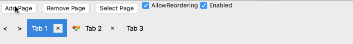
DocumentControl
A new control that is similar to a TabControl, but allows the user to close or optionally reorder tabs.
FilePicker
Pick files or folders.
FontPicker
Pick a font family, style, and size.
TextStepper and MaskedTextStepper
A custom stepper that you can control the text completely and react to up/down events.
Published by cwensley almost 9 years ago
We are proud to announce that Eto.Forms v2.2 is now released!
This release brings much better Xaml support, and huge advancements in the Visual Studio and Xamarin Studio tooling with the new visual designer.
There have been 163 commits and 679 files changed since v2.1.
Visual Studio & Xamarin Studio addins
Get started with Eto.Forms quickly using the new addins here.
Visual Designer
Both Visual Studio and Xamarin Studio/Monodevelop addins now support split screen form preview for Xaml, Json, and Code (C#, F#, or VB.NET) view definitions. Building your cross platform views has never been easier!
| Visual Studio 2013 / 2015 | Xamarin Studio / Monodevelop |
|---|---|
Xaml Autocomplete
Both Visual Studio and Xamarin Studio now have full autocomplete for xaml views, providing you with faster development of views while building them.
| Visual Studio 2013 / 2015 | Xamarin Studio / Monodevelop |
|---|---|
New template options
Both addins now provide more options when creating a new application, like whether you want to use Xaml, Json, or Code preview by default.
New Features
Xaml is now Portable
The Eto.Serialization.Xaml now uses a port of mono's System.Xaml to PCL called Portable.Xaml, with many fixed bugs and performance improvements. This finally allows proper support of markup extensions such as {Binding <property>}, {Resource ...}, etc.
This new Xaml engine is used for all platforms including windows to improve compatibility.
Xaml 'On' Markup Extension
In many cases you may want to tweak the UI, such as padding or sizes for certain platforms. A new markup extension for Xaml allows you to do this very easily and supports any property.
For example:
<StackLayout Padding="{On 10, Mac=5, Windows=10, Gtk=3}">...
The supported options for platforms/operating systems are listed in the OnExtension class. The platforms (Gtk, Mac, WinForms, Wpf) take precidence over the operating systems (Osx, Windows, Linux) and target device (Desktop, Mobile)
CommandParameter support for ICommand binding
Controls with ICommand binding like the Button, LinkButton, ButtonMenuItem, etc now have a CommandParameter that you can use to pass to the command when executing, which should be familiar to developers coming from WPF.
RelayCommand<T> is now also available to easily set up commands in your view model, which passes the command parameter of a particular type. For example:
public class MyModel
{
    public ICommand MyCommand { get; set; }
        = new RelayCommand<string>(p => MessageBox.Show("Clicked: " + p));
}

//...

var myButton = new Button { CommandParameter = "Something" };
myButton.BindDataContext(c => c.Command, (MyModel m) => m.MyCommand);
Parent/Child logical tree vs. visual tree
The Parent/Child relationship of controls are now based on the logical hierarchy. New Control.VisualChildren and Control.VisualParent properties have been added to represent the visual tree. The layout controls have been updated to build the logical tree immediately as children are added/removed, so you can use the FindChild or the new FindParent helpers without waiting for the control(s) to be loaded on the form.
This is especially useful when loading a definition from Xaml or Json, where you can now find children by ID or other criteria to perform additional setup before the form is loaded.
New CustomCell and PropertyCell
The GridView and TreeGridView now support a new CustomCell which can be used to display custom controls on the grid for platforms that support it. The PropertyCell is a subclass of the CustomCell and implements an easy way to present different controls depending on the row value, usually based on its type.
Note that some platforms (e.g. WinForms and Gtk) still require a paint method for displaying the data, which the CustomCell provides for. But for WPF and Mac, the custom control can be used for the cell view and edit.
Check out the CustomCell and PropertyCell samples for how to use these new cells.
SystemColors
You can now get standard system colors using the new SystemColors static class, such as Control, ControlText, ControlBackground (e.g. background of a text box), DisabledText, Highlight, HighlightText, and WindowBackground. Note: in GTK, these may not return the correct result as there's no way to get the theme's colours (help getting this working correctly, if possible, would be appreciated).
Published by cwensley about 9 years ago
Eto.Forms v2.1 builds on the 2.0 release providing many bug fixes, more consistent behaviour across platforms for many controls, and also tons of new features and controls.
Since 2.0, there have been 453 commits and 51 resolved issues.
Visual Studio & Xamarin Studio Addins
TL;DR: Get started with the VS or XS/MD addins here.
There are now F# and VB project and file templates to get you started quicker and easier than ever with your favorite language.
The addins for VS and XS have also been updated with an all new project template wizard to eliminate the confusion of multiple project template types. Check it out:
The Visual Studio extension is also now compatible with both VS 2013 and VS 2015.
Visual Studio Form Preview
You can now preview your Xaml, Json, and code-based forms and controls right within the Visual Studio IDE!
Building an extension for VS feels like mashing the keyboard until something works, but it will no doubt be very useful so the pain was worth it. An example of it in action:
Update: Also, forgot to mention that VS will also underline any Eto.Drawing.Color reference/constructor with its actual color. This only works if you pass numeric values to the constructor, or use any of the values in Colors.*.
New Features
StackLayout
The new StackLayout provides a very clean api for simple layouts, giving you a quick and easy way to create a horizontal or vertical set of controls.
By default, the StackLayout will keep all your controls auto-sized. The HorizontalContentAlignment and VerticalContentAlignment properties (depending on Orientation) specify if the controls are aligned to the Left/Top, Right/Bottom, Center, or Stretch to fill the container. Each StackLayoutItem can also control the alignment for each item individually, and also specify an expand property to tell it to fill the available space.
For example:
var layout = new StackLayout
{
    Orientation = Orientation.Vertical,
    Spacing = 5,
    Padding = new Padding(10),
    HorizontalContentAlignment = HorizontalAlignment.Center,
    Items =
    {
        new Button { Text = "Click Me" }, // implicit conversion
        new StackLayoutItem(new TextArea(), HorizontalAlignment.Stretch, expand: true)
    }
}
The StackLayout is built upon the very versatile TableLayout currently, but will eventually be transitioned to a full fledged control.
Xamarin.Mac Unified
The latest version of Xamarin.Mac (unified) is now fully supported in both the mobile and net45 profiles. This will allow you to bundle the mono runtime with your app and publish to the app store. To use Xamarin.Mac, you need to purchase a license from Xamarin.
Note that the MonoMac platform does not require a Xamarin license, but requires your end users to install mono.
Binding enhancements
For more advanced MVVM capabilities, the abilitiy to bind to a System.Windows.Input.ICommand in your view model has been added to controls such as Button, RadioButton, and LinkButton, to name a few. You can use the Eto.Forms.Command as an implementation of ICommand.
ICommand binding is useful by allowing your view model to define the action and the enabled state of the command, which is automatically reflected in the UI.
In the .NET 4.0 build, a custom type of Eto.Forms.ICommand has been added which can be used similarly to the .NET 4.5 interface.
For example:
class MyModel
{
    public ICommand MyCommand
    {
        get { return new Command((sender, e) => Console.WriteLine("Executed!")); }
    }
}

class MyForm : Form
{
    public MyForm()
    {
        var button = new Button { Text = "Click Me!" };
        // bind the button's Command to the view model
        button.BindDataContext(b => b.Command, (MyModel m) => m.MyCommand);

        Content = new StackLayout { Items = { button } };

        // set the view model for the form
        this.DataContext = new MyModel();
    }
}
Binding support has also been added MenuItem and ToolItem.
Implicit string as a Label
There is now an implicit conversion from String to a Control so when you're creating UI labels you no longer have to create instances of Label explicitly. Combined with the initializer pattern for controls like the StackLayout, this works really nicely:
new StackLayout
{
    Items =
    {
        "Some label",
        new TextBox(),
        "Some other label",
        new Button { Text = "Click Me!" }
    }
}
Xaml from PCL
The Eto.Serialization.Xaml nuget package can now be used from your PCL projects. It uses the bait and switch trick, so you also need to add the package to your startup project for it to work. This is currently only available for desktop platforms.
New Controls
RadialGradientBrush
Rounding out the Graphics capabilities of Eto, the RadialGradientBrush has been added for more gradient options.
GradientWrapMode.Pad has also been added which works for the existing LinearGradientBrush as well.
Keyboard
A new Eto.Forms.Keyboard static class is added giving you access to the state of keyboard modifiers and key lock states for the CapsLock, NumLock, and Insert mode. Note that not all platforms support all lock keys, so check the Eto.Forms.Keyboard.SupportedLockKeys for which lock keys the platform supports.
Expander
The new Expander wraps the existing WPF ang Gtk Expander controls, and a custom implementation for WinForms and Mac platforms. It provides a way to show or hide additional controls on your form using a toggle button.
MaskedTextBox
The MaskedTextBox provides an easy to use and extensible masked input control for things like phone numbers, serial numbers, postal/zip codes, and also variable length formats like a numeric input.
This control uses the IMaskedTextProvider interface to determine how the mask functions, which Eto.Forms provides a few implementations:
- FixedMaskedTextProvider, which wraps .NET's MaskedTextProvider, but is usable from PCL code.
- VariableMaskedTextProvider which is an abstract base to easility implement variable-length masks.
-
NumericMaskedTextProvider which is an implementation of the
VariableMaskedTextProviderthat allows for numeric input of any standard .net type such asint,long,float,double, etc.
ProgressCell
The ProgressCell is usable for the GridView and TreeGridView to show a progress bar as column in your grid. It binds to your model using a nullable float, with values of 0 - 1.0.
Control Enhancements
There have been tons of enhanced controls, here are some of the more notable enhancements:
Window.Owner
A new Window.Owner property has been added to create modeless dialogs using the Form class. Setting this property to another window will ensure the form is always above its owner, and in some cases (e.g. OS X), the child window will move along with its parent.
Button.MinimumSize
The Button control now exposes a MinimumSize property, which allows you to shrink the button to the size of its content. For example, if you are showing only a small image as the button content, you can set the MinimumSize to Size.Empty.
The default value of MinimumSize may be different for each platform to ensure buttons look the correct size in typical use cases.
NumericUpDown.MaximumDecimalPlaces
The NumericUpDown control as a new MaximumDecimalPlaces for cases when you want to show many decimal places, but only if needed. This control has also received numerous updates on all platforms to make its functionality more consistent.
TabControl.TabPosition
The TabControl now supports tabs on the Bottom, Left, and Right of the content.
TextArea.SpellCheck/SpellCheckIsSupported
The TextArea can now show incorrect spelling when TextArea.SpellCheck is set to true. This is only a hint, so check the value of TextArea.SpellCheckIsSupported to see if the current platform supports this feature. Currently only supported on WPF and OS X platforms.
TextBox.CaretIndex/Selection/SelectedText
The TextBox now allows you to control where the caret should be placed, and get/set what text is selected. This functionality is used for the new MaskedTextBox.
TextInput event
The Control.TextInput event has been implemented on all platforms to interpret proper text input on your controls. This ensures that different input methods, languages, etc can be properly handled.
This is also used for the MaskedTextBox to provide correct functionality, but you can also use it on controls like Drawable to provide your own completely custom input control.
Breaking Changes
In keeping (mostly) with SemVer, in 99.9% of the cases your code should compile with no changes in the new version. If not, only minor changes should be necessary.
Before updating to this version you should fix all obsolete warnings in your code so that the upgrade path is smooth.
Graphics Transforms and PixelOffsetMode
Graphics.PixelOffsetMode was incorrectly implemented on pretty much all platforms which caused elements to be drawn in the wrong location when applying a scale transform. The PixelOffsetMode.Half mode also no longer offsets the fill operations and behaves similarly to other graphics platforms. If you did not change the PixelOffsetMode in your application, this should not affect you.
Orientation enumeration
The various Orientation enumerations have been unified to a single Orientation enum. These are RadioButtonListOrientation, SplitterOrientation, and SliderOrientation which are now deprecated.
HorizontalAlign/VerticalAlign
The HorizontalAlign and VerticalAlign enumerations are now deprecated in favour of HorizontalAlignment, VerticalAlignment, and TextAlignment. These are used for the new StackLayout and also apply to the Label control.
Window.RestoreBounds
Window.RestoreBounds is no longer nullable, and will always return the size that the window should be restored to. Previously, this would only return a value when the window was fullscreen or minimized.
Binding moved to Eto.Forms namespace
All binding related classes were moved from Eto to the Eto.Forms namespace.
FileDialog.Filters changed from IEnumerable to Collection
The FileDialog.Filters is now a collection instantiated by the FileDialog. Previously you would have (using initializer pattern):
new OpenFileDialog
{
    Filters = new [] { new FileDialogFilter("My Files", ".my") }
}
Now it's simply:
new OpenFileDialog
{
    Filters = { new FileDialogFilter("My Files", ".my") }
}
Questions & Thanks
If there are any questions about the new release or its features, feel free to talk about it in the forums or on irc. Any issues should be filed in the github issue tracker.
I also want to thank all of the contributors to Eto.Forms that have submitted pull requests, created issues, added information on the wiki, or just helping to spread the word!
Minor fixes in this release:
- Wpf: TableLayout now recalculates child positions properly when layout changes
- Wpf/WinForms: WebView cut/copy/paste/select all shortcuts now work
- WinForms: Fix Form.MininumSize
- Wpf: Width/Height of TextBox/TextArea/DateTimePicker/NumericUpDown/etc no longer change as user enters text when control is auto sized, to have consistent behaviour with other platforms.
- Gtk: Fix setting Save/OpenFileDialog.FileName to pre-populate the name for the user
- Ensure TableLayout is created, even when populated after PreLoad.
Published by cwensley almost 10 years ago
Use TextRenderer for control font rendering, and disable compatible text rendering. Fixes issue #246
Published by cwensley almost 10 years ago
This fixes a regression when setting Form.Resizable to false.
Published by cwensley almost 10 years ago
Eto.Forms v2.0 is a culmination of many major updates to the API which bring a more declarative API, better binding API's, INotifyCollectionChanged support in many controls, and numerous bug fixes in all platforms.
Since 1.3, there have been a whopping 475 commits over 6 months.
New Features
Some great new features are in this release!
First and foremost, Eto.Forms is transitioning to a PCL (Portable Class Library) for its core and is now default when targetting .NET 4.5. The .NET 4.0 assemblies are still kept for compatibility with older versions of mono (< 3.2), mainly to support standard distributions like Ubuntu.
Also, the entirety of Eto.dll is now fully commented and comes along with the nuget package, so intellisense should give you better information on what things do. If there are any comments that need better descriptions, please file an issue with the specific methods/classes.
New Controls
These new controls are supported on all desktop platforms:
-
Calendar- Shows a calendar directly in the form, withMinDate,MaxDate, and can select a range or a single date. -
ColorPicker- Used to show and allow the user select a color. Uses the appropriate picker dialog for each platform, e.g. on OS X it is a standard color tool window, whereas on windows it will show a drop down picker. -
LinkButton- Simple text that acts like a button, similar to a hyperlink on a web page. -
RadioToolItem- Radio button for a toolbar, so you can create dialogs similar to preference dialogs in OS X, or have alternating options.CheckToolItemis also fixed on OS X to be a standard toggle button that can be on or off. -
DrawableCell- A new cell for theGridVieworTreeGridViewthat allows you to paint the contents usingEto.Drawing. -
ComboBox- The oldComboBoxwas renamed toDropDown, and now is a combination of a text entry box and a drop down with all the expected functionality and behaviour consistent on all platforms.
New Platforms
Now with this release, Eto.Platform.iOS and Eto.Platform.XamMac2 (unified) packages are on nuget.org. You can now use Eto.Forms on Xamarin.iOS and 64-bit Xamarin.Mac projects!
Note that there are some desktop-level controls that are not supported on iOS, please see details on how to detect Partially Supported Functionality for each platform.
TableLayout declarative API
The TableLayout has had a lot of love poured into it to make it more useful out of the box. Instead of determining the size of the table then adding controls to each cell manually, you can now use its new Rows property and add rows and cells directly.
For example, in 1.3 you would have to do this:
var layout = new TableLayout(3, 3);
layout.Add(myLabel, 1, 1);
layout.Add(myButton, 1, 2);
layout.SetColumnScale(0);
//...
Now, you can do this with constructors:
var layout = new TableLayout(
    null,
    new TableRow(null, myLabel, myButton),
    null
}
Or, use TableLayout.Rows and TableRow.Cells with the initializer pattern so you can easily set other properties at the same time:
var layout = new TableLayout {
    Padding = new Padding(10),
    Spading = new Size(5, 5),
    Rows = {
        null,
        new TableRow {
            ScaleHeight = true,
            Cells = { null, myLabel, myButton }
        },
        null
    }
}
Currently you cannot modify the rows/cells after you add the layout to your form, but this is planned for a future release. DynamicLayout will continue to be supported, but the recommended way forward will be to use the TableLayout directly.
MenuBar Improvements
The MenuBar has always had a loose method of getting a native feel on all platforms. You would have to create the menu differently depending on the running platform to get the About, Help, Quit, and other application-level items in their right location.
Now, the menu bar supports many new properties directly so you can set these items and it will put them in their right location on all platforms for you. It also supports creating your menu declaratively like so:
Menu = new MenuBar
{
    Items = {
        // main items
        new ButtonMenuItem { Text = "&File", Items = { clickMe } },
        new ButtonMenuItem { Text = "&Edit", Items = { /* commands/items */ } },
        new ButtonMenuItem { Text = "&View", Items = { /* commands/items */ } },
    },
    ApplicationItems = {
        // application (OS X) or file menu (others)
        new ButtonMenuItem { Text = "&Preferences..." },
    },
    QuitItem = quitCommand,
    AboutItem = aboutCommand
};
As you can notice, there's also no order for each item, making things really simple. You can still set the order of your items making merging of items super easy, but it is no longer requried.
Enhanced Binding API's
Binding to controls has been flushed out to provide flexability but consice declaration of binding to your objects either directly or through the DataContext.
For example, you can now specify lambda's to get property values. If the lambda evaluates to a property expression, then it will use reflection to set the value and attach changed events.
using Eto.Forms;
class MyClass
{
    public string MyText { get; set; }
    public bool Enabled { get; set; }
}

class MyForm : Form
{
    public MyForm()
    {
        var myClass = new MyClass { MyText = "someText" };
        DataContext = myClass;

        var textBox = new TextBox();

        // bind using the current DataContext
        // advantage of this, is you can change the DataContext,
        // and the controls will update for the new context.
        textBox.TextBinding.BindDataContext<MyClass>(r => r.MyText);
        // bind to the Enabled property
        textBox.BindDataContext(tb => tb.Enabled, (MyClass r) => r.Enabled);


        // bind directly
        textBox.TextBinding.Bind(myClass, r => r.MyText);
        // different property of the textBox
        textBox.Bind(tb => tb.Enabled, myClass, r => r.Enabled);
    }
}
Easier integration with native applications
Each platform assembly now has extensions added to the Eto.Forms namespace to convert native controls to Eto controls and vise versa.
This will make it much easier to use Eto.Forms when integrating it into your existing application. Samples have been added that demonstrate this for each of the platforms.
Performance improvements
There have been some performance improvements over the framework, mainly in layout. You'll notice drastic improvements in the WinForms platform with better suspend/resume logic in the backend so you don't have to lift a finger for things to just work well.
Breaking Changes
Following the popular SemVer, a major version change brings breaking changes. However, where possible, API's were obsoleted instead of removed allowing for a more seamless upgrade path.
Unfortunately, there were some changes that cannot be gracefully obsoleted and will mean you have to make some minor changes.
Here is a list of things that may break coming from v1.3 code:
1. TableLayout Padding and Spacing are now zero by default
The TableLayout no longer defaults to 10 padding around the border and 5x5 spacing between cells. To get the previous behaviour, you can use a style before starting your app, like this:
Eto.Style.Add<Eto.Forms.TableLayout>(null, table => {
    table.Padding = new Eto.Drawing.Padding(10);
    table.Spacing = new Eto.Drawing.Size(5, 5);
});
2. ComboBox is dead. Long live the ComboBox!
The ComboBox UI control was renamed to DropDown. However a proper ComboBox, according to wikipedia, is a combination of an entry text box and a drop down. Now both exist in Eto.Forms, along with all of the expected properties and events, such as AutoComplete, ReadOnly, Text, and TextChanged. New samples have been added that flex the new ComboBox's muscles so go check it out!
3. DataStore is now IEnumerable<object> in most cases
The IDataStore and IDataStore<T> are now mostly removed in favour of using standard collections. Most controls will bind using the INotifyCollectionChanged interface to update the UI when the collection changes automatically. You can use the standard ObservableCollection<T> which implements INotifyCollectionChanged. The only remaining controls that do not use this mechanism yet is the TreeView and TreeGridView. This is planned for a future version.
4. Platform assemblies and namespaces renamed
If you have only written UI code using Eto.dll, then this will not affect you. However, the platform assemblies are now simplified from Eto.Platform.[platform].dll to Eto.[platform].dll. This means all of the handlers and code are in a different namespace. The nuget packages still have the same name
5. Virtualized Eto.IO is now removed
This was probably not used much (if at all), so it is removed to keep Eto.Forms' code clean of any unnecessary functionality.
6. On[Event] methods are now protected instead of public
To better conform to .NET standard practices, all event handler methods in classes are now protected to prevent them from being called outside the class. This means if you had code like:
public class MyButton : Button {
{
    public override void OnClick(EventArgs e)
    {
        //...
    }
}
It should now be changed to:
public class MyButton : Button
{
    protected override void OnClick(EventArgs e)
    {
        //...
    }
}
7. Static methods with Generator parameter are now static properties
In 2.0, the need to pass the Generator (now Platform) to methods and constructors has been drastically reduced, to the point that you pretty much don't need to worry about it anymore. In doing so, there were some static methods in Eto.Drawing that have been changed. Mainly, these are the helper methods to get pens, brushes, mouse positions, etc. For example:
-
x.IsSupported()becomesx.IsSupported -
Pens.<Color>()becomesPens.<Color>(e.g.Pens.White) -
Brushes.<Color>()becomesBrushes.<Color>(e.g.Brushes.Green) -
Mouse.GetPosition()&Mouse.GetButtons()becomesMouse.Position&Mouse.Buttons
8. Obsolete code removed
All functionality that was marked as obsolete in 1.3 is now removed. Anything that compiled without warnings in 1.3 should mostly compile in 2.0, with a few (hopefully) minor modifications. Anything marked as obsolete will be removed soon in the develop branch, which will become version 2.1 when released.
This means that before upgrading from 2.0 to 2.1, you should ensure to resolve all obsolete warnings.
Questions & Thanks
If there are any questions about the new release or its features, feel free to talk about it in the forums or on irc. Any issues should be filed in the github issue tracker.
I also want to thank all of the contributors to Eto.Forms that have submitted pull requests, created issues, added information on the wiki, or just spreading the word!
