
material-ui
Material UI: Ready-to-use foundational React components, free forever. It includes Material UI, which implements Google's Material Design.
MIT License
Jan 4, 2021
Big thanks to the 14 contributors who made this release possible. Here are some highlights ✨:
- ♿️ Fix major accessibility issue with the Autocomplete (#24213) @inform880
- 👩🎤 Migrate the Container to emotion (#24227) @oliviertassinari
- 🐛 Fix Next.js regression and other cross-platform issues with the build (#24200, #24223)
- And many more 🐛 bug fixes and 📚 improvements.
@material-ui/[email protected]/@material-ui/[email protected]
- [Autocomplete] Fix VoiceOver not reading the correct activedescendant (#24213) @inform880
- [Autocomplete] Warn when value is invalid (#24202) @Sandeep0695
- [Button] Fix disableElevation regression (#24251) @oliviertassinari
- [Container] Migrate to emotion (#24227) @oliviertassinari
- [Pagination] Fix className forwarding when type is ellipsis (#24256) @andrelmlins
- [Select] Improve description on how it extends the Input components (#24180) @azza85
- [styled] Fix missing types for
sx(#24211) @mnajdova - [styled] Remove unused type parameters from StyledOptions (#24255) @eps1lon
- [styled] Support components without theme (#24214) @mnajdova
- [styles] Fix classes logic (#24250) @oliviertassinari
- [styles] Improve the classes structure (#24249) @oliviertassinari
@material-ui/[email protected]
- [DatePicker] Fix year only view, hide the current month (#24205) @hyeonhong
- [DatePicker] Nested imports for better DX (#24147) @oliviertassinari
- [DatePicker] Remove unused type parameters (#24257) @eps1lon
- [TimePicker] Prevent conflicting type parameter in
ClockProps#getClockLabelText(#24193) @eps1lon
Docs
- [docs] Accept pages written in TypeScript (#24230) @oliviertassinari
- [docs] Document emotion migration breaking changes (#24229) @luminaxster
- [docs] Fix broken benchmark link (#24210) @jalaj-k
- [docs] Fix codesandbox datagrid demo (#24218) @brno32
- [docs] Fix iframe demos with emotion (#24232) @oliviertassinari
- [docs] Sync translations (#24161) @l10nbot
Core
- [test] More granular progress tracking of relative type imports (#24233) @eps1lon
- [core] Add missing sx typings on the components migrated to emotion (#24208) @mnajdova
- [core] Batch small changes (#24224) @oliviertassinari
- [core] Create issue mark duplicate (#24184) @xrkffgg
- [core] Fix generation of package.json (#24223) @oliviertassinari
- [core] Fix relative import of types (#24248) @oliviertassinari
- [core] Platform agnostic build script for envinfo (#24200) @eps1lon
- [core] Remove unused generics from experimentalStyled (#24192) @eps1lon
Dec 30, 2020
Big thanks to the 14 contributors who made this release possible. Here are some highlights ✨:
- 👩🎤 Migrate the Avatar to emotion (#24114) @oliviertassinari
- 👩🎤 Migrate the Button to emotion (#24107, #24100) @mnajdova
- ♿️ Improve TrapFocus behavior, ignore the container as a tabbable element (#23364) @gregnb
In rare cases, an element might not longer be tabbable when looping, e.g. overflow container in Firefox.
You can work around the problem by adding atabIndex={0}or customizing thegetTabbableprop. - And many more 🐛 bug fixes and 📚 improvements.
@material-ui/[email protected]/@material-ui/[email protected]
- [Avatar] Migrate to emotion (#24114) @oliviertassinari
- [ButtonBase] Migrate styles to emotion (#24100) @mnajdova
- [Button] Migrate styles to emotion (#24107) @mnajdova
- [unstyled] Add utils for generating utility classes (#24126) @mnajdova
- [TrapFocus] Fix trap to only focus on tabbable elements (#23364) @gregnb
- [Link] Improve integration with Next.js (#24121) @kelvinsanchez15
- [Select] Fix overflow showing scrollbar (#24085) @Segebre
- [Slider] Fix circular type reference in SliderValueLabel (#24190) @eps1lon
- [Skeleton] Fix default TypeScript component type (#24191) @eps1lon
@material-ui/[email protected]
- [system] Fix sx prop typings to support grid gap props (#24093) @mnajdova
- [system] Improve the SxProp typings structure, by splitting them in a separate module. (#24090) @mnajdova
- [system] Replace grid gap properties (#24094) @mnajdova
@material-ui/[email protected]
- [DatePicker] Allow to customize icons (#24017) @jackcwu
- [DatePicker] Fix missing component for theme augmentation (#24092) @rajzik
- [DatePicker] Hide outline on container (#24108) @oliviertassinari
- [DatePicker] Fix accessibility issue with heading (#24183) @gracektay
- [TimePicker] Improve the design to fit on smaller screens (#23855) @marianayap
- [TreeView] Add preventScroll for tree focus (#24105) @praveenkumar-kalidass
@material-ui/[email protected]
- [styles] Fix for supporting non string props in propsToClassKey (#24101) @mnajdova
@material-ui/[email protected]/@material-ui/[email protected]
- [styled-engine] Fix StylesProvider injectFirst with sc (#24104) @mnajdova
Docs
- [docs] Add examples for adding and removing Typography variants (#24088) @mnajdova
- [docs] Fix typo (#24123) @ajonp
- [docs] Fix warning about wrong prop type (#24117) @mnajdova
- [docs] Rename "Customization > Theme > Global" to "Customization > Theme > Components" (#24115) @mnajdova
- [docs] Rename customization/components to customization/how-to-customize (#24089) @mnajdova
- [docs] Replace process.browser with typeof navigator (#24122) @softshipper
- [docs] Sync translations (#24152) @l10nbot
- [docs] Update Fontsource install instructions (#24120) @DecliningLotus
- [docs] Add system grid page (#24119) @mnajdova
- [blog] 2020 in review and beyond (#24130) @oliviertassinari
- [docs] Improve naming and structure of the Customization and Guide pages (#24175) @mnajdova
Core
- [core] Batch small changes (#24131) @oliviertassinari
- [core] Fix overridesResolver on the core components and added tests (#24125) @mnajdova
- [core] Reduce number of files included in language server (#24165) @eps1lon
- [core] Reduce response time of initial PR bot comment (#24168) @eps1lon
- [core] Refactor styled() components to ease out the migration process (#24124) @mnajdova
- [test] Add more packages to browser test suite (#24155) @eps1lon
- [core] Monitor progress of fixing type imports (#24188) @eps1lon
- [core] Fix build on Windows (#24187) @oliviertassinari
Dec 21, 2020
Big thanks to the 13 contributors who made this release possible. Here are some highlights ✨:
-
👩🎤 Migrate the Typography to emotion (#23841) @DanailH
This change allows to add typography variants in the theme and to use them directly:
const theme = createMuiTheme({ typography: { poster: { color: 'red', }, }, }); <Typography variant="poster">poster</Typography>; -
📚 Add a shortcut to open the Algolia search (#23959) @hmaddisb.
-
And many more 🐛 bug fixes and 📚 improvements.
@material-ui/[email protected]/@material-ui/[email protected]
Breaking changes
-
[CssBaseline] Change body font size to body1 (1rem) (#24018) @mbrookes
The new default matches the variant used by the Typography component. To return to the previous size, you can override it in the theme:
const theme = createMuiTheme({
  typography: {
    body1: {
      fontSize: '0.875rem',
    },
  },
});
Changes
- [Badge] Fix the classes description to reflect the correct component (#24035) @mnajdova
- [Select] Fix aria-describedby attribute (#24027) @HVish
- [Skeleton] Fix Circle border radius on Safari (#24054) @anatolzak
- [Slider][badge] Fix classes prop not working (#24034) @mnajdova
- [Typography] Migrate styles to emotion (#23841) @DanailH
@material-ui/[email protected]/@material-ui/[email protected]
- [styled-engine] Add name and slot options (#23964) @mnajdova
- [styled-engine] Add StylesProvider with injectFirst option (#23934) @mnajdova
@material-ui/[email protected]
- [system] Fix transform not firing when theme provided (#24010) @ZovcIfzm
Docs
- [docs] Add a shortcut to access the search bar (#23959) @hmaddisb
- [docs] Animate component's mounting and unmounting (#24049) @cjoecker
- [docs] Fix collapse API docs description of 'hidden' style condition (#24053) @jaiwanth-v
- [docs] Improve color demo snippet spacing (#24009) @yukinoda
- [docs] Improve displayed versions (#24051) @oliviertassinari
- [docs] Show a better file on codesandbox (#24052) @oliviertassinari
- [docs] Update customization/components and customization/global pages (#24016) @mnajdova
- [docs] Update the CSS injection guide (#24020) @mnajdova
Core
- [core] Batch small changes (#24038) @oliviertassinari
- [core] Track size of /unstyled (#24021) @eps1lon
- [core] Use consistent naming scheme for ttp annotations (#24022) @eps1lon
Dec 13, 2020
Big thanks to the 24 contributors who made this release possible. Here are some highlights ✨:
- 👩🎤 Migrate the Badge to emotion (#23745) @mnajdova.
- 🌏 Add infrastructure to translate the API pages (#23852) @mbrookes.
- And many more 🐛 bug fixes and 📚 improvements.
@material-ui/[email protected]
Breaking changes
-
[Icon][svgicon] Change default fontSize from default to medium (#23950) @mbrookes
The default value of
fontSizewas changed fromdefaulttomediumfor consistency.
In the unlikey event that you were using the valuedefault, the prop can be removed:-<SvgIcon fontSize="default">{iconPath}</SvgIcon> +<SvgIcon>{iconPath}</SvgIcon> -
[TextField] Add size prop for outlined and filled input (#23832) @mayralgr
Rename
marginDenseandinputMarginDenseclasses tosizeSmallandinputSizeSmallto match the prop.
Changes
- [Autocomplete] Document onChange last
detailsparam (#23942) @natac13 - [Autocomplete] Fix useAutocomplete groupedOptions type (#23854) @ZachCMP
- [Autocomplete] Improve DX/UX when getOptionLabel is not configured correctly (#23884) @marianayap
- [Autocomplete] Improve getOptionSelected description (#23817) @smartshivkat
- [Badge] Create unstyled component & move to emotion (#23745) @mnajdova
- [Grid] Improve support for nested grid (#23913) @gbrochar
- [Grid] Fix side effects when direction="column" and xs={} is used (#23900) @Kai-W
- [Select] Fix description, value is not required (#23940) @natac13
- [Slider] Remove color prop in unstyled (#23840) @mnajdova
- [Slider] Replaced inlined isHostComponent with the utils (#23880) @mnajdova
- [SwipeableDrawer] Refactor internals (#23944) @eps1lon
- [TextField] Add documentation for hidden label (#23915) @Fredestrik
- [TextField] Fix the color leak of the textbox (#23912) @szabgab
- [useMediaQuery] Fix a false return at the first call (#23806) @marthaerm
- [utils] Fix minified errors throwing with _formatMuiErrorMessage (#23828) @eps1lon
@material-ui/[email protected]
- [core] Use Lerna to publish (#23793) @oliviertassinari
@material-ui/[email protected]
Breaking changes
-
[system] Move visually hidden helper to utils (#23974) @eps1lon
Only applies if you've installed v5.0.0-alpha.1
-import { visuallyHidden } from '@material-ui/system';
+import { visuallyHidden } from '@material-ui/utils';
Changes
- [core] Use Lerna to publish (#23793) @oliviertassinari
@material-ui/[email protected]
- [core] Use Lerna to publish (#23793) @oliviertassinari
@material-ui/[email protected]
- [core] Use Lerna to publish (#23793) @oliviertassinari
@material-ui/[email protected]
- [core] Use Lerna to publish (#23793) @oliviertassinari
Docs
- [example] Change Box to new sx prop (#23937) @natac13
- [example] Explain package choice (#23938, #23958) @mnajdova
- [example] Update nextjs examples to fix hydration (#23936) @mnajdova
- [docs] Add API tradeoff section for the sx prop (#23962) @mnajdova
- [docs] Add ELEVATOR to backers (#23977) @mbrookes
- [docs] Add eslint rule to docs (#23843) @jens-ox
- [docs] Add infrastructure to translate API pages (#23852) @mbrookes
- [docs] Add link to the sx docs page in the API description (#23967) @mnajdova
- [docs] Add prepend option on emotion caches to allow JSS style overrides (#23892) @mnajdova
- [docs] Add Vercel deploy config (#23910) @eps1lon
- [docs] Allow codesandbox deploy for demos in X (#23644) @oliviertassinari
- [docs] Copy icons to clipboard (#23850) @CodeWithGuruji
- [docs] Fix breakpoints typos (#23893) @mnajdova
- [docs] Fix color contrast of code within links (#23819) @eps1lon
- [docs] Fix duplicated styles generated from emotion (#23809) @mnajdova
- [docs] Fix icon alignment in /components/breadcrumbs (#23818) @eps1lon
- [docs] Fix production deploy (#23963) @eps1lon
- [docs] Fix source on Github links (#23821) @praveenkumar-kalidass
- [docs] Fix StickyHeaderTable round borders (#23882) @antoniopacheco
- [docs] Fix typo in date picker dayjs adapter name (#23935) @andresmrm
- [docs] Improve system properties page (#23961) @mnajdova
- [docs] Link module augmentation in TypeScript @oliviertassinari
- [docs] Make stable width of localization example (#23820) @sujinleeme
- [docs] Mention Adobe XD (#23978) @oliviertassinari
- [docs] Prefer system shorthands (#23970) @oliviertassinari
- [docs] Remove 'TODO' comment from buildApi script (#23973) @mbrookes
- [docs] Sync translations (#23742, #23842) @l10nbot
- [docs] Update Badge examples to use Box instead of makeStyles (#23927) @mnajdova
Core
- [test] Add conformance tests for testing the
theme.componentsoptions for the v5 components (#23896) @mnajdova - [test] Include type path mappings in language server (#23905) @eps1lon
- [test] Make Popper tests StrictMode agnostic (#23838) @eps1lon
- [test] Run benchmarks in Azure Pipelines when approved (#23895) @eps1lon
- [test] Skip tests with cascading network requests (#23823) @eps1lon
- [core] All packages are published from /build (#23886) @oliviertassinari
- [core] Batch small changes (#23853) @oliviertassinari
- [core] Fix failing CI on HEAD (#23947) @oliviertassinari
- [core] Force LF for text files (#23932) @eps1lon
- [core] Improve envinfo instructions (#23918) @eps1lon
- [core] Replace fs-extra deprecated function (exists) (#23848) @leonardopliski
- [core] Use Lerna to publish (#23793) @oliviertassinari
- [core] Use playwright instead of puppeteer (#23906) @eps1lon
- [core] Add envinfo --json flag (#23883) @eps1lon
- [core] Ask for output from envinfo in issues (#23881) @eps1lon
Nov 24, 2020
This release widens the peer dependency scope of React to accept ^17.0.0 ⚛️ . The change makes it easier for developers to upgrade React independently from Material-UI. The best support for React 17 will be found in Material-UI v5.
This is a reminder that all ongoing work has moved to v5. This means a feature freeze on v4. The development of v4 is limited to important bug fixes, security patches, and easing the upgrade path to v5.
@material-ui/[email protected]
- [core] Allow React 17 in peer dependencies (#23697) @oliviertassinari
@material-ui/[email protected]
- [core] Allow React 17 in peer dependencies (#23697) @oliviertassinari
@material-ui/[email protected]
- [core] Allow React 17 in peer dependencies (#23697) @oliviertassinari
@material-ui/[email protected]
- [core] Allow React 17 in peer dependencies (#23697) @oliviertassinari
@material-ui/[email protected]
- [core] Allow React 17 in peer dependencies (#23697) @oliviertassinari
@material-ui/[email protected]
- [core] Allow React 17 in peer dependencies (#23697) @oliviertassinari
@material-ui/[email protected]
- [core] Allow React 17 in peer dependencies (#23697) @oliviertassinari
Dec 3, 2020
Big thanks to the 17 contributors who made this release possible. Here are some highlights ✨:
- Fix most of the issues with the system (#23716, #23635, #23737, #23733, #23700, #23688) @mnajdova.
- And many more 🐛 bug fixes and 📚 improvements.
@material-ui/[email protected]
Breaking changes
-
[Box] Remove deprecated props (#23716) @mnajdova
All props are now available under thesxprop. A deprecation will be landing in v4.
Thanks to @mbrookes developers can automate the migration with a codemod.-<Box p={2} bgColor="primary.main"> +<Box sx={{ p: 2, bgColor: 'primary.main' }}>
Changes
- [Autocomplete] Add ability to override key down events handlers (#23487) @hessaam
- [Autocomplete] Better isolate test case (#23704) @oliviertassinari
- [Autocomplete] Fix highlight change event (#23718) @TakumaKira
- [Box] Fix TypeScript issue when component prop is used (#23686) @mnajdova
- [experimentalStyled] Make sx style fn optional (#23714) @mnajdova
- [l10n] Improve Brazilian (pt-BR) locale (#23707) @m4rcelofs
- [l10n] Improve Korean (ko-KR) locale (#23794) @sujinleeme
- [Select] Add disabled attribute in input element when disabled (#23778) @praveenkumar-kalidass
- [Switch] Add preventDefault check for state change (#23786) @praveenkumar-kalidass
- [Tabs] Remove duplicate styles (#23561) @cmfcmf
@material-ui/[email protected]
- [system] Allow values to use shorter string when the prop name is contained in the value (#23635) @mnajdova
- [system] Another round of perf improvements (#23737) @mnajdova
- [system] Fix transform return value to support CSSObject (#23733) @mnajdova
- [system] Make borderRadius multiply a theme's design token (#23700) @mnajdova
- [system] Various perf gain experiments (#23688) @mnajdova
@material-ui/[email protected]
- [styles] Small performance gain (#23749) @oliviertassinari
- [styles] Update mergeClasses types to more closely match its implementation (#23705) @etrepum
@material-ui/[email protected]
- [system] Another round of perf improvements (#23737) @mnajdova
@material-ui/[email protected]
- [DatePicker] Found one prop that was renamed (#23676) @oliviertassinari
- [DateRangePicker] Allow same date selection (#23701) @hmaddisb
@material-ui/[email protected]/@material-ui/[email protected]
- [styled-engine] Fix tagged template syntax with multiple expressions (#23269) @eps1lon
Docs
- [docs] Add settings panel to allow system mode (#23722) @mbrookes
- [docs] Add v5 peer dependencies in README (#23751) @johnrichardrinehart
- [docs] Document using codesandbox-ci (#23800) @brorlarsnicklas
- [docs] Fix link name for canadacasino (#23799) @eps1lon
- [docs] Fix various a11y issues reported by lighthouse (#23791) @eps1lon
- [docs] Improve prop descriptions (#23723) @oliviertassinari
- [docs] Improve SEO structure (#23748) @oliviertassinari
- [docs] Improve settings toggle button styling (#23754) @mbrookes
- [docs] Misc fixes (#23756) @mbrookes
- [docs] Move instructions for starting the docs earlier in the file (#23801) @brorlarsnicklas
- [docs] Prepare v5.0.0-alpha.17 (#23680) @oliviertassinari
- [docs] Remove unused abstraction (#23724) @oliviertassinari
- [docs] Sync translations (#23682) @l10nbot
Core
- [benchmark] Improve printed results (#23729) @oliviertassinari
- [benchmark] Test styleFunctionSx vs. @styled-system/css (#23702) @mnajdova
- [benchmark] Update with latest (#23694) @oliviertassinari
- [core] Batch small changes (#23678) @oliviertassinari
- [core] Fix ci @oliviertassinari
- [core] Fix error handling on upload (#23734) @eps1lon
- [core] Fully clear composite TypeScript project state (#23805) @eps1lon
- [core] Remove unused classes (#23473) @jens-ox
- [test] Add conformance test suite for v5 (#23798) @mnajdova
- [test] Cleanup skipped tests (#23732) @eps1lon
- [test] Misc improvements to experimental and browser test runner (#23699) @eps1lon
- [test] Stay busy until document.fonts is ready (#23736) @eps1lon
Nov 24, 2020
Big thanks to the 12 contributors who made this release possible.
- 🐛 Fix integration issue with TypeScript 4.1 (#23692) @ldrick
- 🐛 Fix right-to-left support of Tabs since Chrome 85 (#22830) @ankit
- 🐛 Fix two issues with React 17 (#22263, #23367) @eps1lon
v4.11.1 doesn't have official support for React 17 like v5 has.
Be careful, use React 17 at your own risk.
@material-ui/[email protected]
- [styles] Add support for TypeScript 4.1 (#23692) @ldrick
- [ClickAwayListener] Fix mounting behavior in Portals in React 17 (#23367) @eps1lon
- [TrapFocus] Prevent possible crash in React 17 (#22263) @eps1lon
- [Tabs] Fix RTL scrollbar with Chrome 85 (#22830) @ankit
@material-ui/[email protected]
- [styles] Add support for TypeScript 4.1 (#23692) @ldrick
Docs
- [blog] Allow to support card preview (#23087) @oliviertassinari
- [blog] Danail Hadjiatanasov joins Material-UI (#23223) @oliviertassinari
- [blog] New posts (#22607) @oliviertassinari
- [blog] Q2 2020 Update (#21822) @oliviertassinari
- [blog] Q3 2020 Update (#23055) @oliviertassinari
- [docs] Add Backstage to showcase (#22428) @stefanalund
- [docs] Add Design resources in installation (#22209) @oliviertassinari
- [docs] Add DoiT diamond sponsor (#22436) @oliviertassinari
- [docs] Add LightyearVPN to showcase (#22568) @lightyearvpn
- [docs] Add Material-UI Builder to in-house ads (#23342) @mbrookes
- [docs] Add Octopus diamond sponsor (#22178) @oliviertassinari
- [docs] Add Spotify to users (#22776) @mbrookes
- [docs] Add ethicalads.io (#21752) @oliviertassinari
- [docs] Add live demo with DataGrid (#22697) @oliviertassinari
- [docs] Add notification about survey @oliviertassinari
- [docs] Add notification for MUI for Figma v4.12.0 (#23212) @mbrookes
- [docs] Add redirection for links published on npm (#22575) @oliviertassinari
- [docs] Allow to host code in a different repo (#23390) @oliviertassinari
- [docs] Avoid confusion between layout grid and data grid (#22681) @oliviertassinari
- [docs] Backport _redirect from next @oliviertassinari
- [docs] Change "Let Us Know" button URL (#22521) @mbrookes
- [docs] Clear the different between table vs data grid right at the start @oliviertassinari
- [docs] Encourage DataGrid in /components/tables/ over alternatives (#22637) @oliviertassinari
- [docs] Engage with more Russian users @oliviertassinari
- [docs] Fix 404 reported by Moz.com @oliviertassinari
- [docs] Fix codesandbox link @oliviertassinari
- [docs] Fix static asset loading with X @oliviertassinari
- [docs] Fix theme.palette.type usage @oliviertassinari
- [docs] Forward x data-grid (#22400) @oliviertassinari
- [docs] Improve SEO on titles (#22742) @oliviertassinari
- [docs] Improve ad display @oliviertassinari
- [docs] Improve codesandbox generation logic (#22221) @oliviertassinari
- [docs] Improve export to CodeSandbox (#22346) @oliviertassinari
- [docs] Improve position in the side nav of DataGrid @oliviertassinari
- [docs] Include new video on customization @oliviertassinari
- [docs] Option to disable ads (#22574) @oliviertassinari
- [docs] Point to the production branch of x @oliviertassinari
- [docs] Reduce tracking events (#21710) @eps1lon
- [docs] Remove codefund Ads (#21714) @eps1lon
- [docs] Remove expansion-panels @oliviertassinari
- [docs] Remove v5 docs capability @oliviertassinari
- [docs] Sync translation (#21638, #21751, #21925, #22751, #22850, #22887, #23357) @oliviertassinari
- [docs] Update homepage quotes (#23326) @mbrookes
- [docs] Use codesandbox deploy for demos created from deploy previews (#22616) @eps1lon
- [docs] configuring redirects for MUI X (#22632) @dtassone
Core
- [core] Remove Alert codeowner @oliviertassinari
- [core] Small changes (master) (#22022) @oliviertassinari
- [test] Add skip ci to Crowdin commit message (#22684) @mbrookes
- [test] Fix CI @oliviertassinari
- [test] Only run on push for master/next (#22627) @eps1lon
- [test] Run CircleCI anytime (#22686) @eps1lon
- [test] Update react next patch (#22393) @eps1lon
Nov 23, 2020
Big thanks to the 18 contributors who made this release possible. Here are some highlights ✨:
-
📚 Improve the IntelliSense support for the
sxprop (#23599) @mnajdova.
You should now get a description for each property of the system. For instance withmx: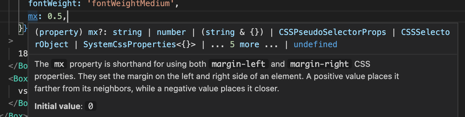
-
💅 Migrate the first core component to the v5 styling architecture (#23308) @mnajdova.
We have spent the last few months iterating on the new styling approach in the lab, and are confident enough in the new approach to move it to the core, so we have migrated the Slider. We will wait a week or two to collect feedback on it, before scaling it to the rest of the codebase. -
📅 Fix the first few issues on the date picker components since the migration in the lab.
-
And many more 🐛 bug fixes and 📚 improvements.
@material-ui/[email protected]
Breaking changes
-
[Slider] Migrate to emotion (#23308) @mnajdova
By default, emotion injects its style after JSS, this breaks the computed styles. In order to get the correct CSS injection order until all the components are migrated, you need to wrap the root of your application with:
import * as React from 'react';
import ReactDOM from 'react-dom';
import { StylesProvider } from '@material-ui/core';
import App from './App';

ReactDOM.render(
  <StylesProvider injectFirst>
    <App />
  </StylesProvider>,
  document.querySelector('#root'),
);
This enforces emotion being injected first. More details in the documentation.
-
[Autocomplete] Rename
closeIconprop withclearIconto avoid confusion (#23617) @akhilmhdh.-<Autocomplete closeIcon={icon} /> +<Autocomplete clearIcon={icon} /> -
[Dialog] Remove the
disableBackdropClickprop. It's redundant with thereasonargument (#23607) @eps1lon.<Dialog - disableBackdropClick - onClose={handleClose} + onClose={(event, reason) => { + if (reason !== 'backdropClick') { + onClose(event, reason); + } + }} /> -
[Modal] Remove the
disableBackdropClickprop. It's redundant with thereasonargument (#23607) @eps1lon.<Modal - disableBackdropClick - onClose={handleClose} + onClose={(event, reason) => { + if (reason !== 'backdropClick') { + onClose(event, reason); + } + }} /> -
[Modal] Remove the
onEscapeKeyDownprop. It's redundant with thereasonargument. (#23571) @eps1lon<Modal - onEscapeKeyDown={handleEscapeKeyDown} + onClose={(event, reason) => { + if (reason === "escapeKeyDown") { + handleEscapeKeyDown(event); + } + }} />;
Changes
- [CircularProgress][linearprogress] Change components from div to span (#23587) @bruno-azzi
- [Grid] Improve warning when a prop is missing (#23630) @udayRedI
- [Icon] Allow customizing the 'material-icons' base class name (#23613) @rart
- [Select] Fix focus() call on ref (#23302) @reedanders
- [Slider] Add test case for triggering a specific value (#23642) @Thehambalamba
- [Slider] General cleanup and add classes prop for unstyled (#23569) @mnajdova
- [styles] Add support for TypeScript 4.1 (#23633) @eps1lon
@material-ui/[email protected]
- [codemod] Add moved-lab-modules (#23588) @eps1lon
This codemod is part of our effort to make the migration from v4 to v5 as painless as possible.
@material-ui/[email protected]
- [Grid] Improve warning when a prop is missing (#23630) @udayRedI
@material-ui/[email protected]
- [system] Improve the
sxprop IntelliSense (#23599) @mnajdova
@material-ui/[email protected]
- [Slider] Replace core Slider with SliderStyled (#23308) @mnajdova
@material-ui/[email protected]
Breaking changes
-
[DatePicker] Change the import path of the date adapters (#23568) @eps1lon.
It better fits with the current import convention.-import AdapterDateFns from '@material-ui/lab/dateAdapter/date-fns'; +import AdapterDateFns from '@material-ui/lab/AdapterDateFns';
Changes
- [DatePicker] Add missing exports (#23621) @havgry
- [DatePicker] Add missing TypeScript definitions (#23560) @mbrookes
- [DatePicker] Fix false-positive when validating mask in Safari (#23602) @eps1lon
- [DatePicker] Fix missing manifest for typescript packages (#23564) @eps1lon
- [TimePicker] Prevent scroll when interacting with the clock (#23563) @knightss27
Docs
- [docs] Add advanced page for the system (#23596) @mnajdova
- [docs] Add docs for typography in system (#23510) @oliviertassinari
- [docs] API pages i18n (#23214) @mbrookes
- [docs] Create pickers migration guide (#23605) @dmtrKovalenko
- [docs] Enable TS language service for docs/src (#23576) @eps1lon
- [docs] Explain the information listed on the system properties page (#23566) @mnajdova
- [docs] Fix /api client-side routing (#23586) @eps1lon
- [docs] Fix the Box section title on migration-v4 guide (#23679) @claudioldf
- [docs] Generate default values for docs from the unstyled components (#23614) @mnajdova
- [docs] Increase printWidth from 80 to 85(#23512) @eps1lon
- [docs] Prevent layout jumps from img loading in system demo (#23504) @eps1lon
- [docs] Remove controlled Tooltip example in Slider (#23625) @micsidoruk
- [docs] Remove dead demos in the system basics page (#23565) @mnajdova
- [docs] Replace emotion-server packages with @emotion/server (#23557) @numToStr
- [docs] Sync translations (#23648) @l10nbot
Core
- [core] Add support for TypeScript 4.1 (#23633) @eps1lon
- [core] Batch small changes (#23554) @oliviertassinari
- [core] Cleanup emotion dependencies (#23556) @eps1lon
- [core] Fix formatting (#23567) @eps1lon
- [core] Fix tracked component size regression (#23516) @eps1lon
- [core] Fix transpilation target of UMD bundle (#23618) @eps1lon
- [test] Create chunks for Argos (#23518) @oliviertassinari
- [test] Debug argos-cli upload failures (#23623) @eps1lon
- [test] Enable experimental-timezone tests (#23595) @eps1lon
- [test] Misc visual regression flakiness improvements (#23619) @eps1lon
- [test] Use playwright instead of vrtest (#23500) @eps1lon
Nov 14, 2020
Big thanks to the 34 contributors who made this release possible. Here are some highlights ✨:
-
📅 Migrate the date picker to the lab (#22692) @dmtrKovalenko.
We have integrated the components with the code infrastructure. Next, we will migrate all the GitHub issues from material-ui-pickers and archive the repository. This migration will help provide first-class support for the date picker components. The component will stay in the lab as long as necessary to reach the high-quality bar we have for core components. You can find the new documentation here.While the source code is currently hosted in the main repository, we might move it to the x repository in the future, depending on what is easier for the commercial date range picker. The date picker will stay open source no matter what.
-
📚 Revamp the documentation for the system. The System contains CSS utilities. The documentation now promotes the use of the
sxprop. It's ideal for adding one-off styles, e.g. padding, but when pushed to its limits, it can be used to implement quickly a complete page. -
👩🎨 Upgrade emotion to v11 (#23007) @mnajdova.
-
And many more 🐛 bug fixes and 📚 improvements.
@material-ui/[email protected]
Breaking changes
-
[TextField] Change default variant from standard to outlined (#23503) @mbrookes
Standard has been removed from the Material Design guidelines. This codemod will automatically update your code.-<TextField value="Standard" /> -<TextField value="Outlined" variant="outlined" /> +<TextField value="Standard" variant="standard" /> +<TextField value="Outlined" /> -
[Autocomplete] Remove
debugin favor ofopenand dev tools (#23377) @eps1lon
There are a couple of simpler alternatives:open={true}, Chrome devtools "Emulate focused", or React devtools props.
Changes
- [Autocomplete] Use Popper when
disablePortal(#23263) @eps1lon - [Box] Better DX for deprecated props (#23285) @eps1lon
- [codemod] Add a codemod for the Box sx prop (#23465) @mbrookes
- [CssBaseline] Add dark mode scrollbar support (#23407) @mmmols
- [Slider] Extract slots as standalone components (#22893) @mnajdova
- [Stepper] Fix the icon prop support in StepLabel (#23408) @randyshoopman
- [theme] Add htmlFontSize to Typography interface (#23412) @fergusmcdonald
- [Tooltip] Fix PopperProps popper modifiers not being merged properly (#23421) @dominique-mueller
- [Tooltip] Long press select text on iOS (#23466) @hmaddisb
- [Tooltip] Unexpected behaviour onOpen/onClose (#23482) @brorlarsnicklas
@material-ui/[email protected]
- [DatePicker] Migrate to the lab #22692 @dmtrKovalenko
@material-ui/[email protected]
- [system] Add typography prop that will pull from theme.typography (#23451) @mnajdova
- [system] Create separate margin and padding functions (#23452) @mnajdova
- [system] Export styleFunctionSx and improve signature (#23397) @mnajdova
- [system] Merge breakpoints in correct order (#23380) @mnajdova
- [system] Remove css utility in favor of sx (#23454) @mnajdova
- [system] Warn for spacing when non integer value is used with theme.spacing array (#23460) @mnajdova
@material-ui/[email protected]
- [styled-engine] Upgrade emotion to 11 RC (#23007) @mnajdova
@material-ui/[email protected]
- [Slider] Extract slots as standalone components (#22893) @mnajdova
@material-ui/[email protected]
- [TextField] Change default variant from standard to outlined (#23503) @mbrookes
Docs
- [docs] Allow to host code in a different repo (#23390) @oliviertassinari
- [docs] CHANGELOG for v5.0.0-alpha.15 (#23383) @oliviertassinari
- [docs] Fix examples download URLs to match the correct branch name (#23467) @matchatype
- [docs] Fix links being opened when dismissing context menus (#23491) @eps1lon
- [docs] Fix the Netlify proxy for localization of X (#23387) @oliviertassinari
- [docs] Fix usage of palette.type instead of palette.mode in docs (#23414) @hubgit
- [docs] Improve documentation of the system (#23294) @mnajdova
- [docs] Improve feedback a11y (#23459) @eps1lon
- [docs] Improve formatting of the system (#23509) @oliviertassinari
- [docs] Improve migration guide for theme.palette (#23416) @hubgit
- [docs] Mention delay instead of transition twice (#23393) @benmneb
- [docs] Prepare Material-UI X (#1893) @oliviertassinari
- [docs] Redirect legacy GridList pages to ImageList (#23456) @eps1lon
- [docs] Remove redundant aria-label when wrapped in Tooltip (#23455) @eps1lon
- [docs] Sync translations (#23316) @l10nbot
- [docs] Update buildAPI script to handle the "styled" components (#23370) @mnajdova
- [docs] Update new components in the roadmap (#23507) @mbrookes
- [docs] Update translations (#23501) @l10nbot
Core
- [core] Batch small changes (#23422) @oliviertassinari
- [core] Fix skipped ignore patterns (#23474) @eps1lon
- [core] Switch to globby and fast-glob (#23382) @eps1lon
- [test] Increase timeout threshold for slow Firefox tests (#23463) @eps1lon
- [test] Make sure system properties are in the same order when generating CSS (#23388) @mnajdova
- [test] Prefer longhand properties (#23445) @eps1lon
- [test] Remove data-mui-test from tests (#23498) @eps1lon
- [test] Remove keyDown#force (#23488) @eps1lon
- [test] Use adapter instead of native Date (#23475) @eps1lon
- [test] Use fake timers in visual regression tests (#23464) @eps1lon
Nov 4, 2020
Big thanks to the 20 contributors who made this release possible. Here are some highlights ✨:
-
⚛️ Add support for React 17 (#23311) @eps1lon.
React 17 release is unusual because it doesn't add any new developer-facing features. It was released a couple of days ago. You can learn more about it in the introduction post. Material-UI now supports^16.8.0 || ^17.0.0. -
🛠 Introduce a new
@material-ui/unstyledpackage (#23270) @mnajdova.
This package will host the unstyled version of the components. In this first iteration, only the Slider is available. You can find it documented under the same page as the styled version.Why an unstyled package?
While engineering teams are successfully building custom design systems by wrapping Material-UI, we occasionally hear that Material Design or our styling solution are something they don't need. Some teams prefer SASS, others prefer to customize the components starting from a pristine state. What all these teams have in common is that they value the features coming from the components, such as accessibility.
The unstyled package goes one step down in the abstraction layer, providing more flexibility. Angular Material introduced this approach two years ago. Today their unstyled components account for 25% of the usage.
Another reason for introducing this package is to prepare the groundwork for a second theme (not Material Design based).
A note on the terminology: "unstyled" means that the components have the same API as the "styled" components but come without CSS. Material-UI also contains "headless" components that exposes a hook API, e.g. useAutocomplete or usePagination.
This change is part of our strategy to iterate on the v5 architecture with the
Sliderfirst. In the next alpha release, we plan to replace the v4 slider with the v5 slider. Once the new approach is stress-tested and validated, we will roll it out to all the components. -
And many more 🐛 bug fixes and 📚 improvements.
@material-ui/[email protected]
Breaking changes
-
[AppBar] Fix z-index when position="static" (#23325) @sujinleeme
Remove z-index when position static and relative -
[theme] Fix error message for augmentColor failure (#23371) @reedanders
The signature oftheme.palette.augmentColorhelper has changed:-theme.palette.augmentColor(red); +theme.palette.augmentColor({ color: red, name: 'brand' });
Changes
- [Autocomplete] Fix unclickable area between text input and endAdornment (#23229) @sujinleeme
- [Autocomplete] Follow Material Design State spec (#23323) @sujinleeme
- [Avatar] Fix usage of srcset property (#23286) @matheuspiment
- [ClickAwayListener] Fix mounting behavior in Portals in React 17 (#23315) @eps1lon
- [core] Allow React 17 (#23311) @eps1lon
- [Icon] Fix translation, e.g Google Translate (#23237) @cbeltrangomez84
- [LinearProgress] Fix Safari's bug during composition of different paint (#23293) @montogeek
- [Radio] Fix dot misalignment in Safari (#23239) @anasufana
- [styled-engine] Fix tagged template syntax with multiple expressions (#23269) @eps1lon
- [Table] Fix empty row logic when displaying all (#23280) @JoaoJesus94
- [Table] Fix handling of rowsPerPage={-1} (#23299) @JoaoJesus94
- [TextareaAutosize] Fix container with no intrinsic height (#23273) @sujinleeme
- [TextField] Fix disabled color in Safari (#23375) @Morteza-Jenabzadeh
- [theme] Fix spacing string arguments (#23224) @GuilleDF
- [Tooltip] Fix excess spacing (#23233) @benneq
@material-ui/[email protected]
- [unstyled] Create package and move SliderUnstyled there (#23270) @mnajdova
- [core] Allow React 17 (#23311) @eps1lon
@material-ui/[email protected]
- [lab] Migrate Timeline to TypeScript (#23242) @oliviertassinari
- [core] Allow React 17 (#23311) @eps1lon
@material-ui/[email protected]
- [core] Allow React 17 (#23311) @eps1lon
@material-ui/[email protected]
- [core] Allow React 17 (#23311) @eps1lon
@material-ui/[email protected]
- [core] Allow React 17 (#23311) @eps1lon
- [theme] Fix spacing string arguments (#23224) @GuilleDF
Docs
- [Transition] Document default appear value (#23221) @GuilleDF
- [blog] Danail Hadjiatanasov joins Material-UI (#23223) @oliviertassinari
- [docs] Add Material-UI Builder to in-house ads (#23342) @mbrookes
- [docs] Fix a few typos and add comma (#23284) @reedanders
- [docs] Fix few propTypes in Inputs (#23331) @youknowhat
- [docs] Fix language cookie (#23324) @mbrookes
- [docs] Fix typo in
README.md(#23329) @mtsknn - [docs] Guard against unknown value in userLanguage cookie (#23336) @mbrookes
- [docs] Make it clearer that custom router is supported (#23304) @Maxgit3
- [docs] Sync translations (#23080) @l10nbot
- [docs] Update homepage quotes (#23326) @mbrookes
- [docs] Update nav translations (#23234) @mbrookes
- [docs] Update system pages to use sx prop instead of deprecated Box props (#23368) @mnajdova
- [docs] Use present tense for bool prop descriptions (#23274) @mbrookes
Core
- [utils] Add all @material-ui/core/utils to @material-ui/utils (#23264) @mnajdova
- [core] Batch small changes (#23327) @oliviertassinari
- [core] Fix implicit transitive 'csstype' dependency (#23301) @quinnturner
- [core] Move material-ui-benchmark into benchmark/server (#23271) @eps1lon
- [core] Replace temp package with node built-ins (#23262) @eps1lon
- [core] Restrict top level imports that target CJS modules (#23159) @eps1lon
- [test] Fix unexpected console warn/error spy swallowing unrelated messages (#23312) @eps1lon
- [test] Fix various issues with the new cli on windows (#23381) @eps1lon
- [test] Improve test debugging (#23372) @eps1lon
- [test] Introduce experimental CLI (#23369) @eps1lon
- [test] Prevent growing call stack in custom keyDown/keyUp (#23321) @eps1lon
- [test] Run with Safari 13 (#23292) @eps1lon
Oct 23, 2020
Big thanks to the 23 contributors who made this release possible. Here are some highlights ✨:
-
💄 Introduce a new
sxprop (#23053, #23205) @mnajdova
We have resumed the work on Material-UI System. This is made possible by the latest progress on the new styling solution of v5.
You can read the introduction blog post that we did for the system two years ago.The system is meant to solve the following problems:
- Naming things is hard. How should a class name, JSS style rule, or styled component be named?
- Jumping between JS and CSS in the editor wastes time. This is particularly true as the complexity (LOCs/# of elements) of a component increases. It's still true when using the
styled()API. - Introducing a
makeStylesfor the first time in a component is daunting. For example, it's why this VS Code plugin exists. What if we had less code to type, gaining velocity when writing styles? - Pulling values out from the theme can be cumbersome. How can we make it less painful to increase the usage of design tokens?
This new iteration of the system brings two major improvements:
-
It moves from the support of a subset of CSS to the support of a superset of CSS.
Learning the shorthand is optional. It's no longer necessary to moving back to styled() when the system doesn't support a specific CSS property. -
It moves from support on Box only to any core component (starting with the slider).
import Slider from '@material-ui/lab/SliderStyled';

// Set the primary color and a vertical margin of 16px on desktop.
<Slider sx={{ color: 'primary.main', my: { xs: 0, md: 2 } }} />;
-
✨ Upgrade Popper.js from v1 to v2 (#21761) @joshwooding
The change reduces the bundle size (-1 kB gzipped) while fixing bugs at the same time. -
🐛 Fix broken nested imports with the icons package (#23157) @eps1lon
The revamp of the bundling strategy in #22814 has broken the nested imports.
Imports such as the one below should work again with this release:import CloseIcon from '@material-ui/icons/Close'; -
And many more 🐛 bug fixes and 📚 improvements.
@material-ui/[email protected]
Breaking changes
-
[Popper] Upgrade to popper.js to v2 (#21761) @joshwooding
This third-party library has introduced a lot of changes.
You can read their migration guide or the following summary:-
The CSS prefixes have changed:
popper: { zIndex: 1, - '&[x-placement*="bottom"] $arrow': { + '&[data-popper-placement*="bottom"] $arrow': { -
Method names have changed.
-popperRef.current.scheduleUpdate()
+popperRef.current.update()
-popperRef.current.update() +popperRef.current.forceUpdate() -
Modifiers' API has changed a lot. There are too many changes to be covered here.
-
-
[withMobileDialog] Remove this higher-order component (#23202) @RDIL
The hook API allows a simpler and more flexible solution than the HOC:-import withMobileDialog from '@material-ui/core/withMobileDialog'; +import { useTheme, useMediaQuery } from '@material-ui/core'; function ResponsiveDialog(props) { - const { fullScreen } = props; + const theme = useTheme(); + const fullScreen = useMediaQuery(theme.breakpoints.down('sm')); const [open, setOpen] = React.useState(false); // ... -export default withMobileDialog()(ResponsiveDialog); +export default ResponsiveDialog;
Changes
- [Box] Add sx prop (#23053) @mnajdova
- [Box] Deprecate system props (#23206) @mnajdova
- [Card] Use flex display for CardHeader.avatar (#23169) @mordechaim
- [Container] Fix support of custom breakpoint units (#23191) @espipj
- [Container] Revert max-width change for xs @oliviertassinari
- [InputBase] Use ref prop instead of inputRef prop on input component (#23174) @GuilleDF
- [l10n] Add Kazakh (kz-KZ) locale (#23195) @abdulgafur24
- [Rating] Ensure hover and click are in sync (#23117) @redbmk
- [Select] Fix SelectDisplayProps className concat (#23211) @reedanders
@material-ui/[email protected]
- [styled] Add @babel/runtime dependency (#23175) @koistya
@material-ui/[email protected]
- [Box] Add sx prop (#23053) @mnajdova
- [core] Fix bundles for packages without subpackages (#23157) @eps1lon
@material-ui/[email protected]
- [core] Fix bundles for packages without subpackages (#23157) @eps1lon
@material-ui/[email protected]
Breaking changes
-
[AvatarGroup] Move from lab to core (#23121) @mbrookes
Move the component from the lab to the core. This component will become stable.-import AvatarGroup from '@material-ui/lab/AvatarGroup'; +import AvatarGroup from '@material-ui/core/AvatarGroup';
Changes
- [Slider] Add sx prop in SliderStyled (#23205) @mnajdova
@material-ui/[email protected]
- [utils] Fix types of chainPropTypes (#23123) @oliviertassinari
- [core] Fix bundles for packages without subpackages (#23157) @eps1lon
@material-ui/[email protected]
- [types] Add LICENSE files (#23162) @lielfr
Docs
- [examples] Remove reason example project (#23158) @mnajdova
- [examples] Update cdn example to use @material-ui/core@next (#23153) @mnajdova
- [examples] Update preact to use the @material-ui/core@next (#23154) @mnajdova
- [examples] Update ssr example to use @material-ui/core@next (#23155) @mnajdova
- [examples] Updated nextjs-typescript example to use @material-ui/core@next (#23119) @numToStr
- [docs] Add Menu component example with explicit positioning prop values (#23167) @jaebradley
- [docs] Add page feedback (#22885) @mbrookes
- [docs] Add Performance section for Modal (#23168) @jaebradley
- [docs] Better document CardActionArea (#23196) @el1f
- [docs] Cleaner image of font-size equation (#23189) @CamDavidsonPilon
- [docs] Fix casing typo (#23148) @piperchester
- [docs] Fix typo in steppers (#23163) @AGDholo
- [docs] Fix typo on interoperability page (#23177) @SassNinja
- [docs] Improve migration v5 guide @oliviertassinari
- [docs] Lazy load demo toolbar (#23108) @eps1lon
- [docs] Remove unused style selectors
extendedIcon(#23160) @MatejKastak - [docs] Use Box sx prop on all Slider examples #23217 @mnajdova
Core
- [benchmark] Add theme-ui and chakra-ui Box scenarios (#23180) @mnajdova
- [benchmark] Create separate workspace (#23209) @eps1lon
- [benchmark] Extracted Profiler & added output in readme (#23178) @mnajdova
- [core] Batch small changes (#23116) @oliviertassinari
- [core] Improve bundle size comment (#23110) @eps1lon
- [core] Prevent unstable chunks in size snapshot (#23181) @eps1lon
Oct 17, 2020
Big thanks to the 25 contributors who made this release possible.
Here are some highlights ✨:
-
📦 Ship modern bundle (#22814) @eps1lon.
This is a significant update to the browsers supported by Material-UI.
The previous policy was defined 2 years ago, and the landscape has evolved since then. The package now includes 4 bundles:-
stable(default, formerlyesm) which targets a snapshot (on release) of> 0.5%, last 2 versions, Firefox ESR, not dead, not IE 11" -
node(formerly default) which targets a snapshot (on release) ofmaintained node versions -
legacy(new) which isstable+ IE11 -
modern(formerlyes) which targets the last 1 version of evergreen browsers and active node (currently that is 14
The change yields a 6% reduction in bundle size 📦 (Babel only).
In the coming weeks, we will refactor the internals to take advantage of the new browser capabilities that dropping these older platforms allows. For instance, we might be able to remove the span we render inside the<Button>to work around Flexbug #9.Check the updated Supported platforms documentation and new "minimizing bundle size" guide.
If you target IE11, you need to use the new bundle (
legacy). We are treating IE11 as a second class-citizen, which is a continuation of the direction taken in #22873. -
-
🚀 Improve the internal benchmark suite (#22923, #23058) @mnajdova.
This was a prerequisite step to improve the system. We needed to be able to measure performance. After #22945, we have measured that theBoxcomponent is x3 faster in v5-alpha compared to v4. -
✏️ A new blog post: Q3 2020 Update (#23055) @oliviertassinari.
-
🐙 Migrate more tests to react-testing-library @deiga, @Morteza-Jenabzadeh, @nicholas-l.
-
And many more 🐛 bug fixes and 📚 improvements.
@material-ui/[email protected]
Breaking changes
- [core] Ship modern bundle (#22814) @eps1lon
Change
- [Autocomplete] Fix autoHighlight synchronization (#23025) @Tubaleviao
- [Autocomplete] Ignore keydown event until IME is confirmed (#23050) @jiggum
- [Card] Fix action area hover style on touch devices (#23079) @giulianovarriale
- [Slider] Align value label text center (#23075) @LorenzHenk
- [SwipeableDrawer] Decorrelate swipeAreaWidth and initial jumping amount (#23042) @omidtajik
- [Tooltip] Fix followCursor preventing onMouseMove on children (#23104) @eps1lon
- [Tooltip] Refactor event handling (#23092) @eps1lon
- [theme] Add missing types for theme overrides (#23028) @povilass
- [l10n] Add Arabic (ar_EG) locale (#23006) @GoldenWings
@material-ui/[email protected]
- [TreeView] Fix bundle size link and refactor array spreads (#22992) @joshwooding
- [TreeView] Fix
alphacolor utility instead of deprecatedfade(#22978) @joshwooding - [core] Ship modern bundle (#22814) @eps1lon
@material-ui/[email protected]
- [core] Ship modern bundle (#22814) @eps1lon
@material-ui/[email protected]
- [core] Ship modern bundle (#22814) @eps1lon
@material-ui/[email protected]
- [core] Ship modern bundle (#22814) @eps1lon
@material-ui/[email protected]
- [core] Ship modern bundle (#22814) @eps1lon
@material-ui/[email protected]
- [core] Ship modern bundle (#22814) @eps1lon
@material-ui/[email protected]
- [core] Ship modern bundle (#22814) @eps1lon
Docs
- [blog] Allow to support card preview (#23087) @oliviertassinari
- [blog] Q3 2020 Update (#23055) @oliviertassinari
- [docs] Add a new demo to the showcase (#22949) @adonig
- [docs] Add demo for Link underline (#23074) @LorenzHenk
- [docs] Add logarithmic slider demo (#23076) @LorenzHenk
- [docs] Add react-admin in related projects page (#23097) @fzaninotto
- [docs] Change color to palette (#23046) @mockingjet
- [docs] Don't suggest putting a Switch inside a ListItemSecondaryAction (#23018) @sirlantis
- [docs] Fix docs:dev (#23023) @eps1lon
- [docs] Fix vertical alignment of Slider demo (#23059) @r0zar
- [docs] Fix wrong variable characters (#23066) @AGDholo
- [docs] Improve docs for Table sticky column grouping (#23100) @andre-silva-14
- [docs] Improve icon preview color contrast (#22974) @oliviertassinari
- [docs] Interoperability guide updates (#23030) @mnajdova
- [docs] Move outdated versions into a collapsible section (#23029) @NoNamePro0
- [docs] Point to material-ui-x/next instead of master @oliviertassinari
- [docs] Restore ButtonBases images (#23083) @eps1lon
- [docs] Slider demos clean up (#22964) @mnajdova
- [docs] Sync translations (#22888) @l10nbot
- [examples] Update gatsby example to use @material-ui/* next (#23089) @mnajdova
- [examples] Update gatsby-theme example to use @material-ui/* next #23093 @mnajdova
- [examples] Update nextjs example project to use @material-ui/* next (#23094) @mnajdova
Core
- [benchmark] Add browser benchmark (#22923) @mnajdova
- [benchmark] Fix benchmark scripts & moved scenarios to correct benchmark project (#23058) @mnajdova
- [test] Enable failing unexpected console warn|error in browser tests (#23063) @eps1lon
- [test] Fail each test on unexpected console logs in test:unit (#23064) @eps1lon
- [test] Introduce toHaveInlineStyle and toHaveComputedStyle matcher (#23054) @eps1lon
- [test] Migrate ButtonBase to react-testing-library (#23011) @deiga
- [test] Migrate IconButton to react-testing-library (#22972) @Morteza-Jenabzadeh
- [test] Migrate InputBase to react-testing-library (#23014) @deiga
- [test] Migrate SpeedDial to react-testing-library (#23021) @nicholas-l
- [test] Migrate TableCell to react-testing-library (#23095) @nicholas-l
- [test] Migrate TableRow to react-testing-library (#23105) @deiga
- [test] Move some work out of evaluation phase (#23112) @eps1lon
- [test] Supress 404 img warnings in browser tests (#23106) @eps1lon
- [test] Throw on console.(error|warn) outside of test (#22907) @eps1lon
- [test] Use dot reporter in CI (#23026) @eps1lon
- [core] Add support for iOS Safari 12 (#23068) @eps1lon
- [core] Also format dot files & folders (#22975) @oliviertassinari
- [core] Extend yarn size:why (#22979) @eps1lon
- [core] Fix react-next test (#23027) @oliviertassinari
- [core] Lint CSS (#22976) @oliviertassinari
- [core] Misc modules/* cleanup (#22983) @eps1lon
Oct 11, 2020
Big thanks to the 45 contributors who made this release possible.
Here are some highlights ✨:
- 🧪 The promotion of 4 components from the lab to core: Autocomplete, Pagination, SpeedDial, and ToggleButton. These components have been in the lab for more than 10 months @mbrookes.
- 📦 Switch the style engine of the
Boxcomponent from JSS to @material-ui/styled-engine (use emotion by default) (#22945) @mnajdova.
The early benchmark we have run shows that performance has improved. We will share more detailed results in #21657. - 🐙 Migrate a large portion of the tests from enzyme to react-testing-library @eladmotola, @baterson, @bewong89, @devrasec, @guillermaster, @itamar244, @jeferson-sb, @The24thDS.
Last month, react-testing-library had more downloads than enzyme in the ecosystem! - 🏷 Add support for tooltips following the cursor (#22876) @xtrixia.
- And many more 🐛 bug fixes and 📚 improvements.
@material-ui/[email protected]
Breaking changes
-
[Accordion] Remove
display:flexfrom AccordionDetails (#22809) @croraf
The style was too opinionated. Most developers expectdisplay: block. -
[Accordion] Replace IconButton wrapper with div (#22817) @croraf
Remove IconButtonProps prop from AccordionSummary.
The component renders a<div>element instead of an IconButton.
The prop is no longer relevant. -
[Box] Add mui styled usage (#22945) @mnajdova
Change the style-engine powering the Box component from JSS to the style engine adatper (emotion by default). -
[CircularProgress] Drop IE11 wobbly workaround (#22873) @suliskh
The IE11 workaround is harming performance on the latest browsers.
This change is part of a best-effort strategy to keep IE11 support.
We are degrading the UX and DX with IE11 where we can improve the components on modern browsers. -
[Table] Rename onChangeRowsPerPage and onChangePage (#22900) @eladmotola
The change was done to match the API convention.<TablePagination - onChangeRowsPerPage={()=>{}} - onChangePage={()=>{}} + onRowsPerPageChange={()=>{}} + onPageChange={()=>{}} -
[theme] Rename fade to alpha (#22834) @mnajdova
Better describe its functionality. The previous name was leading to confusion when the input color already had an alpha value. The helper overrides the alpha value of the color.- import { fade } from '@material-ui/core/styles'; + import { alpha } from '@material-ui/core/styles'; const classes = makeStyles(theme => ({ - backgroundColor: fade(theme.palette.primary.main, theme.palette.action.selectedOpacity), + backgroundColor: alpha(theme.palette.primary.main, theme.palette.action.selectedOpacity), })); -
[Tooltip] Make
interactivedefault (#22382) @eps1lon
The previous default behavior failed success criterion 1.4.3 ("hoverable") in WCAG 2.1.
To reflect the new default value, the prop was renamed todisableInteractive.
If you want to restore the old behavior (thus not reaching level AA), you can apply the following diff:-<Tooltip> +<Tooltip disableInteractive> # Interactive tooltips no longer need the `interactive` prop. -<Tooltip interactive> +<Tooltip>
Changes
- [Accordion] Remove incorrect demo which nests input in button (#22898) @croraf
- [Autocomplete] Fix filtering when value is already selected (#22935) @montelius
- [Autocomplete] Fix virtualization example in IE11 (#22940) @bearfromtheabyss
- [Autocomplete] Restrict component props in
renderInput(#22789) @eps1lon - [Box] Add types for
ref(#22927) @lcswillems - [Button] Fix invalid type value (#22883) @oliviertassinari
- [Button] Improve loading transition (#22884) @oliviertassinari
- [Grid] Clarify document about direction column limitation (#22871) @ThewBear
- [IconButton] Improve warning against non root onClick listeners (#22821) @pranjanpr
- [Popper] Use placement viewport instead of window (#22748) @maksimgm
- [Select] Add generic support for value (#22839) @AntoineGrandchamp
- [Skeleton] Fix importing with named export (#22879) @0prodigy
- [SpeedDial] Fix keyboard navigation when uncontrolled (#22826) @akharkhonov
- [styled] Specify emotion & styled-components as optional peer dependencies (#22808) @mnajdova
- [styled] Support default theme when none is available (#22791) @mnajdova
- [Tabs] Fix RTL scrollbar with Chrome 85 (#22830) @ankit
- [TextField] Pass minRows to InputComponent (#22831) @suliskh
- [ToggleButton] Fix vertical double border (#22825) @Avi98
- [ToggleButton] Match ToggleButtonGroup name and render function name (#22790) @jjoselv
- [Tooltip] Add placement
followCursor(#22876) @xtrixia - [Tooltip] Improve docs and warning for custom children (#22775) @brorlarsnicklas
- [Tooltip] Use label semantics (#22729) @eps1lon
- [useAutocomplete] Fix getXProps functions type (#22749) @kentaro84207
@material-ui/[email protected]
- [styled] Support default theme when none is available (#22791) @mnajdova
@material-ui/[email protected]
Breaking changes
-
[Autocomplete] Move from lab to core (#22715) @mbrookes
Move the component from the lab to the core. This component will become stable.-import Autocomplete from '@material-ui/lab/Autocomplete'; -import useAutocomplete from '@material-ui/lab/useAutocomplete'; +import Autocomplete from '@material-ui/core/Autocomplete'; +import useAutocomplete from '@material-ui/core/useAutocomplete'; -
[Pagination] Move from lab to core (#22848) @mbrookes
Move the component from the lab to the core. This component will become stable.-import Pagination from '@material-ui/lab/Pagination'; -import PaginationItem from '@material-ui/lab/PaginationItem'; -import { usePagination } from '@material-ui/lab/Pagination'; +import Pagination from '@material-ui/core/Pagination'; +import PaginationItem from '@material-ui/core/PaginationItem'; +import usePagination from '@material-ui/core/usePagination'; -
[SpeedDial] Move from lab to core (#22743) @mbrookes
Move the component from the lab to the core. This component will become stable.-import SpeedDial from '@material-ui/lab/SpeedDial'; -import SpeedDialAction from '@material-ui/lab/SpeedDialAction'; -import SpeedDialIcon from '@material-ui/lab/SpeedDialIcon'; +import SpeedDial from '@material-ui/core/SpeedDial'; +import SpeedDialAction from '@material-ui/core/SpeedDialAction'; +import SpeedDialIcon from '@material-ui/core/SpeedDialIcon'; -
[ToggleButton] Move from lab to core (#22784) @mbrookes
Move the component from the lab to the core. This component will become stable.-import ToggleButton from '@material-ui/lab/ToggleButton'; -import ToggleButtonGroup from '@material-ui/lab/ToggleButtonGroup'; +import ToggleButton from '@material-ui/core/ToggleButton'; +import ToggleButtonGroup from '@material-ui/core/ToggleButtonGroup'; -
[TreeView] Improve customization of tree item (#22846) @joshwooding
RemoveonLabelClickandonIconClick.
Changes
- [AvatarGroup] Add variant prop (#22832) @hjades
- [SliderStyled] Fix mark label alignment on coarse pointer devices (#22849) @joshwooding
Docs
- [docs] Add example for using styled-components as styled-engine (#22788) @mnajdova
- [docs] Add longhand system API props to docs (#22796) @possibilities
- [docs] Box & system cleanup (#22962) @mnajdova
- [docs] CONTRIBUTING.md only yarn is supported (#22754) @Yashvirani
- [docs] Document createSvgIcon() (#22843) @mbrookes
- [docs] Document inherited props (#22318) @oliviertassinari
- [docs] Document LoadingButton behavior (#22878) @eps1lon
- [docs] Fix dark theme for input field on autocomplete (#22711) @GauravKesarwani
- [docs] Fix material icon search details view (#22793) @skr571999
- [docs] Fix type vs. mode and capitalization of createMuiTheme (#22844) @joshwooding
- [docs] Fix typo in guides/typescript (#22806) @croraf
- [docs] Fix various typos (#22842) @kkirsche
- [docs] For non-SSR language, internal search fall back to English (#22902) @bicstone
- [docs] Improve CRA example (#22967) @spursbyte
- [docs] Improve FormControl duplication warning (#22823) @talgautb
- [docs] Improve perf when opening the drawer (#22781) @eps1lon
- [docs] Improve SEO on titles (#22742) @oliviertassinari
- [docs] Improve the left side-nav (#22780) @oliviertassinari
- [docs] Include peer deps in installation steps (#22889) @numToStr
- [docs] Link all the examples in docs (#22891) @Avi98
- [docs] More robust description matcher (#22836) @eps1lon
- [docs] Reduce risk of 404 when changing the default branch (#22801) @eps1lon
- [docs] Resolve .tsx first (#22315) @oliviertassinari
- [docs] Simplify locales example (#22747) @mbrookes
- [docs] Sync translations (#22752, #22851) @l10nbot
- [docs] Update installation guide to contain peer dependencies (#22787) @mnajdova
- [docs] Update ToggleButton import (#22971) @mbrookes
- [docs] Use demo name as codesandbox name (#22926) @eps1lon
Core
- [benchmark] Add cross-env to fix window run issue (#22895) @mnajdova
- [core] Batch small changes (#22746) @oliviertassinari
- [core] Batch small changes (#22847) @oliviertassinari
- [core] Drop babel-plugin-transform-dev-warning (#22802) @eps1lon
- [core] Misc dependency fixes (#22909) @eps1lon
- [test] Apply lazy forwardRef fix (#22904) @eps1lon
- [test] Autocomplete drop "defaultProps" pattern (#22896) @eps1lon
- [test] Fix react-next patch (#22800) @eps1lon
- [test] Migrate Accordion to react-testing-library (#22952) @bewong89
- [test] Migrate Backdrop to react-testing-library (#22931) @itamar244
- [test] Migrate Container to react-testing-library (#22919) @eladmotola
- [test] Migrate CssBaseline to react-testing-library (#22920) @eladmotola
- [test] Migrate Fab to react-testing-library (#22959) @The24thDS
- [test] Migrate Fade to react-testing-library (#22918) @eladmotola
- [test] Migrate Grow to react-testing-library (#22917) @eladmotola
- [test] Migrate List to react-testing-library (#22929) @eladmotola
- [test] Migrate MenuList and ImageListItem to react-testing-library (#22958) @eladmotola
- [test] Migrate MobileStepper to react-testing-library (#22963) @devrasec
- [test] Migrate more components to react-testing-library (#22872) @baterson
- [test] Migrate more components to react-testing-library (#22874) @baterson
- [test] Migrate more components to react-testing-library (#22892) @baterson
- [test] Migrate NativeSelect to react-testing-library (#22970) @guillermaster
- [test] Migrate NativeSelectInput to react-testing-library (#22910) @baterson
- [test] Migrate RadioGroup to react-testing-library (#22953) @eladmotola
- [test] Migrate Slide to react-testing-library (#22913) @eladmotola
- [test] Migrate SpeedDialIcon to react-testing-library (#22965) @jeferson-sb
- [test] Migrate TabIndicator to react-testing-library (#22906) @eladmotola
- [test] Migrate TextField to react-testing-library (#22944) @The24thDS
- [test] Migrate useTheme,withTheme to react-testing-library (#22928) @eladmotola
- [test] Migrate Zoom to react-testing-library (#22914) @eladmotola
- [test] Prevent nextjs build cache to grow indefinitely (#22948) @eps1lon
- [test] Simplify usage of
yarn mocha(#22899) @eps1lon - [test] Solve 2000ms timeout (#22778) @oliviertassinari
- [test] Update react next patch (#22890) @eps1lon
- [test] Use appropriate templates for csb CI (#22943) @eps1lon
- [test] Verbose reporter in CI (#22924) @eps1lon
Sep 26, 2020
Big thanks to the 29 contributors who made this release possible.
Here are some highlights ✨:
-
👩🎨 A first iteration on the new styling solution. @mnajdova
You can find a new version of the slider in the lab powered by emotion.
In the event that you are already using styled-components in your application, you can swap emotion for styled-components 💅. Check this CodeSandbox for a demo. It relies on aliases to prevent any bundle size overhead.
The new styling solution saves 2kB gzipped in the bundle compared to JSS, and about 14 kB gzipped if you were already using emotion or styled-components.
Last but not least, the change allows us to take advantage of dynamic style props. We will use them for dynamic color props, variant props, and new style props (an improved system).
This change has been in our roadmap for more than a year.
We announced it in the v4 release blog post as a direction v5 would take. -
🛠 A first iteration on the unstyled components. @mnajdova
You can find a new version of the slider in the lab without any styles.
The unstyled component weighs 6.5 kB gzipped, compared with 26 kB for the styled version when used standalone. The component is best suited for use when you want to fully customize the look of the component without reimplementing the JavaScript and accessibility logic. -
⚡️ A first alpha of the DataGrid component. @dtassone
It has taken 6 months of development since the initial commit (March 15th, 2020) to make the first alpha release of the grid. The component comes in two versions:
@material-ui/data-grid is licensed under MIT, while @material-ui/x-grid is licensed under a commercial license. -
🪓 Keep working on the breaking changes. @mbrookes
We aim to complete most of the breaking changes during the alpha stage of v5.
We will move to beta once all the breaking changes we have anticipated are handled.
As always, you should find a clear and simple upgrade path for each of them.
You can learn more about the breaking changes left to be done in #22700. -
And many more 🐛 bug fixes and 📚 improvements.
@material-ui/[email protected]
Breaking changes
-
[Chip] Rename
defaultvariant tofilled(#22683) @mnajdova
Renamedefaultvariant tofilledfor consistency.-<Chip variant="default"> +<Chip variant="filled"> -
[Tabs] Add allowScrollButtonsMobile prop for mobile view (#22700) @GauravKesarwani
The API that controls the scroll buttons has been split it into two props:- The
scrollButtonsprop controls when the scroll buttons are displayed depending on the space available. - The
allowScrollButtonsMobileprop removes the CSS media query that systematically hides the scroll buttons on mobile.
-<Tabs scrollButtons="on" /> -<Tabs scrollButtons="desktop" /> -<Tabs scrollButtons="off" /> +<Tabs scrollButtons allowScrollButtonsMobile /> +<Tabs scrollButtons /> +<Tabs scrollButtons={false} /> - The
-
[theme] Improve breakpoints definitions (#22695) @mnajdova
Breakpoints are now treated as values instead of ranges.
The behavior ofdown(key)was changed to define media query less than the value defined with the corresponding breakpoint (exclusive).
The behavior ofbetween(start, end)was also updated to define media query for the values between the actual values of start (inclusive) and end (exclusive).Find examples of the changes required defined below:
-theme.breakpoints.down('sm') // '@media (max-width:959.95px)' - [0, sm + 1) => [0, md)
+theme.breakpoints.down('md') // '@media (max-width:959.95px)' - [0, md)
-theme.breakpoints.between('sm', 'md') // '@media (min-width:600px) and (max-width:1279.95px)' - [sm, md + 1) => [sm, lg)
+theme.breakpoints.between('sm', 'lg') // '@media (min-width:600px) and (max-width:1279.95px)' - [sm, lg)
-
[theme] Rename
typetomode(#22687) @mnajdova
Renamestheme.palette.typetotheme.palette.mode, to better follow the "dark mode" term that is usually used for describing this feature.import { createMuiTheme } from '@material-ui/core/styles'; -const theme = createMuitheme({palette: { type: 'dark' }}), +const theme = createMuitheme({palette: { mode: 'dark' }}),The changes are supported by the
adaptV4Theme()for easing the migration
Changes
- [Checkbox] Improve indeterminate UI (#22635) @oliviertassinari
- [Chip] Fix prop-type support for custom variants (#22603) @cansin
- [icons] Expose a data-test-id attribute on all svg icons (#22634) @jaebradley
- [Rating] Add form integration test suite (#22573) @eps1lon
- [Rating] Simpler customization of active "no value" styles (#22613) @eps1lon
- [Rating] Treat as input when readOnly (#22606) @eps1lon
- [Rating] Treat read-only as image (#22639) @eps1lon
- [Select] Improve docs for displayEmpty prop (#22601) @mihaipanait
- [Slider] Better tracking of mouse events (#22557, #22638) @chrisinajar, @oliviertassinari
- [Slider] Create unstyled version and migrate to emotion & styled-components (#22435) @mnajdova
- [Slider] Export components from lab and renamed to fit file names (#22723) @mnajdova
- [Slider] Fix value label display for custom value component (#22614) @NoNonsense126
- [Stepper] Add slight transition (#22654) @xtrixia
- [Tabs] Fix TabScrollButton using absolute path (#22690) @4vanger
- [Tabs] Only scroll the visible tabs (#22600) @quochuy
- [theme] convertLength does not work for fromUnit !== 'px' (#22739) @brorlarsnicklas
- [theme] Fix createSpacing.d.ts definition (#22645) @dabretin
- [theme] Fix Hidden breakpoints issues and updates the migration guide (#22702) @mnajdova
@material-ui/[email protected]
Breaking changes
-
[Alert] Move from lab to core (#22651) @mbrookes
Move the component from the lab to the core. This component will become stable.-import Alert from '@material-ui/lab/Alert'; -import AlertTitle from '@material-ui/lab/AlertTitle'; +import Alert from '@material-ui/core/Alert'; +import AlertTitle from '@material-ui/core/AlertTitle'; -
[Rating] Move from lab to core (#22725) @mbrookes
Move the component from the lab to the core. This component will become stable.-import Rating from '@material-ui/lab/Rating'; +import Rating from '@material-ui/core/Rating'; -
[Skeleton] Move from lab to core (#22740) @mbrookes
Move the component from the lab to the core. This component will become stable.-import Skeleton from '@material-ui/lab/Skeleton'; +import Skeleton from '@material-ui/core/Skeleton'; -
[Autocomplete] Get root elements of options via renderOption (#22591) @ImanMahmoudinasab
After this change, the full DOM structure of the option is exposed.
It makes customizations easier.
You can recover from the change with:<Autocomplete - renderOption={(option, { selected }) => ( - <React.Fragment> + renderOption={(props, option, { selected }) => ( + <li {...props}> <Checkbox icon={icon} checkedIcon={checkedIcon} style={{ marginRight: 8 }} checked={selected} /> {option.title} - </React.Fragment> + </li> )} />
Changes
- [lab] Fix transitive dependencies in @material-ui/lab (#22671) @koistya
- [Autocomplete] Add "remove-option" to AutocompleteCloseReason type (#22672) @iansjk
- [Autocomplete] Don't close popup when Ctrl/Meta is pressed (#22696) @montelius
- [Autocomplete] Fix accessibility issue with empty option set (#22712) @tylerjlawson
- [Autocomplete] Update GitHub customization example (#22735) @hmaddisb
@material-ui/[email protected]
The new default style engine leveraging emotion.
@material-ui/[email protected]
Allows developer to swap emotion with styled-components.
More documentation are coming.
@material-ui/[email protected]
- [icons] Synchronize with Google (#22680) @delewis13
@material-ui/[email protected]
- [Slider] Create unstyled version and migrate to emotion & styled-components (#22435) @mnajdova
@material-ui/[email protected]
- [core] Port createSpacing to TypeScript (#22720) @eps1lon
Docs
- [blog] New posts (#22607) @oliviertassinari
- [docs] Add additional context to Autocomplete asynchronous documentation (#22621) @jaebradley
- [docs] Add emotion dependencies in codesandbox examples (#22736) @mnajdova
- [docs] Add props from Unstyled component to Styled API page (#22733) @mnajdova
- [docs] Add ui-schema in related projects (#22644) @elbakerino
- [docs] Avoid confusion between layout grid and data grid (#22681) @oliviertassinari
- [docs] Batch small changes (#22646) @oliviertassinari
- [docs] Configuring redirects for MUI X (#22632) @dtassone
- [docs] Customized hook at Autocomplete issue in dark mode (#22605) @hmaddisb
- [docs] Encourage DataGrid in /components/tables/ over alternatives (#22637) @oliviertassinari
- [docs] Fix emotion broken in SSR (#22731) @mnajdova
- [docs] Fix markdown metadata yaml (#22629) @oliviertassinari
- [docs] Fix static asset loading with X @oliviertassinari
- [docs] Improve Dashboard template (#22647) @pak1989
- [docs] Improve DX for docs generation (#22619) @eps1lon
- [docs] Migrate templates to TypeScript (#22650) @oliviertassinari
- [docs] New Crowdin updates (#22620) @mbrookes
- [docs] Prevent toolbar tooltips overlapping demos (#22732) @eps1lon
- [docs] Reduce indirections (#22642) @Arsikod
- [docs] Reference experimental slider demos correctly (#22738) @eps1lon
- [docs] Remove minimum-scale from meta viewport in docs (#22724) @barik
- [docs] Remove wrong migration instruction (#22710) @oliviertassinari
- [docs] Use codesandbox deploy for demos created from deploy previews (#22616) @eps1lon
Core
- [core] Port createSpacing to TypeScript (#22720) @eps1lon
- [core] Replace ChangeEvent<{}> with SyntheticEvent (#22716) @eps1lon
- [core] Use ttp sources directly (#22706) @eps1lon
- [test] Add skip ci to Crowdin commit message (#22685) @mbrookes
- [test] Only run on push for master/next (#22624) @eps1lon
- [test] Run CircleCI anytime (#22676) @eps1lon
Sep 15, 2020
Big thanks to the 16 contributors who made this release possible.
Here are some highlights ✨:
- Keep working on the breaking changes before v5-beta.
As always, you should find a clear and simple upgrade path for each of them. - And many more 🐛 bug fixes and 📚 improvements.
@material-ui/[email protected]
Breaking changes
-
[Accordion] Normalize focusVisible logic (#22567) @oliviertassinari
RenamefocusedtofocusVisiblefor consistency with the other components:<Accordion classes={{ - focused: 'custom-focus-visible-classname', + focusVisible: 'custom-focus-visible-classname', }} /> -
[Stepper] Remove Paper and built-in padding (#22564) @mbrookes
The root component (Paper) was replaced with a<div>. Stepper no longer has elevation, nor inherits Paper's props. This change is meant to encourage composition.-<Stepper elevation={2}> - <Step> - <StepLabel>Hello world</StepLabel> - </Step> -</Stepper> +<Paper square elevation={2}> + <Stepper> + <Step> + <StepLabel>Hello world</StepLabel> + </Step> + </Stepper> +<Paper>Remove the built-in 24px padding for consistency with the other components that avoid reserving space anytime it's possible.
-<Stepper> - <Step> - <StepLabel>Hello world</StepLabel> - </Step> -</Stepper> +<Stepper style={{ padding: 24 }}> + <Step> + <StepLabel>Hello world</StepLabel> + </Step> +</Stepper> -
[theme] Always return default spacing value with px units (#22552) @mbrookes
theme.spacingnow returns single values with px units by default.
This change improves the integration with styled-components & emotion (with the CSS template strings syntax).Before:
theme.spacing(2) => 16After:
theme.spacing(2) => '16px'You can restore the previous behavior with:
-const theme = createMuiTheme(); +const theme = createMuiTheme({ + spacing: x => x * 8, +}); -
[theme] Remove palette.text.hint key (#22537) @mbrookes
The
theme.palette.text.hintkey was available but unused in Material-UI v4 components.
You can useadaptV4Theme()to restore the previous behavior.
Changes
- [BottomNavigation] onClick does not fire if tapped while scrolling (#22524) @EliasJorgensen
- [Button] Remove dead code (#22566) @oliviertassinari
- [Chip] Fix focus visible style (#22430) @alexmotoc
- [ImageList] Refactor using CSS grid & React context (#22395) @mbrookes
- [Slider] Improve integration with form libraries (#22548) @NoNonsense126
- [StepIcon] Add className in render SvgIcon (#22559) @ZouYouShun
- [SwipeableDrawer] Avoid blocking events (#22525) @JadRizk
- [theme] Support spacing and border radius with CSS unit (#22530) @madmanwithabike
- [theme] Fix theme object global leak (#22517) @eps1lon
- [theme] Increase usage of the disabled design tokens (#22570) @LorenzHenk
@material-ui/[email protected]
Breaking changes
-
[Rating] Use different shape for empty and filled icons (#22554) @oliviertassinari
Change the default empty icon to improve accessibility (1.4.1 WCAG 2.1).
If you have a customiconprop but noemptyIconprop, you can restore the previous behavior with:<Rating icon={customIcon} + emptyIcon={null} />
Changes
- [Autocomplete] Improve TypeScript in the Google Maps demo (#22555) @L-U-C-K-Y
- [Rating] Explain some styles in code comments (#22571) @eps1lon
Docs
- [docs] Improve Font Awesome integration (#22496) @chrislambe
- [docs] Clarify SSG acronym in Next.js example (#22558) @leerob
- [docs] Add redirection for links published on npm (#22575) @oliviertassinari
- [docs] Add LightyearVPN to showcase (#22568) @lightyearvpn
- [docs] Fix typo, extra 'you' (#22560) @jedsmit
- [docs] Option to disable ads (#22574) @oliviertassinari
Core
- [core] Remove usage of deprecated event.keyCode (#22569) @oliviertassinari
- [core] Remove references to other objects from created theme (#22523) @eps1lon
- [core] Batch small changes (#22565) @oliviertassinari
Sep 6, 2020
Big thanks to the 14 contributors who made this release possible.
Here are some highlights ✨:
- 💎 A new diamond sponsor: DoiT, thank you!
- 📚 Include the default value of the props in IntelliSense (#22447) @eps1lon
- ⚛️ More source migrated to TypeScript and testing-library (#22441) @baterson
- And many more 🐛 bug fixes and 📚 improvements.
@material-ui/[email protected]
Breaking changes
- [Modal] Remove
onRenderedprop from Modal and Portal (#22464) @eps1lon
Depending on your use case either use a callback ref on the child element or an effect hook in the child component.
Changes
- [Modal] Convert ModalManager to TypeScript (#22465) @eps1lon
- [Paper] Fix elevation warning when rendering (#22494) @nesso-pfl
- [Slider] Edge against swallowing of mouse up event (#22401) @motiejunas
- [Tabs] Add option to show scrollbar (#22438) @LogyLeo
- [Tabs] Document visibleScrollBar default value (#22475) @eps1lon
- [TextField] Remove excessive catching of hiddenLabel prop (#22444) @croraf
@material-ui/[email protected]
- [docs] Include default values in IntelliSense (#22447) @eps1lon
Docs
- [docs] Add DoiT diamond sponsor (#22436) @oliviertassinari
- [docs] Bump markdown-to-jsx (#22474) @eps1lon
- [docs] Change showcase approval process (#22398) @africanzoe
- [docs] Fix close context menu if repeated (#22463) @eps1lon
- [docs] Fix Next.js example (#22457) @bhati
- [docs] Fix TypeScript deps in CodeSandbox (#22346) @oliviertassinari
- [docs] Fix unresolved returntypes for props (#22459) @eps1lon
- [docs] Fix usage of overrides instead of styleOverrides (#22478) @discodanne
- [docs] Improve Backstage showcase (#22458) @stefanalund
- [docs] Improve styles basics.md section (#22440) @bxie
- [docs] Include default values in IntelliSense (#22447) @eps1lon
Core
- [core] Batch small changes (#22461) @oliviertassinari
- [core] Fix useEventCallback type (#22448) @kodai3
- [core] Try out new JSX transform where available (#22455) @eps1lon
- [test] Migrate more components to react-testing-library (#22441) @baterson
Aug 31, 2020
Big thanks to the 19 contributors who made this release possible.
Here are some highlights ✨:
- 🎨 Inverse the customization API of the theme to be component-centric (#22347, #22293) @mnajdova.
const theme = createMuiTheme({
  components: {
    MuiIconButton: {
      defaultProps: {
        size: 'small',
      },
      styleOverrides: {
        sizeSmall: {
          marginLeft: 4,
          marginRight: 4,
          padding: 12,
        },
      },
    },
  },
});
-
✨ Add text in divider support (#22285) @ShehryarShoukat96
<Divider>{'CENTER'}</Divider> -
♿️ A bunch of accessibility fixes (#22366, #22374, #22377, #22340, #22376) @fakeharahman @alexmotoc @eps1lon @oliviertassinari
-
⚛️ Increase adoption of TypeScript in the codebase (#22389, #22367, #22282) @Luchanso, @oliviertassinari
-
And many more 🐛 bug fixes and 📚 improvements.
@material-ui/[email protected]
Breaking changes
-
[theme] Rename theme keys to defaultProps and styleOverrides (#22347) @mnajdova
-
[theme] Restructure component definitions (#22293) @mnajdova
The components' definition inside the theme were restructure under thecomponentskey, to allow people easier discoverability about the definitions regarding one component.props
import { createMuiTheme } from '@material-ui/core/styles';

const theme = createMuitheme({
-  props: {
-    MuiButton: {
-      disableRipple: true,
-    },
-  },
+  components: {
+    MuiButton: {
+      defaultProps: {
+        disableRipple: true,
+      },
+    },
+  },
});
overrides
import { createMuiTheme } from '@material-ui/core/styles';

const theme = createMuitheme({
-  overrides: {
-    MuiButton: {
-      root: { padding: 0 },
-    },
-  },
+  components: {
+    MuiButton: {
+      styleOverrides: {
+        root: { padding: 0 },
+      },
+    },
+  },
});
Note that if you don't have the time to upgrade the structure of the theme, you
can use theadaptV4Theme()adapter. -
[GridList] Rename to ImageList (#22311) @mbrookes
-
[GridList] Rename Tile to Item (#22385) @mbrookes
Rename theGridListcomponents toImageListto align with the current Material Design naming.-import GridList from '@material-ui/core/GridList'; -import GridListTile from '@material-ui/core/GridListTile'; -import GridListTileBar from '@material-ui/core/GridListTileBar'; +import ImageList from '@material-ui/core/ImageList'; +import ImageListItem from '@material-ui/core/ImageListItem'; +import ImageListItemBar from '@material-ui/core/ImageListItemBar'; -<GridList> - <GridListTile> +<ImageList> + <ImageListItem> <img src="file.jpg" alt="Image title" /> - <GridListTileBar + <ImageListItemBar title="Title" subtitle="Subtitle" /> - </GridListTile> -</GridList> + </ImageListItem> +</ImageList>
Changes
- [Breadcrumbs] Fix wrong role usage (#22366) @fakeharahman
- [Breadcrumbs] More robust focus capture (#22374) @eps1lon
- [ButtonBase] Reset box-sizing to border-box (#22316) @su8ru
- [Dialog] Fix unexpected close when releasing click on backdrop (#22310) @danbrud
- [Divider] Add text in divider (#22285) @ShehryarShoukat96
- [Slider] Respect disabled property when already focused (#22247) @pireads
- [Tabs] Don't fire onChange if current value (#22381) @jjoselv
- [Tabs] Improve focus management on list with no active tabs (#22377) @alexmotoc
- [theme] Add theme.mixins.gutters() in adaptV4Theme (#22396) @mnajdova
- [Tooltip] Improve readability (#22340) @oliviertassinari
- [Tooltip] Meet dismissable WCAG criterion (#22376) @eps1lon
- [l10n] Improve th-TH locale (#22350) @vimutti77
@material-ui/[email protected]
- [docs] Add IntelliSense for each class in the
classesprop (#22312) @eps1lon
@material-ui/[email protected]
- [theme] Restructure component definitions (#22293) @mnajdova
@material-ui/[email protected]
- [core] Move utils package to TypeScript (#22367) @oliviertassinari
Docs
- [docs] Add Content Security Policy guide (#22383) @tjg37
- [docs] Add IntelliSense for each class in the
classesprop (#22312) @eps1lon - [docs] Add links in the header (#22210) @oliviertassinari
- [docs] Fix Argos-ci 404 link (#22362) @brunocechet
- [docs] Fix test README typo @mbrookes
- [docs] Forward x data-grid (#22400) @oliviertassinari
- [docs] Transpile demo .ts files (#22388) @eps1lon
- [docs] Add Backstage to showcase (#22428) @stefanalund
- [docs] Update Fontsource installation instructions (#22431) @DecliningLotus
Core
- [icons] Label them as vendored for GitHub (#22397) @oliviertassinari
- [test] DialogContent with testing-library (#22356) @baterson
- [test] DialogContentText with testing-library (#22357) @baterson
- [test] DialogTitle with testing-library (#22358) @baterson
- [test] Enable tests that weren't working in JSDOM (#22360) @eps1lon
- [test] Fix failing tests on Windows (#22369) @eps1lon
- [test] Update react 17 patch (#22391) @eps1lon
- [core] Add explicit dependency on
@types/yargs(#22339) @eps1lon - [core] Add useEnhancedEffect module (#22317) @oliviertassinari
- [core] Batch small changes (#22314) @oliviertassinari
- [core] Fix setRef types (#22389) @Luchanso
- [core] Include TypeScript definitions in GitHub source (#22282) @oliviertassinari
- [core] Refactor how we ignore default values in docs (#22355) @eps1lon
- [core] Update SECURITY.md to account for v5 @oliviertassinari
Aug 22, 2020
Big thanks to the 22 contributors who made this release possible. Here are some highlights ✨:
- 💎 A new diamond sponsor: Octopus, thank you!
- ⚛️ Migrate parts of the codebase to TypeScript (#22295, #22280, #22179, #22195) @rothbart, @eps1lon, @oliviertassinari.
- 💅 Add support for custom variant to most of the components (9 new components in this release) @mnajdova
- ⚛️ Keep working on React 17 support (#22270, #22262) @eps1lon
- And many more 🐛 bug fixes and 📚 improvements.
@material-ui/[email protected]
Breaking changes
-
[Menu] Remove transition onX props (#22212) @mbrookes
The onE* transition props were removed. Use TransitionProps instead.<Menu - onEnter={onEnter} - onEntered={onEntered}, - onEntering={onEntered}, - onExit={onEntered}, - onExited={onEntered}, - onExiting={onEntered} + TransitionProps={{ + onEnter, + onEntered, + onEntering, + onExit, + onExited, + onExiting, + }} > -
[Popover] Remove transition onX props (#22184) @mbrookes
The onE* transition props were removed. Use TransitionProps instead.<Popover - onEnter={onEnter} - onEntered={onEntered}, - onEntering={onEntered}, - onExit={onEntered}, - onExited={onEntered}, - onExiting={onEntered} + TransitionProps={{ + onEnter, + onEntered, + onEntering, + onExit, + onExited, + onExiting, + }} /> -
[TextField] Improve line-height reset (#22149) @imnasnainaec
Increase the line-height by 4px to support long descender on special alphabets.
If you were overriding the input vertical padding, reduce it by 4px.
Changes
- [Accordion] Fix scroll anchoring (#22292) @brickmaker17
- [colorManipulator] Add support for CSS Color Module Level 4 (#20790) @marcosvega91
- [Divider] Custom variant (#22182) @mnajdova
- [Fab] Custom variant (#22189) @mnajdova
- [l10n] Add Thai (th-TH) locale (#22242) @smoogi
- [l10n] Improve ja-JP locale (#22287) @chelproc
- [Link] Custom variant (#22204) @mnajdova
- [Paper] Custom variant (#22216) @mnajdova
- [Slider] Improve touch passive event handling (#22269) @mikhalev-im
- [Stepper] Fix spacing without StepContent (#22199) @Floriferous
- [SwipeableDrawer] Fix prevented inner scroll (#22254) @BramKaashoek
- [Tabs] Add aria-orientation of vertical (#22291) @eps1lon
- [Tabs] Document how to make scroll icons visible (#22255) @Sorgrum
- [TextField] Add hidden label to multi-line filled textfield (#22284) @fakeharahman
- [Toolbar] Custom variant (#22217) @mnajdova
- [TrapFocus] Entangle effects (#22155) @eps1lon
- [TrapFocus] Fix compatibility issues with React 17 (#22270) @eps1lon
- [TrapFocus] Prevent possible crash in React 17 (#22262) @eps1lon
@material-ui/[email protected]
- [icons] Synchronize icons (#22186) @oliviertassinari
@material-ui/[email protected]
- [core] Change children to be optional (#22134) @suliskh
@material-ui/[email protected]
- [Alert] Custom variant (#22218) @mnajdova
- [Pagination] Custom variant (#22220, #22219) @mnajdova
- [Skeleton] Custom variant (#22243) @mnajdova
- [SpeedDial] Add support for uncontrolled open state (#22248) @akharkhonov
- [Timeline] Custom variant (#22244) @mnajdova
Docs
- [docs] Add Design resources in installation (#22209) @oliviertassinari
- [docs] Add Octopus diamond sponsor (#22177) @oliviertassinari
- [docs] Better track usage of icons (#22187) @oliviertassinari
- [docs] Change property/properties to prop/props (#22271) @mbrookes
- [docs] Document TextField helperText height (#22146) @morgan-sam
- [docs] Fix
@globalbeing considered a class (#22297) @eps1lon - [docs] Fix a typo on TextField components (#22300) @Renfrew
- [docs] Fix use of removed transition onE* props (#22286) @mbrookes
- [docs] Improve codesandbox generation logic (#22221) @oliviertassinari
- [docs] Migrate Onepirate to TypeScript (#22295) @rothbart
- [docs] Migrate Dashboard template to TypeScript (#22280) @oliviertassinari
- [docs] Fix minimizing-bundle-size.md (#22298) @Primajin
Core
- [core] Batch small changes (#22183) @oliviertassinari
- [core] Change children to be optional (#22134) @suliskh
- [test] Clear fake timers only in afterEach hook (#22307) @dmtrKovalenko
- [test] Convert initMatchers to TypeScript (#22179) @eps1lon
- [test] Improve toHaveVirtualFocus error message (#22185) @eps1lon
- [test] Lint fix the custom rules plugin for useThemeVariants (#22192) @mnajdova
- [test] Make all tests runnable with React 17 (#22290) @eps1lon
- [test] Prevent swallowing errors during setup (#22196) @eps1lon
- [test] Setup infra for tests in TypeScript (#22195) @eps1lon
- [test] Update react next patch (#22260) @eps1lon
Aug 13, 2020
Big thanks to the 26 contributors who made this release possible. Here are some highlights ✨:
-
💅 Introduce a new dynamic variant API (#21648) @mnajdova.
This API allows developers to add new variants on the Material-UI's components right from the theme, without having to wrap the components.
For instance with the Button:// Define the style that should be applied, for specific props. const theme = createMuiTheme({ variants: { MuiButton: [ { props: { variant: 'dashed', color: 'secondary' }, styles: { border: `4px dashed ${red[500]}`, }, }, ], }, }); // Retain type safety. declare module '@material-ui/core/Button/Button' { interface ButtonPropsVariantOverrides { dashed: true; } } // Enjoy! <Button variant="dashed" />More details in the documentation and RFC.
-
👮 Add documentation for the TrapFocus component (#22062) @oliviertassinari.
-
⚛️ Prepare support for React v17 (#22093, #22105, #22143, #22111) @eps1lon.
-
🚧 We have undertaken breaking changes.
@material-ui/[email protected]
Breaking changes
-
[Avatar] Rename variant circle -> circular for consistency (#22015) @kodai3
Renamecircletocircularfor consistency. The possible values should be adjectives, not nouns:-<Avatar variant="circle"> +<Avatar variant="circular"> -
[Badge] Rename overlap circle -> circular and rectangle -> rectangular for consistency (#22050) @kodai3
Renamecircletocircularandrectangletorectangularfor consistency. The possible values should be adjectives, not nouns:-<Badge overlap="circle"> -<Badge overlap="rectangle"> +<Badge overlap="circular"> +<Badge overlap="rectangular"> -
[CircularProgress] Remove static variant, simplify determinate (#22060) @mbrookes
Thestaticvariant has been merged into thedeterminatevariant, with the latter assuming the appearance of the former.
The removed variant was rarely useful. It was an exception to Material Design, and was removed from the specification.-<CircularProgress variant="determinate" />-<CircularProgress variant="static" classes={{ static: 'className' }} /> +<CircularProgress variant="determinate" classes={{ determinate: 'className' }} /> -
[Dialog] Remove transition onX props (#22113) @mbrookes
The onE* transition props were removed. Use TransitionProps instead.<Dialog - onEnter={onEnter} - onEntered={onEntered}, - onEntering={onEntered}, - onExit={onEntered}, - onExited={onEntered}, - onExiting={onEntered} + TransitionProps={{ + onEnter, + onEntered, + onEntering, + onExit, + onExited, + onExiting, + }} /> -
[Fab] Rename round -> circular for consistency (#21903) @kodai3
Renameroundtocircularfor consistency. The possible values should be adjectives, not nouns:-<Fab variant="round"> +<Fab variant="circular"> -
[List] Improve hover/select/focus UI display (#21930) @joshwooding
-
[Pagination] Rename round -> circular for consistency (#22009) @kodai3
Renameroundtocircularfor consistency. The possible values should be adjectives, not nouns:-<Pagination shape="round"> -<PaginationItem shape="round"> +<Pagination shape="circular"> +<PaginationItem shape="circular"> -
[RootRef] Remove component (#21974) @eps1lon
This component was removed. You can get a reference to the underlying DOM node of our components viarefprop.
The component relied onReactDOM.findDOMNodewhich is deprecated inReact.StrictMode.-<RootRef rootRef={ref}> - <Button /> -</RootRef> +<Button ref={ref} /> -
[Snackbar] Change the default position on desktop (#21980) @kodai3
The notification now displays at the bottom left on large screens.
It better matches the behavior of Gmail, Google Keep, material.io, etc.
You can restore the previous behavior with:-<Snackbar /> +<Snackbar anchorOrigin={{ vertical: 'bottom', horizontal: 'center' }} /> -
[Snackbar] Remove transition onX props (#22107) @mbrookes
The onE* transition props were removed. Use TransitionProps instead.<Snackbar - onEnter={onEnter} - onEntered={onEntered}, - onEntering={onEntered}, - onExit={onEntered}, - onExited={onEntered}, - onExiting={onEntered} + TransitionProps={{ + onEnter, + onEntered, + onEntering, + onExit, + onExited, + onExiting, + }} /> -
[TextareaAutosize] Rename rowsMax->maxRows & rowsMin->minRows (#21873) @mhayk
RenamerowsMin/rowsMaxprop withmi Rows/maxRowsfor consistency with HTML attributes.-<TextField rowsMax={6}> -<TextareAutosize rowsMin={1}> -<TextareAutosize rowsMax={6}> +<TextField maxRows={6}> +<TextareAutosize minRows={1}> +<TextareAutosize maxRows={6}> -
[TextField] Better isolate static textarea behavior to dynamic one (#21995) @AxartInc
Better isolate the fixed textarea height behavior to the dynamic one.
You need to use therowsMinprop in the following case:-<TextField rows={2} rowsMax={5} /> +<TextField rowsMin={2} rowsMax={5} />Remove the
rowsprop, use therowsMinprop instead.
This change aims to clarify the behavior of the prop.-<TextareaAutosize rows={2} /> +<TextareaAutosize rowsMin={2} /> -
[theme] Remove theme.mixins.gutters (#22109) @joshwooding
The abstraction hasn't proven to be used frequently enough to be valuable.-theme.mixins.gutters(), +paddingLeft: theme.spacing(2), +paddingRight: theme.spacing(2), +[theme.breakpoints.up('sm')]: { + paddingLeft: theme.spacing(3), + paddingRight: theme.spacing(3), +},
Changes
- [Avatar] Custom variant (#22139) @mnajdova
- [Badge] Add missing class key (#22095) @kodai3
- [Badge] Custom variant (#22140) @mnajdova
- [Button] Improved variant type names & cleanup tests (#22010) @mnajdova
- [ButtonBase] Forward type to other components than 'button' (#22172) @eps1lon
- [ButtonGroup] Custom variant (#22160) @mnajdova
- [Chip] Custom variant (#22161) @mnajdova
- [CssBaseline] Add text size adjust property (#22089) @Tolsee
- [l10n] Add Greek (el-GR) locale (#21988) @tmanolat
- [Table] Cell small's right padding is bigger than medium (#22017) @adamlaurencik
- [TrapFocus] Add documentation (#22062) @oliviertassinari
- [Typography] Add custom variants support (#22006) @mnajdova
- [useIsFocusVisible] Remove focus-visible if focus is re-targetted (#22102) @eps1lon
- [core] Fix various potential issues with multiple windows (#22159) @scottander
- [core] Improve hook dependencies in useControlled.js (#21977) @roth1002
@material-ui/[email protected]
Breaking changes
-
[Skeleton] Rename variant circle -> circular and rect -> rectangular for consistency (#22053) @kodai3
Renamecircletocircularandrecttorectangularfor consistency. The possible values should be adjectives, not nouns:-<Skeleton variant="circle"> -<Skeleton variant="rect"> +<Skeleton variant="circular"> +<Skeleton variant="rectangular">
Changes
- [Autocomplete] Add support for "{label: string}" data type as a default for "options" (#21992) @DanailH
- [TreeView] Add disabled prop (#20133) @netochaves
- [TreeView] Simplify focus logic (#22098) @eps1lon
- [TreeView] Test current behavior of active item removal (#21720) @eps1lon
- [TreeView] Test selection behavior (#21901) @joshwooding
@material-ui/[email protected]
- [core] Bump csstype to 3.0.0 (#22048) @eps1lon
Docs
- [docs] Add 'size' prop to ToggleButton API docs (#22052) @zenje
- [docs] Add ClassKeys migration description for Renaming API (#22061) @kodai3
- [docs] Add a label to the TreeView demos (#21900) @joshwooding
- [docs] Add missing JSDOC for various props (#22005) @eps1lon
- [docs] Add the services that support MUI in readme (#22137) @naineet
- [docs] Add trailingSlash: true (#22008) @oliviertassinari
- [docs] Add visibility to TypeScript examples (#22013) @esemeniuc
- [docs] Avoid using any type in Tabs examples (#22091) @tacigar
- [docs] Bump next to 9.5.0 (#21975) @eps1lon
- [docs] Disallow undefined array members at runtime where they're unexpected (#21990) @eps1lon
- [docs] Improve Autocomplete GitHub demo (#22153) @aquibbaig
- [docs] Improve draggable dialog demo wording (#22021) @Sanskar95
- [docs] Improve transition props API descriptions (#21952) @maksimgm
- [docs] Port buildApi to TypeScript (#22055) @eps1lon
- [docs] Update build instructions for component API (#21970) @eps1lon
- [docs] Update grouped instruction of autocomplete (#22056) @yfng96
- [docs] Use
import * as React from 'react';(#22058) @mbrookes - [docs] Use pickers v4 (#22023) @eps1lon
Core
- [core] Allow running prettier from material-ui-x (#22071) @oliviertassinari
- [core] Bump csstype to 3.0.0 (#22048) @eps1lon
- [core] Fix next and prevent future regressions (#22135) @eps1lon
- [core] Improve merge-conflict label automation (#22065) @eps1lon
- [core] Lint cleanup (#21972) @eps1lon
- [core] Resolve all dot-prop versions to 5.x (#22007) @eps1lon
- [core] Small changes (#22020) @oliviertassinari
- [Security] Bump elliptic from 6.5.0 to 6.5.3 (#21997) @dependabot-preview
- [test] Drop css-loader (#21999) @eps1lon
- [test] Lint framer workspace (#22002) @eps1lon
- [test] Lint useThemeVariants with custom rules plugin (#21963) @eps1lon
- [test] Run same tests in coverage and unit (#22092) @eps1lon
- [test] Type-check framerx package (#21868) @eps1lon
- [test] Work on React v17 (#22093, #22105, #22143, #22111) @eps1lon
July 28, 2020
Big thanks to the 18 contributors who made this release possible.
@material-ui/[email protected]
Breaking changes
-
[Grid] Rename justify prop to justifyContent (#21845) @mnajdova
Rename
justifyprop withjustifyContentto be aligned with the CSS property name.-<Grid justify="center"> +<Grid justifyContent="center">
Changes
- [Accordion] Add new classes key (#21920) @natac13
- [Accordion] Fix IconButtonProps spreading logic (#21850) @kgregory
- [Avatar] Fix group size (#21896) @natac13
- [Button] Custom variant (#21648) @mnajdova
- [CssBaseline] Export ScopedCssBaseline from barrel index (#21869) @mherczeg
- [Dialog] Fix body scrollbar close behavior (#21951) @maksimgm
- [Icon] Hide name placeholder while "Material Icons" font is loading (#21950) @maksimgm
- [Select] Ensure that onChange is called before onClose (#21878) @DanailH
- [Slider] Make
indexpublic in the ValueLabel props (#21932) @govardhan-srinivas
@material-ui/[email protected]
- [TreeView] Change focus management to aria-activedescendant (#21695) @joshwooding
- [TreeView] Fix crash when shift clicking a clean tree (#21899) @joshwooding
Framer
- [framer] Refactor as switch (#21885) @mhkasif
- [framer] Update with latest sources (#21888) @eps1lon
Docs
- [blog] Q2 2020 Update (#21822) @oliviertassinari
- [docs] Add expand all and select all to controlled tree demo (#21929) @joshwooding
- [docs] Add useRadioGroup section (#21910) @kodai3
- [docs] Autocomplete is not showing options even though they exist (#21949) @maksimgm
- [docs] Change the destination branch for PRs (#21870) @DanailH
- [docs] Fix Skeleton inline example (#21918) @ppecheux
- [docs] Fix custom Snackbar width on mobile (#21948) @ruhci28
- [docs] Fix the type of the second argument of 'createMuiTheme' function (#21859) @DanailH
- [docs] Improve ad display @oliviertassinari
- [docs] Improve documentation of theme.breakpoints (#21922) @ruhci28
- [docs] Link react-hook-form (#21886) @jeffshek
- [docs] Mention @MuiContrib in CONTRIBUTING (#21891) @eps1lon
- [docs] Replace latests tags with next in the codesandbox (#21851) @mnajdova
- [docs] Update gold sponsor to Text-Em-All (formerly Call-Em-All) (#21897) @jonmiller0
- [docs] Update testing guide (#21863) @eps1lon
Core
- [test] Enable more StrictMode tests (#21817) @eps1lon
- [test] Lint internal typescript-to-proptypes fork (#21876) @eps1lon
- [test] Pass didWarnControlledToUncontrolled between tests (#21875) @eps1lon
- [test] Unify import to `test/utils (#21856) @eps1lon
- [core] Add warnings where ref-forwarding components/elements are required (#21883) @eps1lon
- [core] Automatically tweet about good first issues (#21879) @eps1lon
- [core] Batch small changes (#21928) @oliviertassinari
- [core] Remove /test-utils (#21855) @eps1lon
- [core] Throw on unused
typescript-to-proptypes-ignoredirectives (#21867) @eps1lon