
material-ui
Material UI: Ready-to-use foundational React components, free forever. It includes Material UI, which implements Google's Material Design.
MIT License
July 19, 2020
Big thanks to the 11 contributors who made this release possible.
@material-ui/[email protected]
Breaking changes
- [core] Drop support for non-ref-forwarding class components (#21811) @eps1lon
Support for non-ref-forwarding class components in thecomponentprop or as an immediatechildrenhas been dropped. If you were usingunstable_createStrictModeThemeor didn't see any warnings related tofindDOMNodeinReact.StrictModethen you don't need to do anything.
Otherwise check out the "Caveat with refs" section in our composition guide to find out how to migrate.
This change affects almost all components where you're using thecomponentprop or passingchildrento components that requirechildrento be elements (e.g.<MenuList><CustomMenuItem /></MenuList>) - [Stepper] Use context API (#21613) @baterson
Rely on the context over theReact.cloneElement()API.
This change makes composition easier.
@material-ui/[email protected]
- [icons] Add Google brand icon (#21807) @bmg02
Docs
- [docs] Break up Select demos (#21792) @cjoecker
- [docs] Change RMUIF info to new version (#21812) @phoqe
- [docs] Fix Spanish translation (#21800) @adamsr123
- [docs] Fix nav color (#21780) @mbrookes
- [docs] Update advanced-de.md (#21786) @jasonericdavis
Core
- [core] Allow dist tag as argv in use-react-dist-tag (#21810) @eps1lon
- [core] Drop support for non-ref-forwarding class components (#21811) @eps1lon
- [core] Lint with typescript-eslint parser (#21758) @oliviertassinari
- [core] One label is enough @oliviertassinari
- [core] Remove lint:fix command @oliviertassinari
- [test] Enable "missing act()"-warnings (#21802) @eps1lon
- [test] Improve stack trace for unexpected errors (#21818) @eps1lon
- [test] Update react next patch (#21746) @eps1lon
- [test] Use testing-library in withStyles (#21804) @eps1lon
July 12, 2020
Big thanks to the 14 contributors who made this release possible.
@material-ui/[email protected]
- [Avatar] Avoid usage of z-index (#21685) @nvdai2401
- [GridList] Fix crash when loading images (#21741) @paradoxxxzero
- [List] Fix secondary action position when disableGutters={true} (#21732) @kgregory
- [TablePagination] Fix broken labelling if SelectProps provided ids (#21703) @eps1lon
- [theme] Fix custom breakpoint in CSS Media Queries (#21759) @nkrivous
- [TrapFocus] Fix disableAutoFocus prop (#21612) @oliviertassinari
@material-ui/[email protected]
- [lab] Fix TypeScript theme overrides support (#21724) @cjoecker
- [Autocomplete] Fail form validation if required is filled when
multiple(#21692, #21670) @weslenng, @eps1lon
Docs
- [examples] Include troubleshooting for next.js (#21683) @ocavue
- [docs] Add ethicalads.io (#21752) @oliviertassinari
- [docs] Apply small fixes (#21754) @jaironalves
- [docs] Batch small changes (#21669) @oliviertassinari
- [docs] Bump next to 9.4.4 (#21690) @eps1lon
- [docs] Fix custom switch ripple color (#21729) @xanderoku
- [docs] Fix text from showcase (#21755) @cjoecker
- [docs] Improve customized timeline demo (#21739) @mageprincess
- [docs] Move more prop docs into IntelliSense (#21659) @eps1lon
- [docs] Move more prop docs into IntelliSense (#21687) @eps1lon
- [docs] Recommend default branch (#21719) @eps1lon
- [docs] Remove
@documentdirective from IntelliSense (#21688) @eps1lon - [docs] Track web-vitals (#21702) @eps1lon
Core
- [test] Allow container + hydrate in render (#21747) @eps1lon
- [test] Bump url-loader (#21689) @eps1lon
- [test] Restore clock between each test (#21760) @eps1lon
- [test] Run lab unit tests in browser (#21691) @eps1lon
- [core] Allow generating markdown api docs for subset of components (#21731) @eps1lon
- [core] Batch small changes (#21756) @oliviertassinari
- [core] Don't bail out early if docs:api fails (#21726) @eps1lon
- [core] Remove dead code from docs:api (#21730) @eps1lon
- [core] Simplify debounce (#21666) @NMinhNguyen
- [core] Use common yarn version (#21779) @eps1lon
July 4, 2020
Big thanks to the 16 contributors who made this release possible.
@material-ui/[email protected]
Breaking changes
-
[Button] Make primary the default color (#21594) @mbrookes
The buttoncolorprop is now "primary" by default, and "default" has been removed. This makes the button closer to the Material Design specification and simplifies the API.-<Button color="default" /> -<Button color="primary" /> +<Button /> +<Button /> -
[ExpansionPanel] Remove component (#21630) @mnajdova
This completes our effort on renaming the ExpansionPanel component Accordion -
[Collapse] Add orientation and horizontal support (#20619) @darkowic
ThecollapsedHeightprop was renamedcollapsedSizeto support the horizontal direction.-<Collapse collapsedHeight={40}> +<Collapse collapsedSize={40}>
Changes
- [Card] Fix vertically center header action (#21646) @kgregory
- [l10n] Update cs-CZ and sk-SK locales (#21656) @char0n
- [l10n] Update sv-SE locale (#21631) @tbz
- [Menu] Remove overflow style in MenuItem (#21644) @tj3407
- [MenuItem] Add types for ListItemClasses (#21654) @eps1lon
- [Slider] Fix cannot read property ‘focus’ of nulll (#21653) @mageprincess
- [TextField] Fix CSS isolation issue (#21665) @Codetalker777
- [TrapFocus] Fix portal support (#21610) @mnajdova
- [TypeScript] Fix version support (#21640) @jakubfiglak
@material-ui/[email protected]
- [TreeView] Improve node registration and fix other issues (#21574) @joshwooding
Docs
- [blog] Post survey results 2020 (#21555) @mnajdova
- [docs] Add new showcase (#21637) @cjoecker
- [docs] CodeFund is shutting down (#21632) @oliviertassinari
- [docs] Document next version (#21591) @oliviertassinari
- [docs] Enable docs search on v5.0.0 & fix duplicate on master @oliviertassinari
- [docs] Fix ad issues @oliviertassinari
- [docs] Move more prop docs into IntelliSense (#21655) @eps1lon
- [docs] Remove in-context translation code & files (#21633) @mbrookes
- [example] Remove dead dependency from next-typescript (#21628) @StefanWerW
Core
- [test] Add toWarnDev() and toErrorDev() matcher (#21581) @eps1lon
July 1, 2020
Big thanks to the 8 contributors who made this release possible.
@material-ui/[email protected]
-
[ExpansionPanel] Prepare renaming to Accordion in v5 (#21560) @mnajdova
It uses a more common naming convention:-import ExpansionPanel from '@material-ui/core/ExpansionPanel'; -import ExpansionPanelSummary from '@material-ui/core/ExpansionPanelSummary'; -import ExpansionPanelDetails from '@material-ui/core/ExpansionPanelDetails'; -import ExpansionPanelActions from '@material-ui/core/ExpansionPanelActions'; +import Accordion from '@material-ui/core/Accordion'; +import AccordionSummary from '@material-ui/core/AccordionSummary'; +import AccordionDetails from '@material-ui/core/AccordionDetails'; +import AccordionActions from '@material-ui/core/AccordionActions'; -<ExpansionPanel> +<Accordion> - <ExpansionPanelSummary> + <AccordionSummary> <Typography>Location</Typography> <Typography>Select trip destination</Typography> - </ExpansionPanelSummary> + </AccordionSummary> - <ExpansionPanelDetails> + <AccordionDetails> <Chip label="Barbados" onDelete={() => {}} /> <Typography variant="caption">Select your destination of choice</Typography> - </ExpansionPanelDetails> + </AccordionDetails> <Divider /> - <ExpansionPanelActions> + <AccordionActions> <Button size="small">Cancel</Button> <Button size="small">Save</Button> - </ExpansionPanelActions> + </AccordionActions> -</ExpansionPanel> +</Accordion>
Docs
- [blog] Post survey results 2020 (#21555) @mnajdova
- [docs] Add new gold sponsor @oliviertassinari
- [docs] CodeFund is shutting down (#21632) @oliviertassinari
- [docs] Enable next.material-ui.com sub-domain @oliviertassinari
- [docs] Fix ad issues @oliviertassinari
- [docs] Fix version in localized urls (#21442) @tchmnn
- [docs] Sync translations (#21445) @oliviertassinari
- [docs] Sync translations (#21535) @oliviertassinari
Core
- [core] Batch small changes (#21419) @oliviertassinari
- [core] Fix react next patch and prevent regression (#21482) @eps1lon
June 27, 2020
This is the first release on the v5 version, where we have moved most of our efforts to. You can find the documentation for this version at http://next.material-ui.com/. We plan to spend the next 6-8 months on it, following our roadmap and milestone.
Big thanks to the 33 contributors who made this release possible. Here are some highlights ✨:
- 🔄 Introduce a new
LoadingButtoncomponent in the lab (#21389) @mnajdova. - 📍 Synchronize icons with Google, add 200 new icons (#21498) @alecananian
- 💥 Start working on new features & breaking changes.
@material-ui/[email protected]
Breaking changes
-
[Divider] Use border instead of background color (#18965) @mikejav.
It prevents inconsistent height on scaled screens. For people customizing the color of the border, the change requires changing the override CSS property:.MuiDivider-root { - background-color: #f00; + border-color: #f00; } -
[Rating] Rename
visuallyhiddentovisuallyHiddenfor consistency (#21413) @mnajdova.<Rating classes={{ - visuallyhidden: 'custom-visually-hidden-classname', + visuallyHidden: 'custom-visually-hidden-classname', }} /> -
[Typography] Replace the
srOnlyprop so as to not duplicate the capabilities of System (#21413) @mnajdova.-import Typography from '@material-ui/core/Typography'; +import { visuallyHidden } from '@material-ui/system'; +import styled from 'styled-component'; +const Span = styled('span')(visuallyHidden); -<Typography variant="srOnly">Create a user</Typography> +<Span>Create a user</Span> -
[TablePagination] Add showFirstButton and showLastButton support (#20750) @ShahAnuj2610.
The customization of the table pagination's actions labels must be done with thegetItemAriaLabelprop. This increases consistency with thePaginationcomponent.<TablePagination - backIconButtonText="Avant" - nextIconButtonText="Après + getItemAriaLabel={…} -
[ExpansionPanel] Rename to Accordion (#21494) @mnajdova.
Use a more common the naming convention:-import ExpansionPanel from '@material-ui/core/ExpansionPanel'; -import ExpansionPanelSummary from '@material-ui/core/ExpansionPanelSummary'; -import ExpansionPanelDetails from '@material-ui/core/ExpansionPanelDetails'; -import ExpansionPanelActions from '@material-ui/core/ExpansionPanelActions'; +import Accordion from '@material-ui/core/Accordion'; +import AccordionSummary from '@material-ui/core/AccordionSummary'; +import AccordionDetails from '@material-ui/core/AccordionDetails'; +import AccordionActions from '@material-ui/core/AccordionActions'; -<ExpansionPanel> +<Accordion> - <ExpansionPanelSummary> + <AccordionSummary> <Typography>Location</Typography> <Typography>Select trip destination</Typography> - </ExpansionPanelSummary> + </AccordionSummary> - <ExpansionPanelDetails> + <AccordionDetails> <Chip label="Barbados" onDelete={() => {}} /> <Typography variant="caption">Select your destination of choice</Typography> - </ExpansionPanelDetails> + </AccordionDetails> <Divider /> - <ExpansionPanelActions> + <AccordionActions> <Button size="small">Cancel</Button> <Button size="small" color="primary">Save</Button> - </ExpansionPanelActions> + </AccordionActions> -</ExpansionPanel> +</Accordion> -
[BottomNavigation] typescript: The
eventinonChangeis no longer typed as aReact.ChangeEventbutReact.SyntheticEvent.-<BottomNavigation onChange={(event: React.ChangEvent<{}>) => {}} /> +<BottomNavigation onChange={(event: React.SyntheticEvent) => {}} /> -
[Slider] typescript: The
eventinonChangeis no longer typed as aReact.ChangeEventbutReact.SyntheticEvent.-<Slider onChange={(event: React.ChangEvent<{}>, value: unknown) => {}} /> +<Slider onChange={(event: React.SyntheticEvent, value: unknown) => {}} /> -
[Tabs] typescript: The
eventinonChangeis no longer typed as aReact.ChangeEventbutReact.SyntheticEvent.-<Tabs onChange={(event: React.ChangEvent<{}>, value: unknown) => {}} /> +<Tabs onChange={(event: React.SyntheticEvent, value: unknown) => {}} /> -
[Accordion] typescript: The
eventinonChangeis no longer typed as aReact.ChangeEventbutReact.SyntheticEvent.-<Accordion onChange={(event: React.ChangEvent<{}>, expanded: boolean) => {}} /> +<Accordion onChange={(event: React.SyntheticEvent, expanded: boolean) => {}} />
Changes
- [Badge] Fix transition flicker (#21557) @mnajdova
- [ButtonGroup] Improve contained hover style (#21532) @alecananian
- [l10n] Improve Russian translation (#21480) @AntonLukichev
- [l10n] Improve zh-CN, add zh-TW (#21493) @Jack-Works
- [LinearProgress] High frequency updates (#21416) @dnicerio
- [Stepper] Fix optional label alignment (#21420) @curtislin7
- [Table] Move prop docs into IntelliSense (#21530) @oliviertassinari
- [TablePagination] Add showFirstButton and showLastButton support (#20750) @ShahAnuj2610
- [Tabs] Fix useCallback missing arguments (#21471) @KitsonBroadhurst
- [TextField] Fix FilledInput disable hover style when disabled (#21457) @tchmnn
@material-ui/[email protected]
- [Autocomplete] Fix support for renderTags={() => null} (#21460) @matthenschke
- [LoadingButton] Introduce new component (#21389) @mnajdova
- [Pagination] Fix display when boundaryCount={0} (#21446) @guimacrf
- [Skeleton] Fix text border (#21543) @el1f
- [Timeline] Align dots with content (#21402) @mnajdova
- [TreeView] Minor styling changes (#21573) @joshwooding
- [TreeView] Simplify customization (#21514) @joshwooding
@material-ui/[email protected]
- [icons] Synchronize icons with Google (#21498) @alecananian
@material-ui/[email protected]
- [system] Introduce visuallyHidden style utility (#21413) @mnajdova
Docs
- [docs] Add CSP support section to docs (#21479) @razor-x
- [docs] Add explicit example for extending existing palette colors (#21458) @BennyHinrichs
- [docs] Add more details about breakpoint widths (#21545) @Muzietto
- [docs] Add new gold sponsor @oliviertassinari
- [docs] Add transitions customization page (#21456) @mnajdova
- [docs] Correct syntax errors to improve document readability (#21515) @AGDholo
- [docs] Document type="number" limitation (#21500) @IwalkAlone
- [docs] Entry for translations and fix grammar error (#21478) @jaironalves
- [docs] Fix broken "customization" anchor link (#21506) @connorads
- [docs] Fix typo in MultipleSelects.js (#21510) @ShiyuCheng2018
- [docs] Fix typo in SpeedDialIcon classes comment (#21398) @zachbradshaw
- [docs] Fix typo in TextField required prop (#21538) @HumbertoL
- [docs] Fix version in localized urls (#21442) @tchmnn
- [docs] Format english markdown files (#21463) @eps1lon
- [docs] Format some previously unformatted, untranslated files (#21558) @eps1lon
- [docs] Hide duplicate table borders (#20809) @marcosvega91
- [docs] Improve docs for useMediaQuery and breakpoint (#21512) @DDDDDanica
- [docs] Improve npm homepage links (#21452) @eps1lon
- [docs] Move more prop docs into IntelliSense (#21383) @eps1lon
- [docs] Restrict docs markdown and demos to 80ch (#21481) @eps1lon
- [docs] Reword palette intention and fix format (#21477) @DDDDDanica
- [docs] Update v4 migration guide (#21462) @eps1lon
Core
- [typescript-to-proptypes] Integrate into monorepo @eps1lon
- [test] Add type test CardHeader title component (#21590) @eps1lon
- [test] Fix type tests not being type checked (#21539) @eps1lon
- [test] Ignore empty vrtests (#21450) @eps1lon
- [test] Improve makeStyles error coverage (#21568) @eps1lon
- [test] Migrate Typography to testing-library (#21534) @marcosvega91
- [test] Move size comparison details to separate page (#21504) @eps1lon
- [test] Use testing-library in MenuItem (#21391) @eps1lon
- [test] Use testing-library in StepButton (#21406) @baterson
- [test] Use testing-library in Stepper (#21400) @baterson
- [core] Batch small changes (#21419) @oliviertassinari
- [core] Batch small changes (#21553) @oliviertassinari
- [core] Disable caching for yarn proptypes permanently (#21414) @eps1lon
- [core] Extend env for build script (#21403) @eps1lon
- [core] Fix react next patch and prevent regression (#21495) @eps1lon
- [core] Fork typescript-to-proptypes (#21497) @eps1lon
- [core] Misc branch cleaning (#21459) @eps1lon
- [core] Misc prettier changes (#21484) @eps1lon
- [core] Run prettier on the JSON sources (#21556) @oliviertassinari
- [core] Type custom
onChangeimplementations with a generic react event (#21552) @eps1lon
June 11, 2020
⚠️ This release marks the end of the active development on the v4.x versions, after 18 months of development.
We are moving all ongoing efforts to v5 (next branch) ✨.
This means a feature freeze on v4. The development of this version will be limited to important bug fixes, security patches, and easing the upgrade path to v5.
You can follow our progress on the v5 milestone. We will make the documentation of the v5 alpha releases available under https://next.material-ui.com/, starting next week (weekly releases, as usual).
Big thanks to the 19 contributors who made this release possible. Here are some highlights ✨:
-
Introduce a new Timeline component (#21331) @mnajdova.
You can find the component in the lab. -
Simplify the theme overrides with TypeScript for the components in the lab (#21279) @CarsonF.
In order to benefit from the CSS overrides with the theme and the lab components, TypeScript users need to import the following types. Internally, it uses module augmentation to extend the default theme structure with the extension components available in the lab.
// 1. augment the theme import type '@material-ui/lab/themeAugmentation'; // 2. override const theme = createMuiTheme({ overrides: { MuiTimeline: { root: { backgroundColor: 'red', }, }, }, }); -
Minify error messages in production (#21214) @eps1lon.
Using the React error decoder as inspiration, the exceptions thrown by Material-UI in production are now minified.
You will be redirected to the documentation to decode the error.
@material-ui/[email protected]
- [Checkbox] Fix custom icon fontSize prop support (#21362) @kn1ves
- [Dialog] Fix dialog children being announced as clickable (#21285) @eps1lon
- [Select] Improve native validation, autofill, and testability (#21192) @netochaves
- [Stepper] Always pass state props to connector (#21370) @baterson
- [Stepper] Only render label container if a label exists (#21322) @Floriferous
@material-ui/[email protected]
- [Autocomplete] Fix scroll reset after unselect the only option (#21280) @svikhristyuk
- [Autocomplete] Prevent default event for disabled options (#21390) @GregoryAndrievskiy
- [SpeedDial] Improve tooltip work break (#21359) @SugiKent
- [Timeline] Introduce new component (#21331) @mnajdova
- [TypeScript] Allow lab components to have overrides in theme (#21279) @CarsonF
@material-ui/[email protected]
- [core] Minify error messages in production (#21214) @eps1lon
Docs
- [docs] Add palette TypeScript override example (#21319) @WillSquire
- [docs] Always consider code as left-to-right (#21386) @eps1lon
- [docs] Correct the name of a prop in the Table docs (#21384) @fedde-s
- [docs] Improve CONTRIBUTING.md (#21303) @pedrooa
- [docs] Improve ad display (#21246) @oliviertassinari
- [docs] Improve legibility of required star (#21369) @eps1lon
- [docs] List all the Tab components under the API section (#21241) @emretapci
- [docs] Move more prop docs into IntelliSense (#21002) @eps1lon
- [docs] Move more prop docs into IntelliSense (#21368) @eps1lon
- [docs] Move more prop docs into IntelliSense (#21375) @eps1lon
- [docs] Sync translations (#21336) @oliviertassinari
- [docs] Update builderbook.org image in showcase (#21360) @klyburke
- [docs] Update builderbook.org showcase (#21274) @klyburke
- [docs] Update minimum TypeScript version to 3.2 (#21197) @NMinhNguyen
- [docs] Use rem in responsive font sizes chart (#21373) @thewidgetsmith
Core
- [test] Speed up slow TablePagination tests (#21374) @eps1lon
- [test] Type-test event handlers on ListItem (#21298) @eps1lon
- [core] Batch small changes (#21335) @oliviertassinari
- [core] Don't ship type tests (#21300) @eps1lon
- [core] Minify error messages in production (#21214) @eps1lon
- [core] Switch from
$ExpectErrorto@ts-expect-error(#21308) @eps1lon - [core] Use custom $ExpectType assertion (#21309) @eps1lon
June 1, 2020
Big thanks to the 21 contributors who made this release possible.
@material-ui/[email protected]
- [CircularProgress] Fix IE 11 wobbling (#21248) @AmirAhrari
- [l10n] Improve Ukrainian translation (#21239) @goodwin64
- [LinearProgress] Set aria-valuemin and aria-valuemax (#21195) @eps1lon
- [List] Add ‘alignItemsFlexStart’ to ListItemIconClassKey #21256) @YoonjiJang
- [Slider] Fix missing type definitions (#21244) @konekoya
- [Stepper] Add focus ripple to StepButton (#21223) @mnajdova
- [SvgIcon] Add displayName in react-devtools (#21134) @gndplayground
- [Table] Add React node support to TablePagination.labelRowsPerPage (#21226) @oliviertassinari
- [TextField] Fix missing autofill events (#21237) @maksimgm
- [Tooltip] Improve arrow customization (#21203) @mnajdova
- [Transition] Prevent passing undefined argument to callbacks (#21158) @iamhosseindhv
@material-ui/[email protected]
- [Autocomplete] Document how to use a 3rd party input (#21257) @maksimgm
- [Autocomplete] Fix dynamic changes of multiple={boolean} (#21194) @weizhi9958
- [Autocomplete] Improve getOptionLabel usage warning (#21207) @rhuanbarreto
- [Skeleton] Improve component (#21255) @oliviertassinari
- [Skeleton] Improve contrast on light themes (#21122) @eps1lon
- [Pagination] Fix selected item style (#21252) @svikhristyuk
Docs
- [docs] Adapt CONTRIBUTING.md for https instead of SSH git clone (#21187) @cjoecker
- [docs] Add Progress value label examples (#21190) @cjoecker
- [docs] Document the onClick handler on Button (#21234) @hoop71
- [docs] English improvements in api.md (#21159) @dandv
- [docs] Fix typo in default palette value (#21243) @dbgb
- [docs] Fix typo, principals -> principles (#21160) @dandv
- [docs] Improve ad display (#21219) @oliviertassinari
- [docs] Mention laying out radio buttons horizontally (#21186) @dandv
- [docs] Replace typefaces with fontsource (#21153) @DecliningLotus
- [docs] Simplify CONTRIBUTING.md (#21196) @NMinhNguyen
- [docs] Small grammar fix (#21161) @dandv
- [docs] Sync translations (#21275) @oliviertassinari
- [docs] Track pixel ratio (#21209) @eps1lon
Core
- [TrapFocus] Make an unstable version public (#21201) @dmtrKovalenko
- [test] Track size of
@material-ui/utils(#21240) @eps1lon - [core] Batch small changes (#21156) @oliviertassinari
- [core] Batch small changes (#21249) @oliviertassinari
May 23, 2020
Big thanks to the 30 contributors who made this release possible.
Here are some highlights ✨:
- 🦴 Allow Skeleton to infer its dimensions from the children (#21097) @mikew.
In the following example, the skeleton will take the size of the avatar.
Follow the docs to learn more.<Skeleton><Avatar /></Skeleton> - ♿️ Add tabs accessibility docs section (#20965) @eps1lon.
The behavior of the keyboard navigation can be customized with theselectionFollowsFocusprop. - ℹ Improve tooltip arrow customizability (#21095) @sakulstra.
The arrow background color and border can now be customized independently.
- 🔘 Add vertical support to the ToggleButton component (#21051) @xiaomaini
- And many more 🐛 bug fixes and 📚 improvements.
@material-ui/[email protected]
- [AppBar] Fix z-index issue on Firefox (#21063) @pedrooa
- [Avatar] Fix group positioning (#21141) @CarsonF
- [Button] Fix disableFocusRipple prop description (#21116) @umairfarooq44
- [CircularProgress] Improve custom bar demo (#21005) @id0Sch
- [l10n] Add new keys to Finnish (fi-FI) locale (#21087) @SampsaKaskela
- [l10n] Prepare iteration on number formatting (#20656) @oliviertassinari
- [Popper] Remove duplicate handleOpen call from effect (#21106) @inomdzhon
- [Select] Fix possible crash when clicking on the label (#21047) @eps1lon
- [Slide] Fix double negation in CSS translate (#21115) @scristall
- [Snackbar] Explain how to place the snackbar (#21052) @dandv
- [Snackbar] Fix double click issue on demos (#21059) @joshwooding
- [Tabs] Add a11y docs section (#20965) @eps1lon
- [theme] Fix types, reject undefined coefficient in darken, lighten (#21006) @dellink
- [Tooltip] Add PopperComponent prop (#21039) @joshwooding
- [Tooltip] Improve arrow customizability (#21095) @sakulstra
@material-ui/[email protected]
- [styles] Increase counter only for non global styles (#21003) @jantimon
@material-ui/[email protected]
- [Autocomplete] Improve value type inference (#20949) @kanoshin
- [Autocomplete] Fix autoHighlight for dynamic options (#21090) @mstykow
- [Autocomplete] Fix iOS double tap (#21060) @kaplantm
- [Pagination] Document difference with TablePagination (#21107) @hoop71
- [Skeleton] Allow children to influence width and height (#21097) @mikew
- [Skeleton] Reduce SkeletonChildren test flakyness (#21121) @eps1lon
- [TabPanel] Allow flow content (#21017) @eps1lon
- [ToggleButton] Add orientation prop (#21051) @xiaomaini
- [TreeView] Add test for undesired behavior (#21043) @eps1lon
Docs
- [docs] Add CssBaseline to auto dark mode example (#21094) @fantasyui-com
- [docs] Add new twitter quotes to the homepage (#21061) @mbrookes
- [docs] Fix anchor link to using inline vs. classes (#21151) @dandv
- [docs] Fix autocomplete attributes (#21138) @socsieng
- [docs] Fix typo in Modal accessibility description (#21062) @arthur-melo
- [docs] Improve mui-treasury integration (#21054) @siriwatknp
- [docs] Improve text based sizing for larger font scales (#21131) @eps1lon
- [docs] Keep the same header between locales (#21041) @jaironalves
- [docs] Minor fixes in theming, link to Context (#21149) @dandv
- [docs] Recommend no-restricted-imports to catch treeshake issues (#21035) @eps1lon
- [docs] Reduce confusion around higher order component (#21056) @ravshansbox
- [docs] Show font smoothing override (#21057) @mattstobbs
- [docs] Sort ways to support MUI; clarify clsx (#21150) @dandv
- [docs] Sync translations (#21155) @oliviertassinari
Core
- [core] Add issue template for material design issues (#21120) @eps1lon
- [core] Batch small changes (#20980) @oliviertassinari
- [core] Explicitly declare children (#21014) @eps1lon
- [core] Narrow type definition for useControlled hook (#21027) @EdwardSalter
- [core] Small changes (#21064) @oliviertassinari
- [Security] Bump handlebars from 4.5.3 to 4.7.6 (#21033) @dependabot-preview
- [test] Fix react next patch (#21109) @eps1lon
- [test] Improve isolation of tests using mount() (#21034) @eps1lon
- [test] Isolate transition tests (#21032) @eps1lon
- [test] Migrate some tests to testing-library (#21058) @joshwooding
May 11, 2020
Big thanks to the 19 contributors who made this release possible.
Here are some highlights ✨:
- 🗂 An experimental extension of the Tab API (#20806) @eps1lon.
- ⚛️ An improved version of unstable strict mode support (#20952, #20985) @eps1lon @DrewVartanian.
- And many more 🐛 bug fixes and 📚 improvements.
@material-ui/[email protected]
- [l10n] Add Hindi (hi-IN) locale (#20916) @chandan-singh
- [Popper] Fix keepMounted visibility (#20937) @weslenng
- [Select] Focus labelled element on click (#20833) @qkdreyer
- [Slider] Fix center label in IE 11 (#20942) @Uneetpatel7
- [Tabs] Add
selectionFollowsFocus(#20936) @eps1lon - [Tabs] Forward aria-label* attributes to tablist (#20986) @eps1lon
- [TextField] Fix typography inheritance issue (#20908) @esseswann
- [theme] Fix missing args to createMuiStrictModeTheme (#20985) @DrewVartanian
- [theme] Add support #rrggbbaa pattern in hexToRgb function (#20931) @dellink
- [theme] Fix override breakpoints (#20901) @JasonHK
- [Tooltip] Fix arrow placement overlap (#20900) @esseswann
@material-ui/[email protected]
- [styles] Return simpler type from ComponentCreator (#20854) @vlazh
@material-ui/[email protected]
- [system] Add csstype as dependency to material-ui-system (#20922) @govizlora
@material-ui/[email protected]
- [Autocomplete] Add new handleHomeEndKeys prop (#20910) @p00000001
- [Autocomplete] Fix Google Map demo warnings (#20983) @oliviertassinari
- [Autocomplete] Fix onHighlightChange when filtering (#20923) @marcosvega91
- [Tabs] Add new experimental Tabs API (#20806) @eps1lon
- [ToggleButton] Reduce gap with ButtonGroup (#20967) @rehanmohiuddin
@material-ui/[email protected]
- [types] Add OverridableStringUnion helper (#20901) @JasonHK
Docs
- [docs] Add missing spot do DiamondSponsors (#20958) @eps1lon
- [docs] Fix leaking lazy stylesheets (#20903) @eps1lon
- [docs] Label accessibility for native select (#20876) @mkesavan13
- [docs] Reduce likelyhood of overflow in ToC (#20961) @eps1lon
- [docs] Remove redirection to v0 (#17637) (#20902) @dellink
- [docs] Sychronize translations (#20982) @oliviertassinari
Core
- [test] Improve assertion mismatch messages (#20964) @eps1lon
- [test] Migrate all Table components to testing-library (#20914) @marcosvega91
- [test] Migrate CircularProgress and Collapse to testing-library (#20789) @marcosvega91
- [test] Prepare patch for
react@next(#20966) @eps1lon - [test] Use actual element over document.activeElement (#20945) @eps1lon
- [core] Remove unstable_StrictMode transition components (#20952) @eps1lon
- [core] Fix typo in internal ScrollbarSize (#20934) @liujiajun
- [core] Fix typo in test description (#20943) @kunal-mandalia
May 4, 2020
Big thanks to the 27 contributors who made this release possible.
Here are some highlights ✨:
- 💎 A new diamond sponsor: Sencha, thank you!
- ⚛️ More tests migrated from enzyme to testing-library @marcosvega91.
- And many more 🐛 bug fixes and 📚 improvements.
@material-ui/[email protected]
- [AvatarGroup] Improve limit display (#20793) @let-aurn
- [ClickAwayListener] Remove misleading code comment (#20743) @eps1lon
- [l10n] Improve es-ES locale (#20794) @eloyrubinos
- [Modal] Should propagate event if disableEscapeKeyDown (#20786) @weslenng
- [Pagination] Refactor boundaryCount (#20826) @mbrookes
- [Select] Fix height overflow (#20822) @esseswann
- [Slider] Fix RTL support (#20851) @weslenng
- [Tabs] Implement keyboard navigation (#20781) @eps1lon
- [Tabs] Improve customizability of the scroll buttons (#20783) @netochaves
- [TextField] Fix caret color in autofill dark theme (#20857) @CarsonF
- [Tooltip] Fix disableTouchListener behavior (#20807) @weslenng
- [unstable_TrapFocus] Guard against dropped memo cache (#20848) @eps1lon
@material-ui/[email protected]
- [styles] Fix wording in indexCounter comment (#20874) @iamclaytonray
- [styles] Improve component props inference of styled (#20830) @vlazh
@material-ui/[email protected]
- [system] Improve breakpoints types (#20753) @nodeTempest
@material-ui/[email protected]
- [Autocomplete] Display loading feedback with freeSolo (#20869) @weslenng
- [Autocomplete] Fix support for limitTags={0} (#20850) @tykdn
- [Skeleton] Fix z-index elevation issue (#20803) @luminaxster
- [SpeedDial] Fix direct dependency on react-transition-group (#20847) @squirly
- [TreeView] Add onIconClick and onLabelClick (#20657) @tonyhallett
Docs
- [docs] Add collapsible table demo (#19795) @LorenzHenk
- [docs] Fix "Find the source" link in localization.md (#20791) @ValentinH
- [docs] Fix emojis/html being included in toc (#20841) @eps1lon
- [docs] Fix groups name in autocomplete virtualization example (#20898) @Uneetpatel7
- [docs] Fix header and row shift on pagination click (#20873) @ankitasingh170190
- [docs] Fix incorrect signature of createStyles (#20866) @eps1lon
- [docs] Fix table zebra customization demo (#20870) @rkrueger11
- [docs] Fix typo in Select type definitions (#20817) @qkdreyer
- [docs] Implement keyboard navigation for demo toolbar (#20798) @eps1lon
- [docs] Improve svgr documentation (#20893) @tavantzo
- [docs] Make CSS interoperability examples easier to use (#20860) @weisk
- [docs] Use mathematical interval notation for breakpoints (#20843) @eps1lon
- [examples] Add next.js SSG clarification comment (#20810) @sospedra
Core
- [test] Migrate colorManipulator from assert to expect (#20792) @marcosvega91
- [test] Migrate from assert to expect (#20799) @oliviertassinari
- [test] Replace all assert with expect (#20853) @marcosvega91
- [core] Batch small changes (#20823) @oliviertassinari
- [core] Batch small changes (#20877) @oliviertassinari
Apr 27, 2020
Big thanks to the 32 contributors who made this release possible.
Here are some highlights ✨:
- ⚛️ A first module written in TypeScript (#20685) @eps1lon.
- 🇧🇷 A documentation fully translated in Brazilian (@jaironalves).
- And many more 🐛 bug fixes and 📚 improvements.
@material-ui/[email protected]
- [ButtonBase] Fix ripple size when clientX or clientY is 0 (#20654) @jin60641
- [ButtonGroup] Add disableElevation prop (#20747) @Andrew5569
- [ClickAwayListener] Fix support of leading edge (#20647) @oliviertassinari
- [ExpansionPanel] Increase contrast for focus state (#20720) @petermikitsh
- [l10n] Document how far Material-UI should go (#20737) @eloyrubinos
- [l10n] Improve az-AZ locale (#20659) @rommelmamedov
- [l10n] Improve bg-BG locale (#20668) @panayotoff
- [l10n] Improve cs-CZ locale (#20670) @char0n
- [l10n] Improve de-DE locale (#20684) @eps1lon
- [l10n] Improve et-EE locale (#20682) @villuv
- [l10n] Improve hu-HU locale (#20658) @vgaborabs
- [l10n] Improve it-IT locale (#20674) @Angelk90
- [l10n] Improve pl-PL locale (#20672) @eXtreme
- [l10n] Improve pt-BR locale (#20734) @jaironalves
- [l10n] Improve pt-PT locale (#20673) @hrafaelveloso
- [l10n] Improve ro-RO locale (#20681) @raduchiriac
- [l10n] Improve tr-TR locale (#20754) @yunusemredilber
- [l10n] Port locale to TypeScript (#20685) @eps1lon
- [Modal] Prevent focus steal from other windows (#20694) @eps1lon
- [Popper] Add ref type definition (#20688) @takakobem
- [Select] Fix height inconsistency between input and select (#20780) @esseswann
- [Select] Pass onClick to menuItem (#20739) @marcosvega91
- [Slider] Fix focus after click (#20651) @davidcalhoun
- [Snackbar] Improve consecutive demos (#20721) @calbatr0ss
- [Tabs] Use a native element for the tabpanel role (#20648) @oliviertassinari
- [TextField] Fix required outlined label space with no asterisk (#20715) @eps1lon
- [TextField] Use aria-hidden on required asterisk (#20742) @alorek
- [Tooltip] Fix flip invalid CSS property error (#20745) @j-mendez
- [useScrollTrigger] Fix out of sync trigger (#20678, #20680) @ohlr @marcosvega91.
@material-ui/[email protected]
Breaking changes
- [Autocomplete] Remove startAfter props (#20729) @marcosvega91
Change
- [Autocomplete] Add new onHighlightChange callback (#20691) @marcosvega91
- [Autocomplete] Fix "fixed tags" demo (#20687) @kthyer
- [Autocomplete] Fix popup open logic when non empty (#20732) @marcosvega91
- [Autocomplete] Remove dead code (#20663) @oliviertassinari
- [TreeView] Update firstCharMap when a TreeItem is removed (#20085) @tonyhallett
@material-ui/[email protected]
- [core] Avoid test with instanceof HTMLElement (#20646) @oliviertassinari
Docs
- [docs] Add "Persian" to the list of RTL languages (#20679) @mirismaili
- [docs] Add "reset focus" control to demo tools (#20724) @eps1lon
- [docs] Allow default actions of nested elements (#20777) @eps1lon
- [docs] Batch small changes (#20644) @oliviertassinari
- [docs] English fix: fewer boilerplate -> less boilerplate (#20775) @dandv
- [docs] Fix dropped iframe content in firefox (#20686) @eps1lon
- [docs] Fix typo in vision.md (#20649) @Flavyoo
- [docs] Fix warning and crash in dev mode (#20623) @oliviertassinari
- [docs] Improve infrastructure (#20751) @oliviertassinari
- [docs] Modernize DemoFrame (#20664) @eps1lon
- [docs] Never transition preview if not shown (#20784) @eps1lon
- [docs] Parse markdown on mount (#20601) @eps1lon
- [docs] Replace react-frame-component with concurrent safe impl (#20677) @eps1lon
- [docs] Sync translations (#20779) @oliviertassinari
- [material-ui-docs] Fix missing/extraneous dependencies (#20771) @eps1lon
Core
- [AppBar] Migrate to testing-library (#20693) @marcosvega91
- [Avatar] Migrate to testing-library (#20697) @marcosvega91
- [Badge] Migrate to testing-library (#20710) @marcosvega91
- [BottomNavigation] Migrate to testing-library (#20728) @marcosvega91
- [Box] Migrate to testing-library (#20736) @marcosvega91
- [Card] Migrate to testing-library (#20773) @marcosvega91
- [core] Bump
@material-ui/react-transition-group(#20699) @eps1lon - [core] Force visibility on a few components in ink save print mode (#20749) @coktopus
- [test] Improve textToHash test (#20770) @eps1lon
- [test] Relax lint rules in test (#20702) @eps1lon
Apr 18, 2020
Big thanks to the 25 contributors who made this release possible.
@material-ui/[email protected]
- [Backdrop] Document Fade inherited component (#20500) @Josh-Weston
- [Checkbox] Add test showcase for checked checkbox (#20571) @eps1lon
- [ExpansionPanel] Unify paddings with ListItem and similar components (#20586) @esseswann
- [l10n] Improve persian (fa-IR) locale (#20543) @ali4heydari
- [List] Fix ListItemIcon
childrentype from element to Node (#20577) @alielkhateeb - [Popper] Fix support for TypeScript 3.2 (#20550) @NMinhNguyen
- [SwitchBase] Prepare v5 removal of the second argument of onChange (#20541) @samuliasmala
- [Tabs] Fix the types of the color props (#20595) @sirajalam049
- [TextareaAutosize] Fix height inconsistency for empty last row (#20575) @benwiley4000
- [TextField] Fix long label scrollbar (#20535) @Uzwername
- [theme] Allow palette tonalOffset light and dark values (#20567) @TidyIQ
@material-ui/[email protected]
- [Autocomplete] Add fullWidth prop (#20538) @Uzwername
- [Autocomplete] Add test cases for createFilterOptions (#20499) @netochaves
- [Autocomplete] Fix autoHighlight behavior (#20606) @qkdreyer
- [Autocomplete] Fix correcy core peer-dependency @oliviertassinari
- [Autocomplete] Fix missing startAfter type (#20542) @dohomi
- [Autocomplete] Fix reset input on blur for freeSolo mode too (#20603) @goffioul
- [Pagination] Fix missing renderItem types (#20592) @ankitasingh170190
Docs
- [blog] Q1 2020 Update (#20536) @oliviertassinari
- [docs] Add link for help on creating a custom transition (#20524) @zeckdude
- [docs] Correct "row" to "col" in Table (#20566) @sdpaulsen
- [docs] Fix command to start docs server (#20612) @plug-n-play
- [docs] Fix filerOption typo in autocomplete (#20572) @qkdreyer
- [docs] Fix punctuation and english grammar (#20596) @samisnotinsane
- [docs] Fix small typo in Container (#20589) @plug-n-play
- [docs] Improve a11y of the chip array example (#20294) @m4theushw
- [docs] Refactor markdown parsing (#20549) @eps1lon
- [docs] Remove old workarounds (#20587) @eps1lon
- [docs] Remove unnecessary webpack loaders (#20563) @eps1lon
- [docs] Sync translations (#20498) @oliviertassinari
- [docs] Use reactStrictMode over custom switch (#20522) @eps1lon
Core
- [test] Add StrictMode compat layer test (#20547) @eps1lon
- [test] Use method calls over property access expressions (#20545) @eps1lon
- [react] Add createMuiStrictModeTheme (#20523) @eps1lon
Apr 11, 2020
Big thanks to the 20 contributors who made this release possible.
Here are some highlights ✨:
- ⚛️ Migrate more descriptions of the props to TypeScript (#20342) @eps1lon.
The coverage has increased from 50 to 75 components. We are working on migrating the 48 missing components. - 🦋 Fix support for portals and dropped events with ClickAwayListener (#20406, #20409) @NMinhNguyen, @seare-kidane.
- ♿️ Fix 3 accessibility issues (#20489, #20432, #20475) @arturbien, @ShehryarShoukat96.
- And many more 🐛 bug fixes and 📚 improvements.
Over the last 3 months, we have focused exclusively on making patch releases. We have done 11 so far. We have optimized for stability. In the coming weeks, we will initiate our work on the next major: v5. You can expect the following:
- A feature freeze on v4.
- The introduction of deprecation messages in the next v4 minors. These messages will help developers upgrade to v5.
- A progressive bug fixes freeze on v4, to the exception of security issues and important bugs.
- At least 6 months of work on v5 to get to a stable release (probably more). You can follow our milestone. We will likely look for hiring a new full-time member on the core team to move faster.
@material-ui/[email protected]
- [Breadcrumbs] Keep focus in the component after expanding (#20489) @ShehryarShoukat96
- [ButtonBase] Warn with wrong component prop (#20401) @oliviertassinari
- [ClickAwayListener] Fix support for portal (#20406) @NMinhNguyen
- [ClickAwayListener] Fix support for removed DOM node (#20409) @seare-kidane
- [CssBaseline] Add limitation for ScopedCssBaseline (#20481) @newrice
- [CssBaseline] Fix typings for
@globaloverride (#20454) @eps1lon - [Dialog] Fix TypeScript type for
children(#20450) @NMinhNguyen - [Popper] Fix links to popper.js (#20464) @eps1lon
- [Popper] Fix outdated TypeScript props docs (#20465) @eps1lon
- [Popper] Fix popper.js deprecation npm warning (#20433) @oliviertassinari
- [Select] Add aria-disabled attribute (#20432) @arturbien
- [Select] Add new test for onChange (#20444) @arturbien
- [Slider] Allow individual mark customization (#17057) @mstrugo
- [Table] Add role if the default role of elements can't be used (#20475) @arturbien
- [TextareaAutosize] Update rows/rowMax to use number for better clarity (#20469) @esemeniuc
- [theme] Fix typings to pass array for spacing (#20486) @denys-pavlenko
- [theme] Fix typings for theme.spacing (#20435) @m4theushw
- [theme] Support string args in theme.spacing (#20408) @m4theushw
- [TypeScript] Move more prop docs into IntelliSense (#20342) @eps1lon
- [TypeScript] Fix support for TypeScript 3.2 (#20443) @NMinhNguyen
- [TypeScript] Fix TypeScript type for optional
children(#20458) @NMinhNguyen
@material-ui/[email protected]
- [TypeScript] Fix support for TypeScript 3.2 (#20443) @NMinhNguyen
@material-ui/[email protected]
- [TypeScript] Fix support for TypeScript 3.2 (#20443) @NMinhNguyen
@material-ui/[email protected]
- [TypeScript] Fix support for TypeScript 3.2 (#20443) @NMinhNguyen
@material-ui/[email protected]
- [Alert] Fix support for nested elements (#20490) @developerKumar
- [Autocomplete] Improve virtualization example (#20496) @galkadaw
- [Autocomplete] Warn when mixing controlled/uncontrolled inputValue states (#20403) @vileppanen
- [Rating] Warn if precision prop is below 0.1 (#20491) @AlexAndriyanenko
- [ToggleButton] Don't set default for disableRipple prop (#20493) @cp
Docs
- [examples] Fix Next.js AMP support (#20463) @timneutkens
- [examples] Fix Next.js prop-type (#20474) @Izhaki
- [docs] Material-UI Developer Survey 2020 @oliviertassinari
- [docs] Add Component name section to API docs (#20434) @Josh-Weston
- [docs] Fix various issues with heading structure (#20389) @eps1lon
- [docs] Synchronize translations (#20405) @oliviertassinari
Core
- [core] Introduce unstable_useId hook (#20407) @NMinhNguyen
- [test] Fix broken tests in
react@next(#20472) @eps1lon - [test] Use .checkPropTypes instead of render + propTypes (#20451) @eps1lon
Apr 4, 2020
Big thanks to the 20 contributors who made this release possible.
@material-ui/[email protected]
- [Card] Fix TypeScript not recognizing "component" prop (#20179) @rart
- [Chip] Fix input integration (#20368) @chaudharykiran
- [Drawer] Fix clipped scroll overflow (#20396) @maksimgm
- [ExpansionPanel] Use theme.spacing in summary (#20344) @eps1lon
- [MenuItem] Fix prop ListItemClasses (#20377) @netochaves
- [Select] Fix onChange fired with current value (#20361) @ksrb
- [Select] Fix validator.w3.org error (#20356) @mfsjr
- [Slide] Fix
directionas optional in TypeScript (#20338) @maksimgm - [styles] Fix missing export of ThemeProviderProps (#20390) @TomekStaszkiewicz
- [TextField] Fix line-height and height that cut text (#20363) @fyodorovandrei
@material-ui/[email protected]
- [Autocomplete] Fix blurOnSelect consistency for keyboard (#20314) @alexbarkin
- [Autocomplete] Fix multiselect regression (#20315) @oliviertassinari
- [Autocomplete] Go back to the initial groupBy tradeoff (#20376) @oliviertassinari
- [TreeView] Allow TreeItem to have conditional child (#20238) @tonyhallett
- [TreeView] Correct visibleNodes on re-render (#20157) @tonyhallett
- [TreeView] Fix move focus when pressing a modifier key + letter (#20309) @m4theushw
Docs
- [examples] Move Copyright into its own component (#20383) @HaNdTriX
- [blog] Introducing Material-UI for Sketch (#20295) @oliviertassinari
- [docs] Batch small changes (#20312) @oliviertassinari
- [docs] Explain mini-theme example (#20339) @maksimgm
- [docs] Fix Tidelift UTM parameters (#20348) @phated
- [docs] Fix grammer: a -> they (#20336) @nainardev
- [docs] Fix masked text field bug (#20397) @mattcorner
- [docs] Improve _app usage in nextjs examples (#20381) @HaNdTriX
- [docs] Improve analytics (#20337) @oliviertassinari
- [docs] Sync translations (#20316) @oliviertassinari
- [docs] Next.js: Remove unused config files (#20382) @HaNdTriX
Core
- [core] Add TextField
focusedprop (#20276) @dmtrKovalenko - [core] Add missing test case for restricted-path-imports (#20350) @NMinhNguyen
- [core] Batch of small changes (#20349) @oliviertassinari
- [core] Export core utils modules from barrel (#20354) @NMinhNguyen
- [core] Improve out-of-date PR story (#20341) @eps1lon
- [core] Remove createSvgIcon duplication (#20308) @oliviertassinari
Mar 28, 2020
Big thanks to the 24 contributors who made this release possible.
Here are some highlights ✨:
-
⚛️ Improve the DX, migrate a couple of props' descriptions to TypeScript (#20298, #20171, #20264) @eps1lon.

The coverage has increased from 17 to 50 components. We are working on migrating the 94 missing components.
-
⚛️ Improve the DX, add debug information when using hooks (#19515) @eps1lon.
For instance, with the
useMediaQueryhook: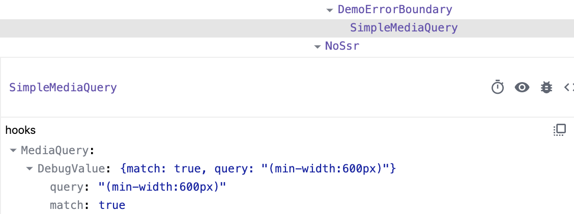
-
And many more 🐛 bug fixes and 📚 improvements.
@material-ui/[email protected]
- [DX] Add debug values to various hooks (#19515) @eps1lon
- [ListItem] Add component prop to primaryTypographyProps and… (#19155) @fyodore82
- [MenuList] Include disabled items in keyboard navigation (#19967) @scottander
- [MenuList] Remove if-statement that is always true (#20270) @CptWesley
- [Popover] Fix resize event leak (#20272) @skmail
- [Select] Fix disabled color to the icon (#20287) @HenryLie
- [SvgIcon] Remove wrong role (#20307) @oliviertassinari
- [theme] Warn when palette structure is wrong (#20253) @oliviertassinari
- [Tooltip] Fix TextField integration (#20252) @ShehryarShoukat96
- [Tooltip] Remove superfluous argument in handleBlur call (#20271) @CptWesley
- [TypeScript] Enable module augmentation of CommonColors (#20212) @eps1lon
- [TypeScript] Add JSDOC to ListItem TypeScript props (#20171) @eps1lon
- [TypeScript] Fix Checkbox and Radio type propType (#20293) @eps1lon
- [TypeScript] Fix incorrect typings regarding transition components a… (#20306) @eps1lon
- [TypeScript] Link to demos and API in IntelliSense (#20078) @eps1lon
- [TypeScript] Mark context value as nullable for optional providers (#20278) @ianschmitz
- [TypeScript] Move more prop docs into IntelliSense (#20298) @eps1lon
- [TypeScript] Add more props documentation to IntelliSense (#20264) @eps1lon
@material-ui/[email protected]
- [Autocomplete] Add limitTags prop (#20209) @netochaves
- [Autocomplete] Add startAfter option (#20305) @netochaves
- [Autocomplete] Warn when value does not match options (#20235) @igorbrasileiro
- [Pagination] Add RTL support (#20247) @HenryLie
- [TreeView] Correct single-select aria-selected (#20102) @tonyhallett
- [TreeView] Disable all selection when disableSelection (#20146) @tonyhallett
- [TreeView] Fix focus steal (#20232) @tonyhallett
- [TreeView] fix inconsistent focus for programmatically focused treeitem (#20237) @tonyhallett
Docs
- [docs] Add a new site to showcase (google-keep clone) (#20260) @anselm94
- [docs] Add color preview to default theme tree (#20082) @mlizchap
- [docs] Add demo link (#20262) @esemeniuc
- [docs] Extract landing-only modules (#20187) @eps1lon
- [docs] Fix TablePagination props swap descriptions (#20274) @johncalvinroberts
- [docs] Fix a few WAVE errors (#20304) @oliviertassinari
- [docs] Fix icons + locale (#20213) @oliviertassinari
- [docs] Fix popover anchor playground crash (#20265) @Zaynex
- [docs] Fix wording in backdrop.md (#20190) @matt-savvy
- [docs] Improve demo error boundary (#20177) @eps1lon
- [docs] Improve doc for textField and buttons (#20207) @DDDDDanica
- [docs] Improve loading experience (#20005) @eps1lon
- [docs] Improve material icons installation instructions (#20290) @ArianKrasniqi
- [docs] Mark toolbar for assistive technology (#20158) @eps1lon
- [docs] Page size tracking fixes (#20199) @eps1lon
- [docs] Sync translations (#20210) @oliviertassinari
Core
- [test] Improve regression test suite debugging (#20194) @eps1lon
- [ci] Retry mergable state for 30 minutes (#20269) @eps1lon
- [core] Automatically apply "PR: needs rebase" PR label (#20169) @eps1lon
- [core] Batch small changes (#20255) @oliviertassinari
- [core] Fix docs:start which should start next.js server (#20202) @ro7584
- [core] Fix maintenance workflow failing on fork PRs (#20195) @eps1lon
- [core] Format all ts files (#20233) @eps1lon
Published by oliviertassinari over 4 years ago
@material-ui/[email protected]
- [core] Patch correct dependencies (10bc98f)
Mar 18, 2020
Big thanks to the 39 contributors who made this release possible.
Here are some highlights ✨:
-
⚛️ Improve the DX in Visual Studio Code (#20079, #19962, #19280) @eps1lon @jedwards1211.
-
Preview the purpose of each
theme.spacingarguments right in the editor:
-
Leverage code snippets to save time with this extension.

-
Preview the colors right in the editor:


-
-
🔍 12 patches on the Autocomplete component.
-
💄 Polish on the Pagination component (#19933, #19964, #19966, #19987) @pvdstel @eps1lon @mbrookes.
@material-ui/[email protected]
- [Chip] Prevent event default when onDelete is triggered (#20051) @eps1lon
- [Container] Reset display block (#19971) @oliviertassinari
- [DatePicker] Fix codesandbox demo (#19926) @netochaves
- [Drawer] Add a comment for clarity on the styling of height of the toolbar (#19934) @smerriman18
- [Grid] Fix row-reverse typo (#20048) @jhthompson
- [Link] Fix color mismatch with Typography component (#19949) Weslen do Nascimento
- [ListItemText] Fix display block issue (#20039) @psdr03
- [Select] Simplify the demos (remove ref) (#20076) @captain-yossarian
- [TablePagination] Out of range warning when "count={-1}" (#19874) @dbarabashdev
- [TextField] Avoid outline label CSS leak (#19937) @ivoiv
- [TextField] Fix outlined render gap if label = empty string (#19722) @captain-yossarian
- [TextField] Minimize usage of z-index (#19547)" (#20016) @piotros
- [theme] Describe what each argument of theme.spacing affects (#19962) @eps1lon
- [theme] Array reject on spacing transformation fixed (#19900) Weslen do Nascimento
- [Tooltip] Fix useMemo dependency (#19899) @NMinhNguyen
- [Tooltip] Reduce enterDelay to 100ms (#19898) @oliviertassinari
@material-ui/[email protected]
- [styles] Fix theme default props overriden by Component default (#20091) @adridavid
- [styles] Name anonymous function type (#19996) @eps1lon
@material-ui/[email protected]
- [theme] Array reject on spacing transformation fixed (#19900) Weslen do Nascimento
@material-ui/[email protected]
- [core] Fix deepmerge of DOM elements (#20100) @ValentinH
@material-ui/[email protected]
- [Autocomplete] Add more details in the onChange event (#19959) @akharkhonov
- [Autocomplete] Add scrollbar support in IE11 (#19969) @SergeyUstinovich
- [Autocomplete] Better synchronize the highlight with the value (#19923) @captain-yossarian
- [Autocomplete] Document listbox limitation (#20101) @zatine
- [Autocomplete] Fix clearOnEscape + multiple combination (#20065) @chaudharykiran
- [Autocomplete] Fix GitHub's demo behavior (#19928) @hasanozacar
- [Autocomplete] Fix typo in prop description (#20086) @vince1995
- [Autocomplete] Improvement popup open logic (#19901) @haseebdaone
- [Autocomplete] Make categories more obvious (#20142) @embeddedt
- [Autocomplete] Simplify error for wrong getOptionLabel (#20103) @oliviertassinari
- [Autocomplete] Update onChange API @oliviertassinari
- [Autocomplete] Use getOptionLabel over stringify (#19974) @a-type
- [AvatarGroup] Add max avatar prop (#19853) @GFynbo
- [Pagination] Add TypeScript types (#19933) @pvdstel
- [Pagination] Fix prop forwarding of
onChangeandpage(#19964) @eps1lon - [Pagination] Leverage
@defaultover default values (#19966) @eps1lon - [Pagination] Remove children prop (#19987) @mbrookes
- [Rating] Fix text alignment inheritance (#20055) @mlizchap
- [Skeleton] Fix SkeletonClassKey type (#20047) @100terres
- [Skeleton] Improve wave dark mode support (#20112) @oliviertassinari
Docs
- [docs] Add radio error demo (#19599) @mbrookes
- [docs] Bump next to latest (#19995) @eps1lon
- [docs] Display color preview in IntelliSense (#20079) @eps1lon
- [docs] Document typescript:transpile script (#19951) @eps1lon
- [docs] Fix @material-ui/styles release version number (#19939) @jkjustjoshing
- [docs] Fix OutlinedLabel typo (#20006) @ljcooke
- [docs] Fix SEO issues (#20108) @oliviertassinari
- [docs] Fix Sketch link (#19944) @mbrookes
- [docs] Fix grammar in autocomplete doc (#20066) @dandv
- [docs] Fix incorrect type for fontWeight @eps1lon
- [docs] Fix missing OutlinedLabel#label link in Select API docs (#19993) @eps1lon
- [docs] Flexbox, add element for show the good effect (#19956) @tbredillet
- [docs] Flexbox: update item number (#19954) @tbredillet
- [docs] Improve font size scaling of some demos (#19950) @eps1lon
- [docs] Remove premium support offerings (#19972) @mbrookes
- [docs] Simplify checkbox examples (#20052) @tacigar
- [docs] Simplify some demos (#19608) @mbrookes
- [docs] Track bundle size of pages (#19978) @eps1lon
- [docs] Upgrade to next 9 (#18441) @eps1lon
- [docs] Simplify drawer examples (#20040) @TommyJackson85
- [examples] Fix typo in gatsby readme (#19998) @eps1lon
Core
- [test] Match against messages not args on console methods (#20046) @eps1lon
- [test] Resize screenshots with sharp (#19979) @oliviertassinari
- [test] Run snapshot tests on the a11y tree (#20019) @eps1lon
- [ci] Fix azure not running (#20127) @eps1lon
- [ci] Fix incorre pr number for experimental scripts (#20021) @eps1lon
- [ci] Let failed types-next jobs pass (#20007) @eps1lon
- [ci] Let failed types-next jobs pass (#20017) @eps1lon
- [core] Add missing properties to TypeAction (#20075) @timonweber
- [core] Add spacing after prettier command (#20073) @dandv
- [core] Batch small changes (#20111) @oliviertassinari
- [core] Fix typos in code comments (#19999) @eps1lon
- [core] Improve the DX when iterating on components (#20128) @oliviertassinari
- [core] Use Babel 7 version of transform-react-constant-elements (#20015) @merceyz
- [security] Bump acorn from 5.7.3 to 5.7.4 (#20105) @dependabot-preview
- [core] Batch small changes (#19896) @oliviertassinari
- [core] Update type defs to use OverridableComponent (#20110) @theGirrafish
- [core] Fix docs:api cleaning the wrong directory #20164 @ro7584
Feb 29, 2020
Big thanks to the 15 contributors who made this release possible.
Here are some highlights ✨:
- 💄 Add selection (and multi-selection) support to tree view (#18357) @joshwooding
- And many more 🐛 bug fixes and 📚 improvements.
@material-ui/[email protected]
- [ButtonBase] Fix when changing enableRipple prop from false to true (#19667) @dmtrKovalenko
- [l10n] Add Armenian (hy-AM) locale (#19844) @vgevorgyan
- [l10n] Add Hebrew (he-IL) locale (#19850) @boazberman
- [Popper] Fix deep merge of PopperProps (#19851) @valgrindMaster
- [RadioGroup] Random default name (#19890) @dfernandez-asapp
- [Slider] Add explicit types for slider callbacks (#19867) @deymundson
- [Step] Add missing expanded prop to step TypeScript (#19873) @countableSet
@material-ui/[email protected]
- [Autocomplete] Fix list of countries (#19862) @FottyM
- [TreeView] Fix conditional nodes support (#19849) @joshwooding
- [Treeview] Add node selection support (#18357) @joshwooding
Docs
- [docs] Fix broken link to jss-nested plugin (#19837) @Izhaki
- [docs] Fix typo on supported-platforms.md (#19841) @vferdiansyah
- [docs] Move store to a subfolder (#19822) @oliviertassinari
Core
- [ci] Enable re-run of azure pipelines (#19823) @eps1lon
- [ci] fix heap out of memory in azure pipelines (#19825) @eps1lon
- [core] Migrate to import * as React from 'react' (#19802) @TrySound
- [test] Fix defaultProps overriding props (#19858) @eps1lon
- [test] Test against typescript nightlies (#19857) @eps1lon
Feb 23, 2020
Big thanks to the 18 contributors who made this release possible.
Here are some highlights ✨:
- ♿️ Improve the accessibility support of the Breadcrumbs and ButtonBase (#19724, #19784) @captain-yossarian.
- 💄 Polish the new Pagination component (#19758) @zettca.
- 🐛 Fix Preact support of the swipeable drawer (#19782) @TommyJackson85.
- 💅 Introduce a small delay in the appearance of the tooltip (#19766) @Ritorna.
- And many more 🐛 bug fixes and 📚 improvements.
@material-ui/[email protected]
- [Breadcrumbs] Fix expand/collapsed Breadcrumbs via keyboard (#19724) @captain-yossarian
- [ButtonBase] Fix space handling for non native button elements (#19784) @captain-yossarian
- [CardMedia] Fix propTypes to allow
componentprop (#19790) @stevenmusumeche - [CssBaseline] Change of children type to ReactNode (#19770) @dfernandez-asapp
- [Framer] Release v1.1.0 (#19800) @mbrookes
- [SwipeableDrawer] Improve Preact support (#19782) @TommyJackson85
- [SwipeableDrawer] Support global theme changes (#19771) @TommyJackson85
- [TextareaAutosize] Prevent "Maximum update depth exceeded" (#19743) @SofianeDjellouli
- [theme] Built-in convertLength method (#19720) @oliviertassinari
- [Tooltip] Add enterNextDelay prop (#19766) @Ritorna
@material-ui/[email protected]
- [Autocomplete] Built-in fullWidth (#19805) @oliviertassinari
- [Autocomplete] Fix stuck with open popup (#19794) @hasanozacar
- [Autocomplete] Warn when using wrong getOptionSelected (#19699) @ahmad-reza619
- [AvatarGroup] Add spacing prop (#19761) @GFynbo
- [Pagination] Fix activatedOpacity typo (#19758) @zettca
Docs
- [docs] Fix typo in Autocomplete (#19775) @aurnik
- [docs] Add Data Driven Forms to the list of libraries (#19747) @rvsia
- [docs] Improve wording of bundle size guide (#19768) @larsenwork
- [docs] Sync translations.json @oliviertassinari
- [docs] Update the translations (#19741) @mbrookes
Core
- [core] Export ThemeOptions (#19789) @dbarabashdev
- [core] Small fixes (#19803) @oliviertassinari
- [core] Update getDisplayName to handle React.memo (#19762) @dantman
Big thanks to the 18 contributors who made this release possible.
@material-ui/[email protected]
- [l10n] Add Estonian (et-EE) locale (#19707) @villuv
- [ScopedCssBaseline] Allow css to be only applied on children (#19669) @TomPradat
@material-ui/[email protected]
- [system] Add boxSizing to sizing styled system (#19684) @mesteche
@material-ui/[email protected]
- [Autocomplete] Improve freeSolo UX (#19663) @itelofilho
- [Autocomplete] Make options required (#19648) @alexandesigner
- [Pagination] Second iteration (#19612) @oliviertassinari
Docs
- [TreeView] Add recursive demo (#19636) @captain-yossarian
- [docs] Encourage mui-rff (#19676) @lookfirst
- [docs] Fix missing import in auto-dark theme palette example (#19694) @vinyldarkscratch
- [docs] Fix typo in sticky footer template (#19695) @bryndyment
- [docs] List default attributes first (#19693) @amcasey
- [docs] Revamp the notifications (#19615) @mbrookes
- [docs] Revert sidebar scrolling (#19678) @kristenmills
- [docs] Switch to cross-fetch (#19644) @eps1lon
- [docs] Update codemod documentation (#19661) @larsenwork
- [docs] What's the lab about? (#19611) @jcafiero
Core
- [core] Export TypographyVariant type (#19598) @aleccaputo
- [core] Host normalize-scroll-left (#19638) @oliviertassinari
- [core] Misc dependency fixes (#19643) @eps1lon
- [core] Batch small changes (#19639) @oliviertassinari
- [core] Batch small changes (#19717) @oliviertassinari